Instructor Notes
Install the required workshop packages
Please use the instructions in the Setup document to perform installs. If you encounter setup issues, please file an issue with the tags ‘High-priority’.
Checking installations.
In the episodes/files/scripts/check_env.py
directory, you will find a script called check_env.py This checks the
functionality of the Anaconda install.
By default, Data Carpentry does not have people pull the whole
repository with all the scripts and addenda. Therefore, you, as the
instructor, get to decide how you’d like to provide this script to
learners, if at all. To use this, students can navigate into
_includes/scripts in the terminal, and execute the
following:
If learners receive an AssertionError, it will inform
you how to help them correct this installation. Otherwise, it will tell
you that the system is good to go and ready for Data Carpentry!
07-visualization-ggplot-python
iPython notebooks for plotting can be viewed in the
learners folder.
08-putting-it-all-together
Answers are embedded with challenges in this lesson, other than random distribtuion which is left to the learner to choose, and final plot, for which the learner should investigate the matplotlib gallery.
Scientists often operate on mathematical equations. Being able to use them in their graphics has a lot of added value Luckily, Matplotlib provides powerful tools for text control. One of them is the ability to use LaTeX mathematical notation, whenever text is used (you can learn more about LaTeX math notation here: https://en.wikibooks.org/wiki/LaTeX/Mathematics). To use mathematical notation, surround your text using the dollar sign (“$”).
LaTeX uses the backslash character (“\”) a lot. Since backslash has a special meaning in the Python strings, you should replace all the LaTeX-related backslashes with two backslashes.
PYTHON
plt.plot(t, t, 'r--', label='$y=x$')
plt.plot(t, t**2 , 'bs-', label='$y=x^2$')
plt.plot(t, (t - 5)**2 + 5 * t - 0.5, 'g^:', label='$y=(x - 5)^2 + 5  x - \\frac{1}{2}$') # note the double backslash

plt.legend(loc='upper left', shadow=True, fontsize='x-large')

# Note the double backslashes in the line below.
plt.xlabel('This is the x axis. It can also contain math such as $\\bar{x}=\\frac{\\sum_{i=1}^{n} {x}} {N}$')
plt.ylabel('This is the y axis')
plt.title('This is the figure title')

plt.show()
This page contains more information.
Before we start
Short Introduction to Programming in Python
Assigning to Dictionaries
It can help to further demonstrate the freedom the user has to define values to keys in a dictionary, by showing another example with a value completely unrelated to the current contents of the dictionary, e.g.
OUTPUT
{1: 'one', 2: 'apple-sauce', 3: 'three'}Starting With Data
Recapping object (im)mutability
Working through solutions to the challenge above can provide a good
opportunity to recap about mutability and immutability of different
objects. Show that the DataFrame index ( the columns
attribute) is immutable, e.g.
surveys_df.columns[4] = "plotid" returns a
TypeError.
Adapting the name is done with the rename function:
Important Bug Note
In pandas prior to version 0.18.1 there is a bug causing
surveys_df['weight'].describe() to return a runtime
error.
Indexing, Slicing and Subsetting DataFrames in Python
Instructor Note
Tip: use .head() method throughout this lesson to keep
your display neater for students. Encourage students to try with and
without .head() to reinforce this useful tool and then to
use it or not at their preference.
For example, if a student worries about keeping up in pace with
typing, let them know they can skip the .head(), but that
you’ll use it to keep more lines of previous steps visible.
Instructor Note
When working through the solutions to the challenges above, you could introduce already that all these slice operations are actually based on a Boolean indexing operation (next section in the lesson). The filter provides for each record if it satisfies (True) or not (False). The slicing itself interprets the True/False of each record.
Instructor Note
Referring to the challenge solution above, as we know the other values are all Nan values, we could also select all not null values:
PYTHON
stack_selection = surveys_df[(surveys_df['sex'].notnull()) &
          surveys_df["weight"] > 0.][["sex", "weight", "plot_id"]]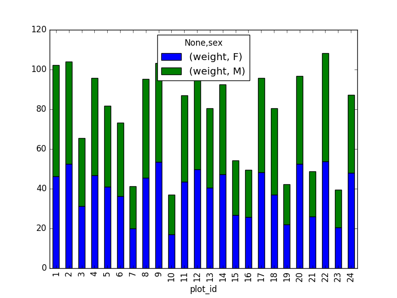
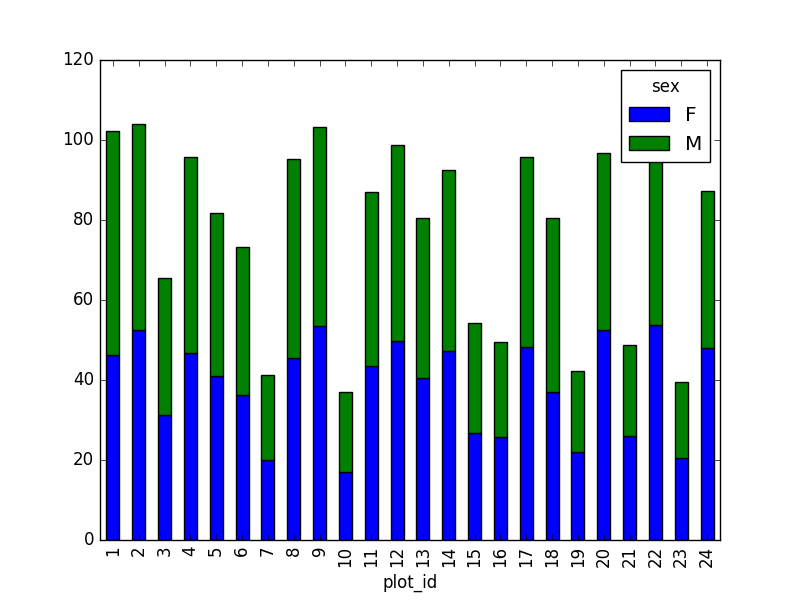
However, due to the unstack command, the legend header
contains two levels. In order to remove this, the column naming needs to
be simplified:
This is just a preview, more in next episode.
Data Types and Formats
Processed Data Checkpoint
If learners have trouble generating the output, or anything happens
with that, the folder sample_output
in this repository contains the file surveys_complete.csv
with the data they should generate.
Combining DataFrames with Pandas
Suggestion (for discussion only)
The number of individuals for each taxa in each plot per sex can be derived as well.
PYTHON
sex_taxa_site  = merged_left.groupby(["plot_id", "taxa", "sex"]).count()['record_id']
sex_taxa_site.unstack(level=[1, 2]).plot(kind='bar', logy=True)
plt.legend(loc='upper center', ncol=3, bbox_to_anchor=(0.5, 1.15),
           fontsize='small', frameon=False)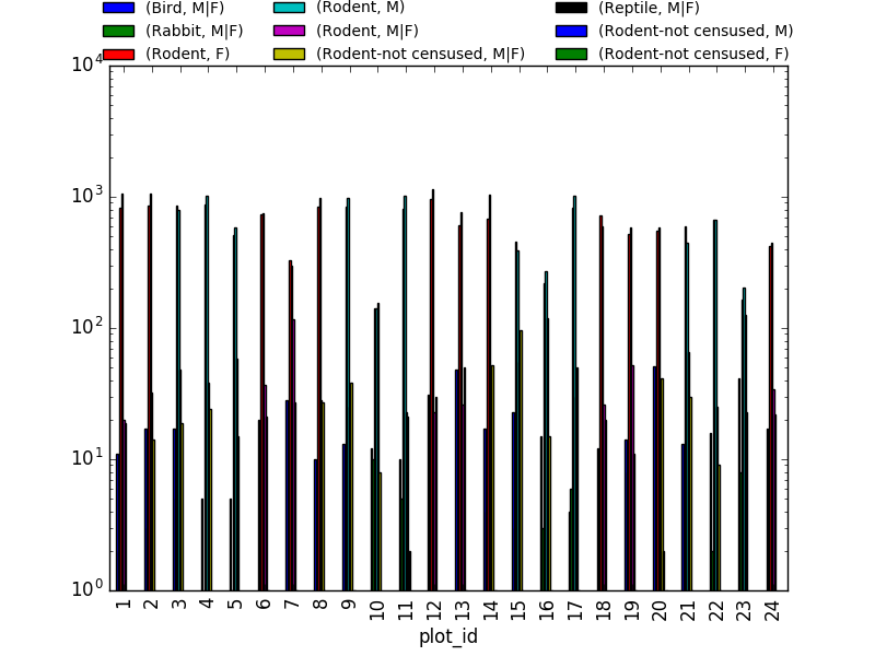
This is not really the best plot choice, e.g. it is not easily
readable. A first option to make this better, is to make facets.
However, pandas/matplotlib do not provide this by default. Just as a
pure matplotlib example (M|F if for not-defined sex
records):
PYTHON
fig, axs = plt.subplots(3, 1)
for sex, ax in zip(["M", "F", "M|F"], axs):
    sex_taxa_site[sex_taxa_site["sex"] == sex].plot(kind='bar', ax=ax, legend=False)
    ax.set_ylabel(sex)
    if not ax.is_last_row():
        ax.set_xticks([])
        ax.set_xlabel("")
axs[0].legend(loc='upper center', ncol=5, bbox_to_anchor=(0.5, 1.3),
              fontsize='small', frameon=False)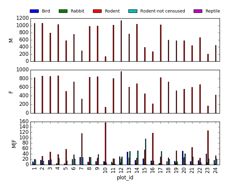
However, it would be better to link to Seaborn and Altair for this kind of multivariate visualisation.
Data Workflows and Automation
Instructor Note
When teaching the challenge below, demonstrating the results in a debugging environment can make function scope more clear.
Making Plots With plotnine
Instructor Note
If learners have trouble generating the output, or anything happens
with that, the folder sample_output
in this repository contains the file surveys_complete.csv
with the data they should generate.
Instructor Note
Note plotnine contains a lot of deprecation
warnings in some versions of python/matplotlib, warnings may need to be
suppressed with