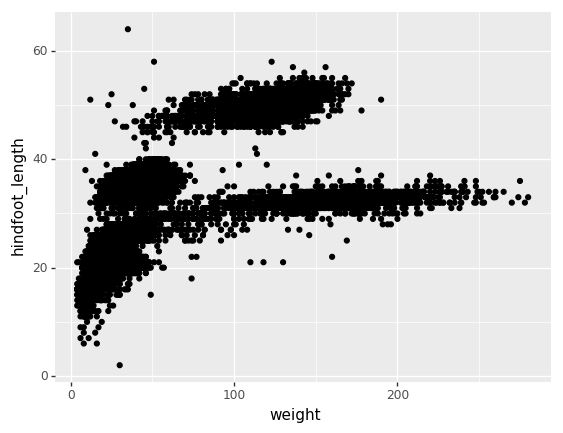
Image 1 of 1: ‘scatter plot of hindfoot length vs weight with black dots denoting individual sampled animals, showing 4 main clusters of dots in the middle and left middle sides’
Figure 2
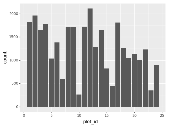
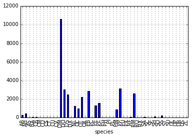
Image 1 of 1: ‘bar chart of count of rodents caught at each plot site’
Figure 3
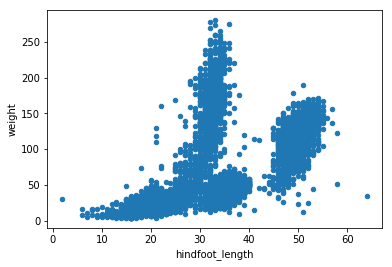
Image 1 of 1: ‘scatter plot of hindfoot-length vs weight of rodents, showing a curve increasing to a plateau’
Figure 4
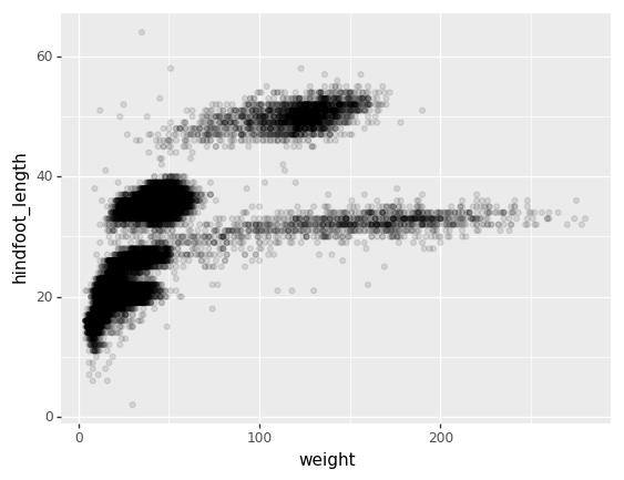
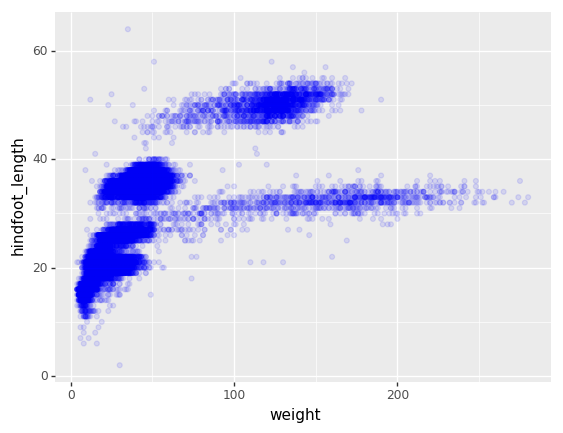
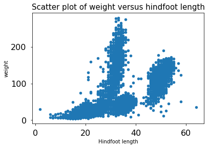
Image 1 of 1: ‘scatter plot of hindfoot-length vs weight of rodents, demonstrating overplotting’
Figure 5
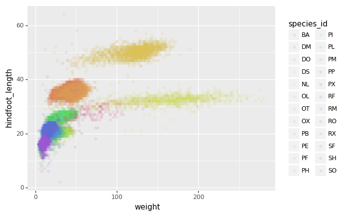
Image 1 of 1: ‘scatter plot of Hindfoot length vs weight with colors coordinating to specific species, showing abundance in the mid to lower left side of the plot’
Figure 6
Image 1 of 1: ‘scatter plot of Hindfoot length vs weight (g) with colors coordinating to specific species, showing abundance in the mid to lower left side of the plot’
Figure 7
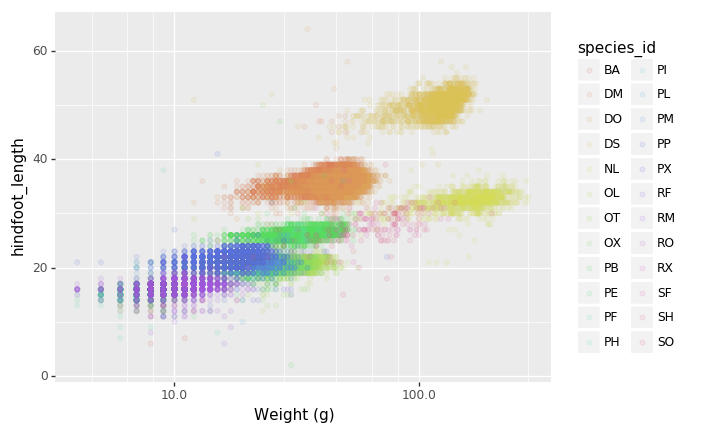
Image 1 of 1: ‘Scatterplot of hindfoot length versus weight where logarithmic x-axis is used to distribute lower numbers’
Figure 8
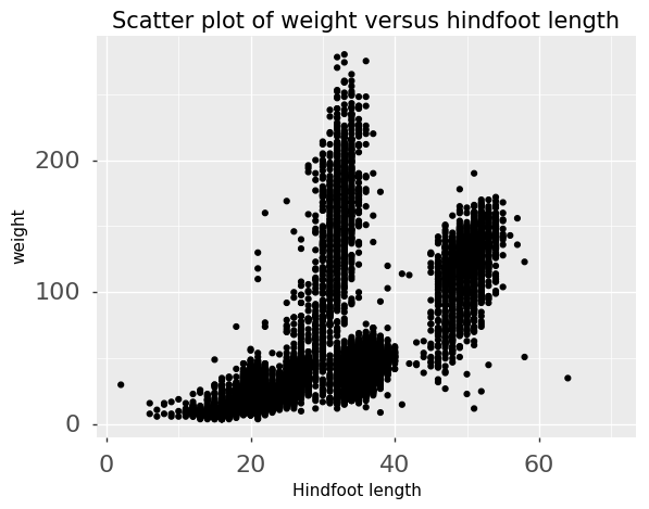
Image 1 of 1: ‘Scatterplot of hindfoot length versus weight on a logarithmic x-axis using a white background’
Figure 9
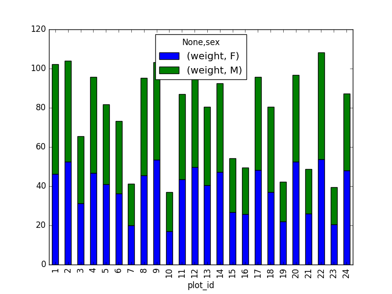
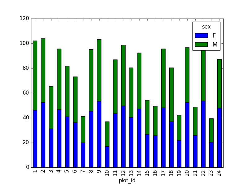
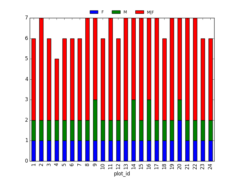
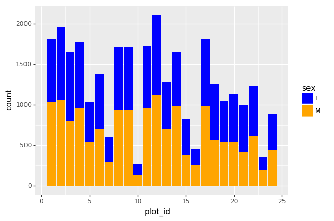
Image 1 of 1: ‘Bar chart of counts of males (yellow) and females (blue) vs plot id, showing the number of females to be higher in all plots’
Figure 10
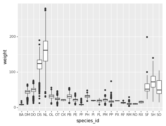
Image 1 of 1: ‘boxplot showing distribution of rodent weight for each species group’
Figure 11
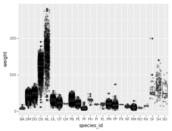
Image 1 of 1: ‘Boxplot of weight by species overlaying observation points to visualize the distribution’
Figure 12
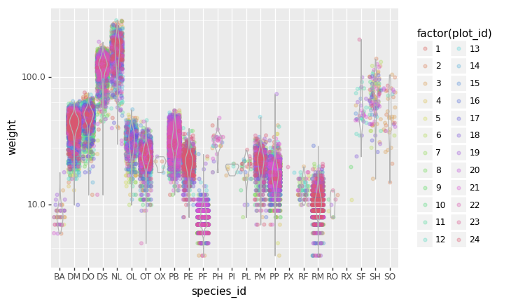
Image 1 of 1: ‘Violin plot of weight of species shown with weight scaled down and datapoints with color.’
Figure 13
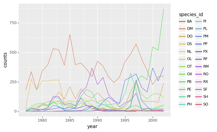
Image 1 of 1: ‘Line graph of count per year where data for each species is indicated by a different color’
Figure 14
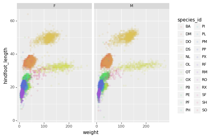
Image 1 of 1: ‘2 scatter plots, one for males and the other for females, of hindfoot length vs weight with colored dots denoting specific species, showing the trend is the same between both male and females of multiple species’
Figure 15
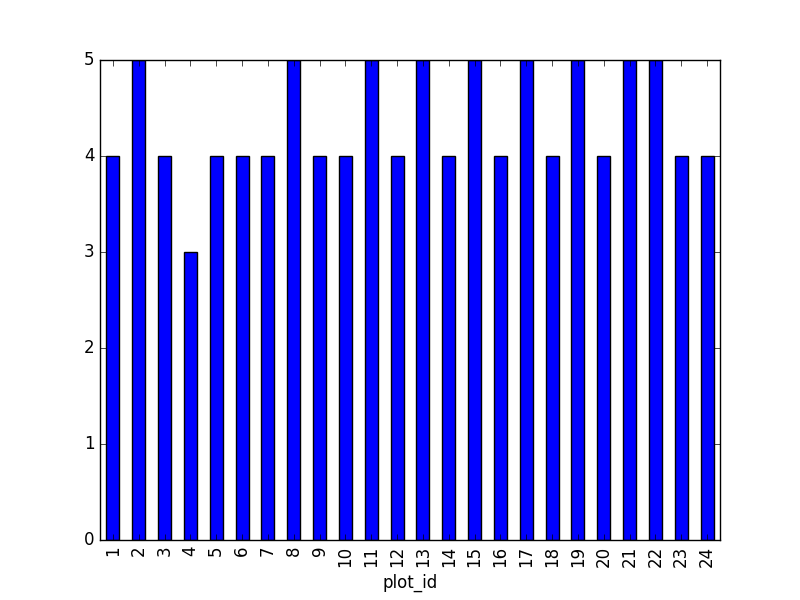
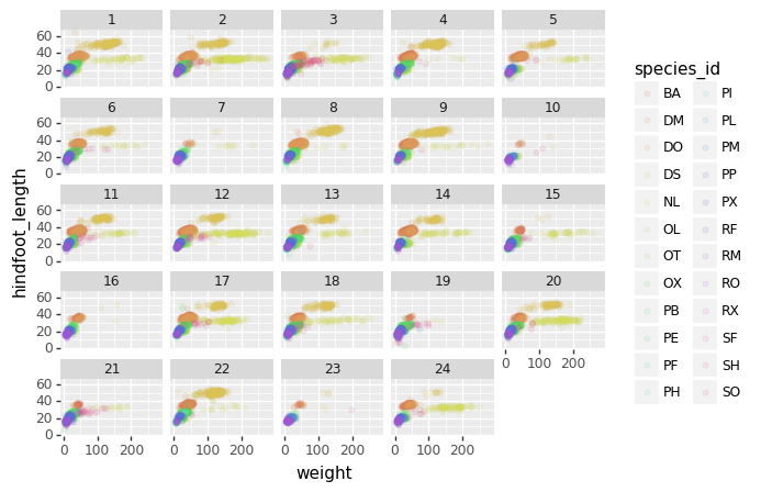
Image 1 of 1: ‘24 individual scatter plots of Hindfoot length vs weight of species with colors denoting species and numbers above plot representing 1 of the 24 plots, showing trends for each unique plot id studied’
Figure 16
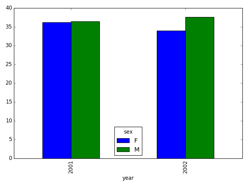
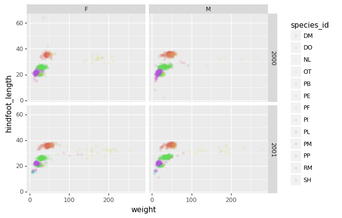
Image 1 of 1: ‘Set of 4 color scatterplots showing the relationship between weight and hind foot length for 13 species, separated by sex and year’
Figure 17
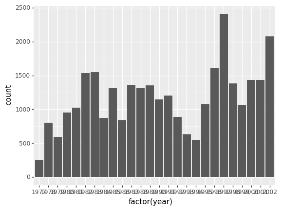
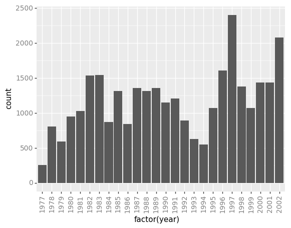
Image 1 of 1: ‘Bar graph of count per year showing overlapping x-axis labels’
Figure 18
Image 1 of 1: ‘Bar graph of count per year demonstrating how the theme function rotates the x-axis labels’
Figure 19
Image 1 of 1: ‘Bar graph of count per year demonstrating the use of a customized theme’
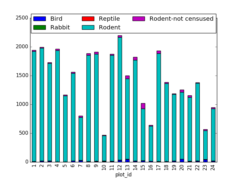
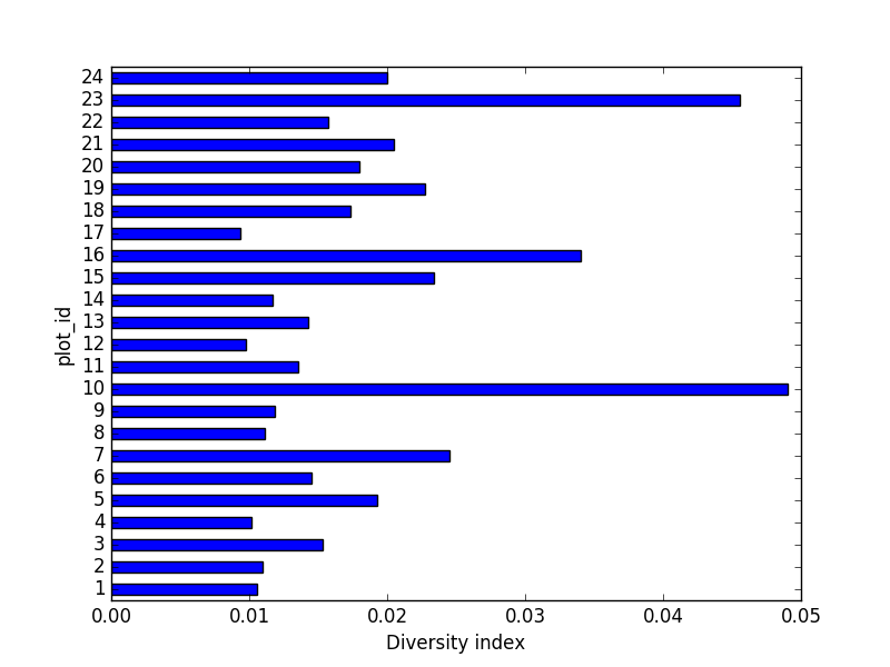
 Count per species site