Content from Introduction
Last updated on 2023-07-26 | Edit this page
Estimated time: 5 minutes
Overview
Questions
- What sort of scientific questions can we answer with image processing / computer vision?
- What are morphometric problems?
Objectives
- Recognise scientific questions that could be solved with image processing / computer vision.
- Recognise morphometric problems (those dealing with the number, size, or shape of the objects in an image).
As computer systems have become faster and more powerful, and cameras and other imaging systems have become commonplace in many other areas of life, the need has grown for researchers to be able to process and analyse image data. Considering the large volumes of data that can be involved - high-resolution images that take up a lot of disk space/virtual memory, and/or collections of many images that must be processed together - and the time-consuming and error-prone nature of manual processing, it can be advantageous or even necessary for this processing and analysis to be automated as a computer program.
This lesson introduces an open source toolkit for processing image
data: the Python programming language and the scikit-image
(skimage) library. With careful experimental design,
Python code can be a powerful instrument in answering many different
kinds of questions.
Uses of Image Processing in Research
Automated processing can be used to analyse many different properties of an image, including the distribution and change in colours in the image, the number, size, position, orientation, and shape of objects in the image, and even - when combined with machine learning techniques for object recognition - the type of objects in the image.
Some examples of image processing methods applied in research include:
- imaging a Black Hole
- estimating the population of Emperor Penguins
- the global-scale analysis of marine plankton diversity
- segmentation of liver and vessels from CT images
With this lesson, we aim to provide a thorough grounding in the fundamental concepts and skills of working with image data in Python. Most of the examples used in this lesson focus on one particular class of image processing technique, morphometrics, but what you will learn can be used to solve a much wider range of problems.
Morphometrics
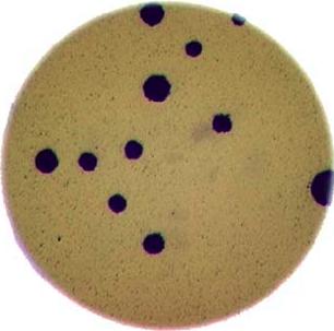
Morphometrics involves counting the number of objects in an image, analyzing the size of the objects, or analyzing the shape of the objects. For example, we might be interested in automatically counting the number of bacterial colonies growing in a Petri dish, as shown in this image:
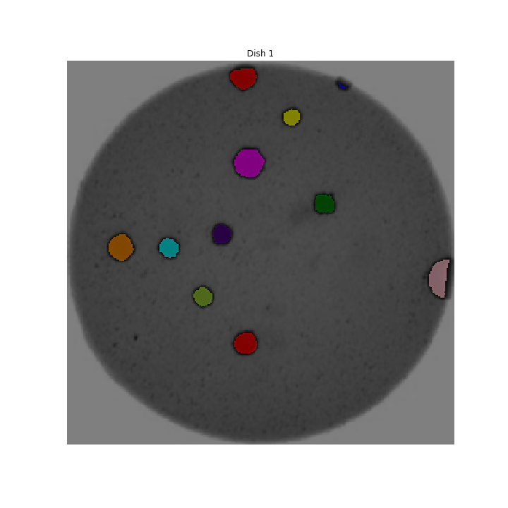
We could use image processing to find the colonies, count them, and then highlight their locations on the original image, resulting in an image like this:
Why write a program to do that?
Note that you can easily manually count the number of bacteria colonies shown in the morphometric example above. Why should we learn how to write a Python program to do a task we could easily perform with our own eyes? There are at least two reasons to learn how to perform tasks like these with Python and scikit-image:
- What if there are many more bacteria colonies in the Petri dish? For example, suppose the image looked like this:
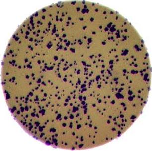
Manually counting the colonies in that image would present more of a challenge. A Python program using scikit-image could count the number of colonies more accurately, and much more quickly, than a human could.
- What if you have hundreds, or thousands, of images to consider? Imagine having to manually count colonies on several thousand images like those above. A Python program using scikit-image could move through all of the images in seconds; how long would a graduate student require to do the task? Which process would be more accurate and repeatable?
As you can see, the simple image processing / computer vision techniques you will learn during this workshop can be very valuable tools for scientific research.
As we move through this workshop, we will learn image analysis methods useful for many different scientific problems. These will be linked together and applied to a real problem in the final end-of-workshop capstone challenge.
Let’s get started, by learning some basics about how images are represented and stored digitally.
Key Points
- Simple Python and scikit-image techniques can be used to solve genuine image analysis problems.
- Morphometric problems involve the number, shape, and / or size of the objects in an image.
Content from Image Basics
Last updated on 2024-06-18 | Edit this page
Estimated time: 25 minutes
Overview
Questions
- How are images represented in digital format?
Objectives
- Define the terms bit, byte, kilobyte, megabyte, etc.
- Explain how a digital image is composed of pixels.
- Recommend using imageio (resp. scikit-image) for I/O (resp. image processing) tasks.
- Explain how images are stored in NumPy arrays.
- Explain the left-hand coordinate system used in digital images.
- Explain the RGB additive colour model used in digital images.
- Explain the order of the three colour values in scikit-image images.
- Explain the characteristics of the BMP, JPEG, and TIFF image formats.
- Explain the difference between lossy and lossless compression.
- Explain the advantages and disadvantages of compressed image formats.
- Explain what information could be contained in image metadata.
The images we see on hard copy, view with our electronic devices, or process with our programs are represented and stored in the computer as numeric abstractions, approximations of what we see with our eyes in the real world. Before we begin to learn how to process images with Python programs, we need to spend some time understanding how these abstractions work.
Callout
Feel free to make use of the available cheat-sheet as a guide for the rest of the course material. View it online, share it, or print the PDF!
Pixels
It is important to realise that images are stored as rectangular arrays of hundreds, thousands, or millions of discrete “picture elements,” otherwise known as pixels. Each pixel can be thought of as a single square point of coloured light.
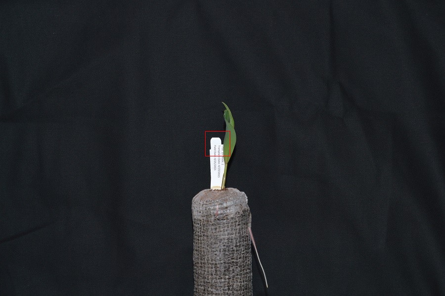
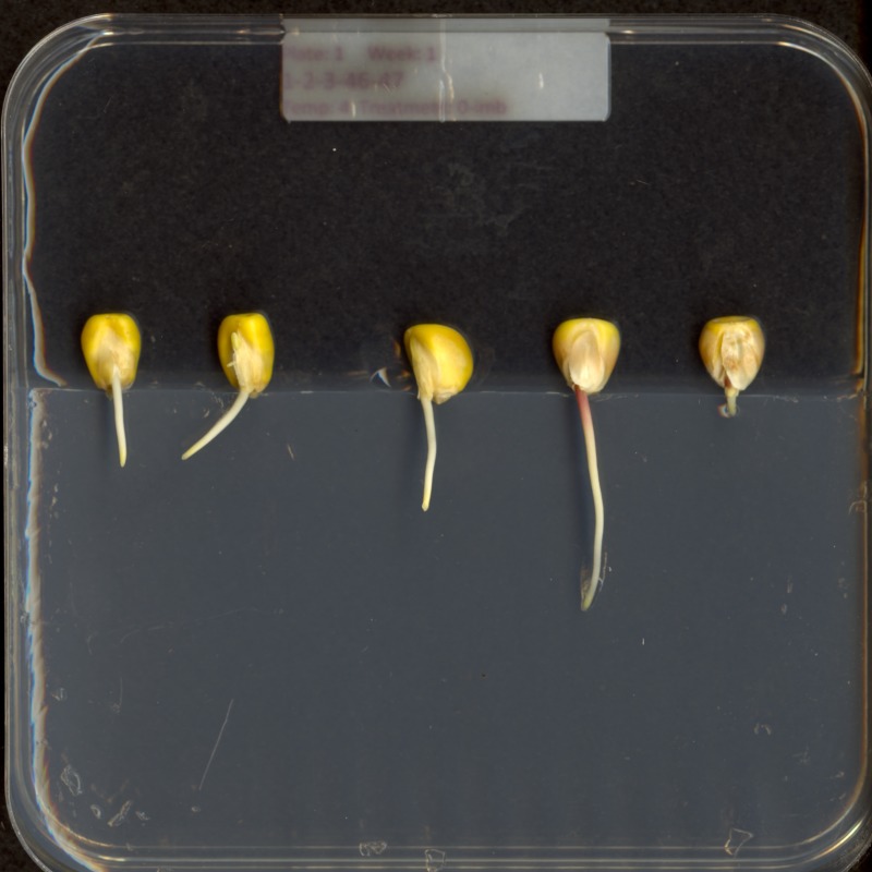
For example, consider this image of a maize seedling, with a square area designated by a red box:
Now, if we zoomed in close enough to see the pixels in the red box, we would see something like this:
Note that each square in the enlarged image area - each pixel - is all one colour, but that each pixel can have a different colour from its neighbors. Viewed from a distance, these pixels seem to blend together to form the image we see.
Real-world images are typically made up of a vast number of pixels, and each of these pixels is one of potentially millions of colours. While we will deal with pictures of such complexity in this lesson, let’s start our exploration with just 15 pixels in a 5 x 3 matrix with 2 colours, and work our way up to that complexity.
Matrices, arrays, images and pixels
A matrix is a mathematical concept - numbers evenly arranged in a rectangle. This can be a two-dimensional rectangle, like the shape of the screen you’re looking at now. Or it could be a three-dimensional equivalent, a cuboid, or have even more dimensions, but always keeping the evenly spaced arrangement of numbers. In computing, an array refers to a structure in the computer’s memory where data is stored in evenly spaced elements. This is strongly analogous to a matrix. A NumPy array is a type of variable (a simpler example of a type is an integer). For our purposes, the distinction between matrices and arrays is not important, we don’t really care how the computer arranges our data in its memory. The important thing is that the computer stores values describing the pixels in images, as arrays. And the terms matrix and array will be used interchangeably.
Loading images
As noted, images we want to analyze (process) with Python are loaded into arrays. There are multiple ways to load images. In this lesson, we use imageio, a Python library for reading (loading) and writing (saving) image data, and more specifically its version 3. But, really, we could use any image loader which would return a NumPy array.
The v3 module of imageio (imageio.v3) is
imported as iio (see note in the next section). Version 3
of imageio has the benefit of supporting nD (multidimensional) image
data natively (think of volumes, movies).
Let us load our image data from disk using the imread
function from the imageio.v3 module.
OUTPUT
<class 'numpy.ndarray'>Note that, using the same image loader or a different one, we could also read in remotely hosted data.
Why not use
skimage.io.imread()?
The scikit-image library has its own function to read an image, so
you might be asking why we don’t use it here. Actually,
skimage.io.imread() uses iio.imread()
internally when loading an image into Python. It is certainly something
you may use as you see fit in your own code. In this lesson, we use the
imageio library to read or write images, while scikit-image is dedicated
to performing operations on the images. Using imageio gives us more
flexibility, especially when it comes to handling metadata.
Beyond NumPy arrays
Beyond NumPy arrays, there exist other types of variables which are
array-like. Notably, pandas.DataFrame
and xarray.DataArray
can hold labeled, tabular data. These are not natively supported in
scikit-image, the scientific toolkit we use in this lesson for
processing image data. However, data stored in these types can be
converted to numpy.ndarray with certain assumptions (see
pandas.DataFrame.to_numpy() and
xarray.DataArray.data). Particularly, these conversions
ignore the sampling coordinates (DataFrame.index,
DataFrame.columns, or DataArray.coords), which
may result in misrepresented data, for instance, when the original data
points are irregularly spaced.
Working with pixels
First, let us add the necessary imports:
PYTHON
"""Python libraries for learning and performing image processing."""

import ipympl
import matplotlib.pyplot as plt
import numpy as np
import skimage as ski
Import statements in Python
In Python, the import statement is used to load
additional functionality into a program. This is necessary when we want
our code to do something more specialised, which cannot easily be
achieved with the limited set of basic tools and data structures
available in the default Python environment.
Additional functionality can be loaded as a single function or
object, a module defining several of these, or a library containing many
modules. You will encounter several different forms of
import statement.
PYTHON
import skimage                 # form 1, load whole skimage library
import skimage.draw            # form 2, load skimage.draw module only
from skimage.draw import disk  # form 3, load only the disk function
import skimage as ski # form 4, load all of skimage into an object called skiIn the example above, form 1 loads the entire scikit-image library
into the program as an object. Individual modules of the library are
then available within that object, e.g., to access the disk
function used in the drawing episode, you
would write skimage.draw.disk().
Form 2 loads only the draw module of
skimage into the program. The syntax needed to use the
module remains unchanged: to access the disk function, we
would use the same function call as given for form 1.
Form 3 can be used to import only a specific function/class from a
library/module. Unlike the other forms, when this approach is used, the
imported function or class can be called by its name only, without
prefixing it with the name of the library/module from which it was
loaded, i.e., disk() instead of
skimage.draw.disk() using the example above. One hazard of
this form is that importing like this will overwrite any object with the
same name that was defined/imported earlier in the program, i.e., the
example above would replace any existing object called disk
with the disk function from skimage.draw.
Finally, the as keyword can be used when importing, to
define a name to be used as shorthand for the library/module being
imported. This name is referred to as an alias. Typically, using an
alias (such as np for the NumPy library) saves us a little
typing. You may see as combined with any of the other first
three forms of import statements.
Which form is used often depends on the size and number of additional tools being loaded into the program.
Now that we have our libraries loaded, we will run a Jupyter Magic Command that will ensure our images display in our Jupyter document with pixel information that will help us more efficiently run commands later in the session.
With that taken care of, let us display the image we have loaded,
using the imshow function from the
matplotlib.pyplot module.
You might be thinking, “That does look vaguely like an eight, and I see two colours but how can that be only 15 pixels”. The display of the eight you see does use a lot more screen pixels to display our eight so large, but that does not mean there is information for all those screen pixels in the file. All those extra pixels are a consequence of our viewer creating additional pixels through interpolation. It could have just displayed it as a tiny image using only 15 screen pixels if the viewer was designed differently.
While many image file formats contain descriptive metadata that can
be essential, the bulk of a picture file is just arrays of numeric
information that, when interpreted according to a certain rule set,
become recognizable as an image to us. Our image of an eight is no
exception, and imageio.v3 stored that image data in an
array of arrays making a 5 x 3 matrix of 15 pixels. We can demonstrate
that by calling on the shape property of our image variable and see the
matrix by printing our image variable to the screen.
OUTPUT
(5, 3)
[[0. 0. 0.]
 [0. 1. 0.]
 [0. 0. 0.]
 [0. 1. 0.]
 [0. 0. 0.]]
Thus if we have tools that will allow us to manipulate these arrays
of numbers, we can manipulate the image. The NumPy library can be
particularly useful here, so let’s try that out using NumPy array
slicing. Notice that the default behavior of the imshow
function appended row and column numbers that will be helpful to us as
we try to address individual or groups of pixels. First let’s load
another copy of our eight, and then make it look like a zero.
To make it look like a zero, we need to change the number underlying the centremost pixel to be 1. With the help of those row and column headers, at this small scale we can determine the centre pixel is in row labeled 2 and column labeled 1. Using array slicing, we can then address and assign a new value to that position.
PYTHON
zero = iio.imread(uri="data/eight.tif")
zero[2, 1]= 1.0

# The following line of code creates a new figure for imshow to use in displaying our output.
fig, ax = plt.subplots()
ax.imshow(zero)
print(zero)
OUTPUT
[[0. 0. 0.]
 [0. 1. 0.]
 [0. 1. 0.]
 [0. 1. 0.]
 [0. 0. 0.]]
Coordinate system
When we process images, we can access, examine, and / or change the colour of any pixel we wish. To do this, we need some convention on how to access pixels individually; a way to give each one a name, or an address of a sort.
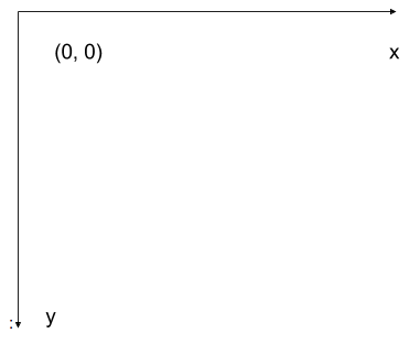
The most common manner to do this, and the one we will use in our programs, is to assign a modified Cartesian coordinate system to the image. The coordinate system we usually see in mathematics has a horizontal x-axis and a vertical y-axis, like this:
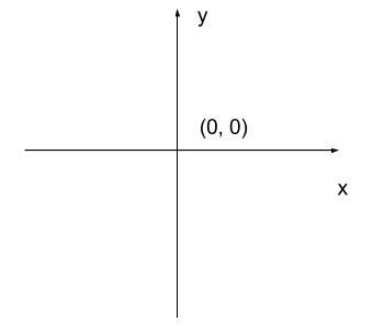
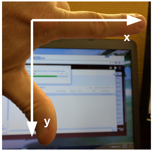
The modified coordinate system used for our images will have only positive coordinates, the origin will be in the upper left corner instead of the centre, and y coordinate values will get larger as they go down instead of up, like this:
This is called a left-hand coordinate system. If you hold your left hand in front of your face and point your thumb at the floor, your extended index finger will correspond to the x-axis while your thumb represents the y-axis.
Until you have worked with images for a while, the most common mistake that you will make with coordinates is to forget that y coordinates get larger as they go down instead of up as in a normal Cartesian coordinate system. Consequently, it may be helpful to think in terms of counting down rows (r) for the y-axis and across columns (c) for the x-axis. This can be especially helpful in cases where you need to transpose image viewer data provided in x,y format to y,x format. Thus, we will use cx and ry where appropriate to help bridge these two approaches.
Changing Pixel Values (5 min)
Load another copy of eight named five, and then change the value of pixels so you have what looks like a 5 instead of an 8. Display the image and print out the matrix as well.
More colours
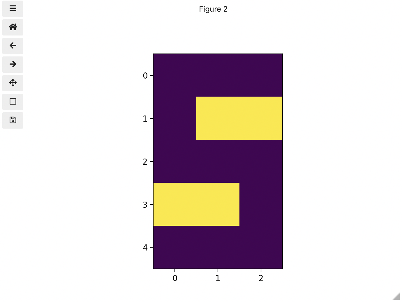
Up to now, we only had a 2 colour matrix, but we can have more if we use other numbers or fractions. One common way is to use the numbers between 0 and 255 to allow for 256 different colours or 256 different levels of grey. Let’s try that out.
PYTHON
# make a copy of eight
three_colours = iio.imread(uri="data/eight.tif")

# multiply the whole matrix by 128
three_colours = three_colours * 128

# set the middle row (index 2) to the value of 255.,
# so you end up with the values 0., 128., and 255.
three_colours[2, :] = 255.
fig, ax = plt.subplots()
ax.imshow(three_colours)
print(three_colours)
We now have 3 colours, but are they the three colours you expected? They all appear to be on a continuum of dark purple on the low end and yellow on the high end. This is a consequence of the default colour map (cmap) in this library. You can think of a colour map as an association or mapping of numbers to a specific colour. However, the goal here is not to have one number for every possible colour, but rather to have a continuum of colours that demonstrate relative intensity. In our specific case here for example, 255 or the highest intensity is mapped to yellow, and 0 or the lowest intensity is mapped to a dark purple. The best colour map for your data will vary and there are many options built in, but this default selection was not arbitrary. A lot of science went into making this the default due to its robustness when it comes to how the human mind interprets relative colour values, grey-scale printability, and colour-blind friendliness (You can read more about this default colour map in a Matplotlib tutorial and an explanatory article by the authors). Thus it is a good place to start, and you should change it only with purpose and forethought. For now, let’s see how you can do that using an alternative map you have likely seen before where it will be even easier to see it as a mapped continuum of intensities: greyscale.
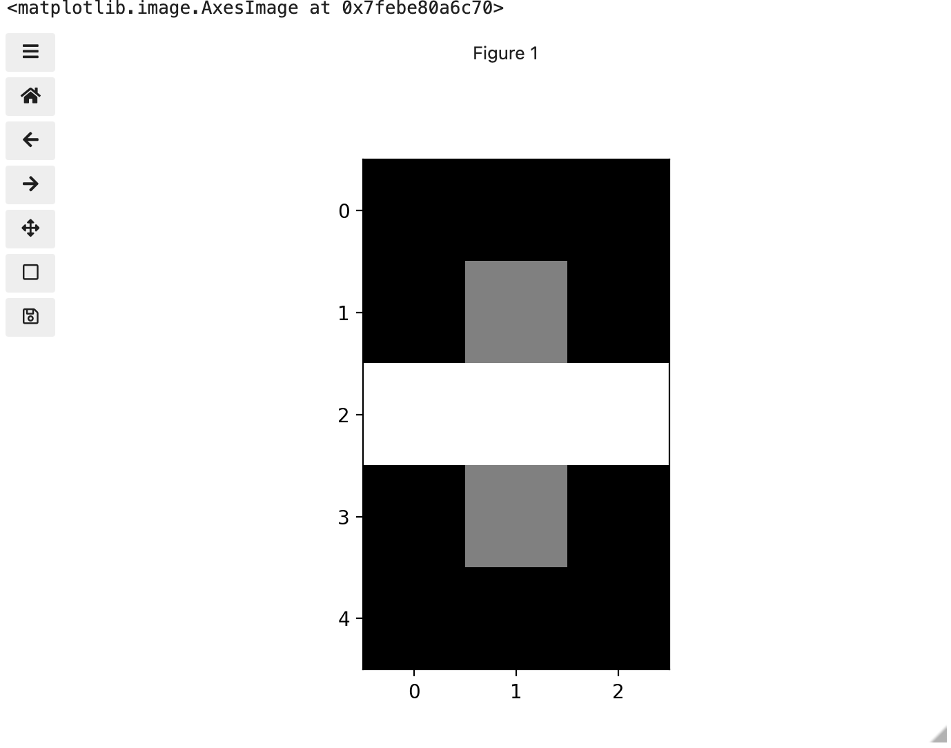
Above we have exactly the same underying data matrix, but in greyscale. Zero maps to black, 255 maps to white, and 128 maps to medium grey. Here we only have a single channel in the data and utilize a grayscale color map to represent the luminance, or intensity of the data and correspondingly this channel is referred to as the luminance channel.
Even more colours
This is all well and good at this scale, but what happens when we instead have a picture of a natural landscape that contains millions of colours. Having a one to one mapping of number to colour like this would be inefficient and make adjustments and building tools to do so very difficult. Rather than larger numbers, the solution is to have more numbers in more dimensions. Storing the numbers in a multi-dimensional matrix where each colour or property like transparency is associated with its own dimension allows for individual contributions to a pixel to be adjusted independently. This ability to manipulate properties of groups of pixels separately will be key to certain techniques explored in later chapters of this lesson. To get started let’s see an example of how different dimensions of information combine to produce a set of pixels using a 4 x 4 matrix with 3 dimensions for the colours red, green, and blue. Rather than loading it from a file, we will generate this example using NumPy.
PYTHON
# set the random seed so we all get the same matrix
pseudorandomizer = np.random.RandomState(2021)
# create a 4 × 4 checkerboard of random colours
checkerboard = pseudorandomizer.randint(0, 255, size=(4, 4, 3))
# restore the default map as you show the image
fig, ax = plt.subplots()
ax.imshow(checkerboard)
# display the arrays
print(checkerboard)
OUTPUT
[[[116  85  57]
  [128 109  94]
  [214  44  62]
  [219 157  21]]

 [[ 93 152 140]
  [246 198 102]
  [ 70  33 101]
  [  7   1 110]]

 [[225 124 229]
  [154 194 176]
  [227  63  49]
  [144 178  54]]

 [[123 180  93]
  [120   5  49]
  [166 234 142]
  [ 71  85  70]]]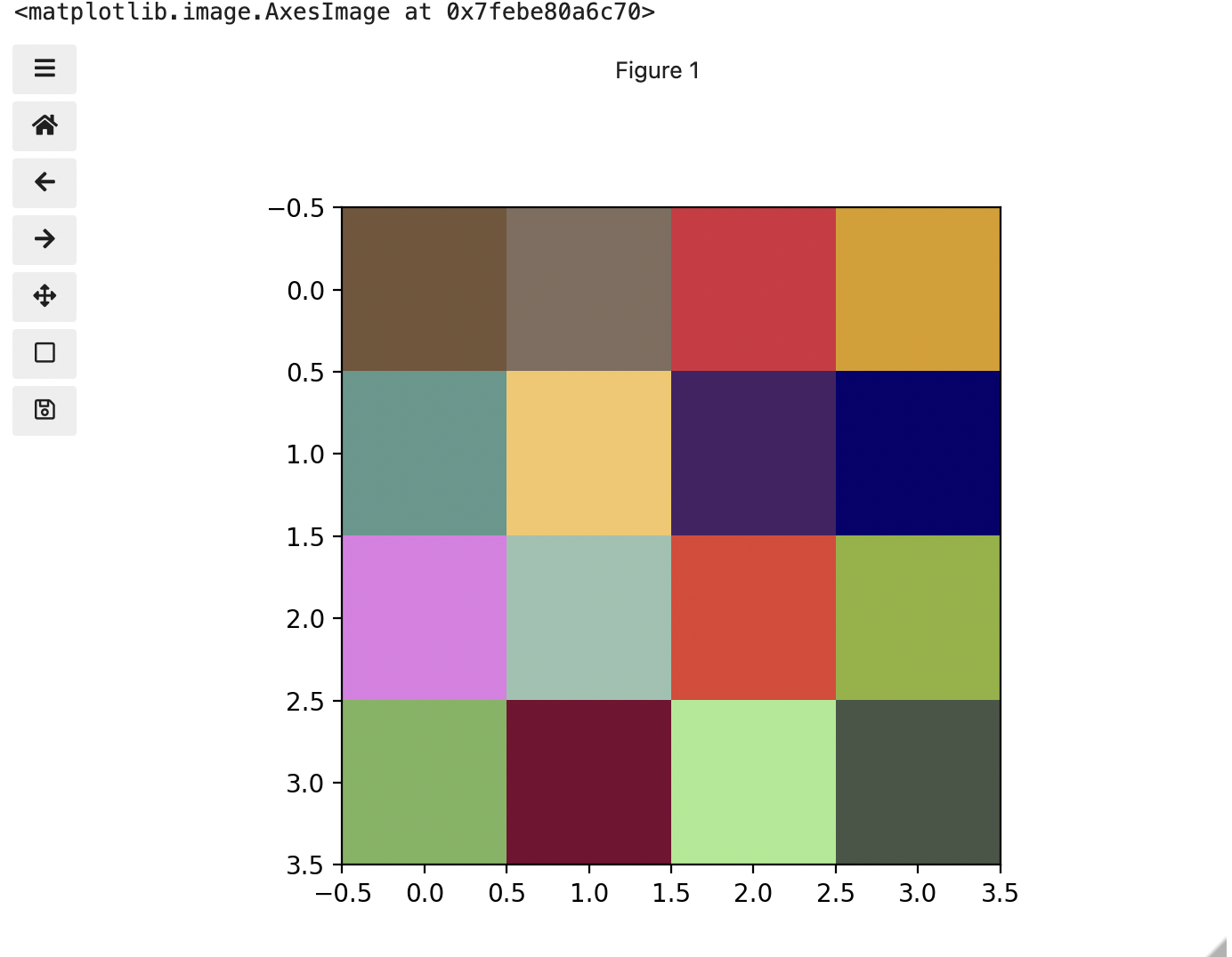
Previously we had one number being mapped to one colour or intensity. Now we are combining the effect of 3 numbers to arrive at a single colour value. Let’s see an example of that using the blue square at the end of the second row, which has the index [1, 3].
PYTHON
# extract all the colour information for the blue square
upper_right_square = checkerboard[1, 3, :]
upper_right_square
This outputs: array([ 7, 1, 110]) The integers in order represent Red, Green, and Blue. Looking at the 3 values and knowing how they map, can help us understand why it is blue. If we divide each value by 255, which is the maximum, we can determine how much it is contributing relative to its maximum potential. Effectively, the red is at 7/255 or 2.8 percent of its potential, the green is at 1/255 or 0.4 percent, and blue is 110/255 or 43.1 percent of its potential. So when you mix those three intensities of colour, blue is winning by a wide margin, but the red and green still contribute to make it a slightly different shade of blue than 0,0,110 would be on its own.
These colours mapped to dimensions of the matrix may be referred to as channels. It may be helpful to display each of these channels independently, to help us understand what is happening. We can do that by multiplying our image array representation with a 1d matrix that has a one for the channel we want to keep and zeros for the rest.
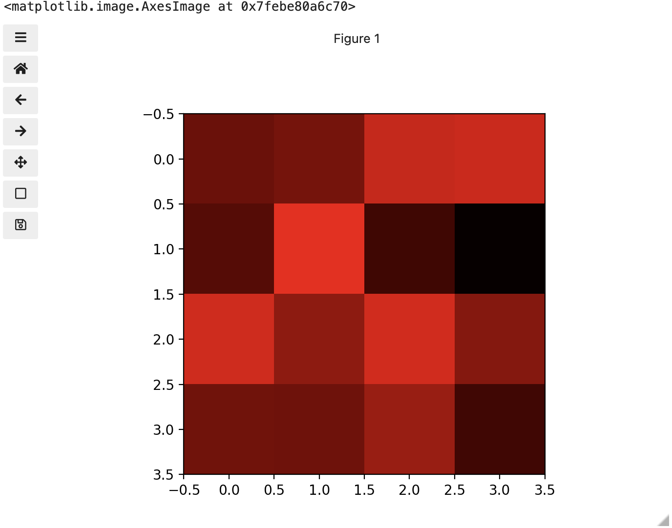
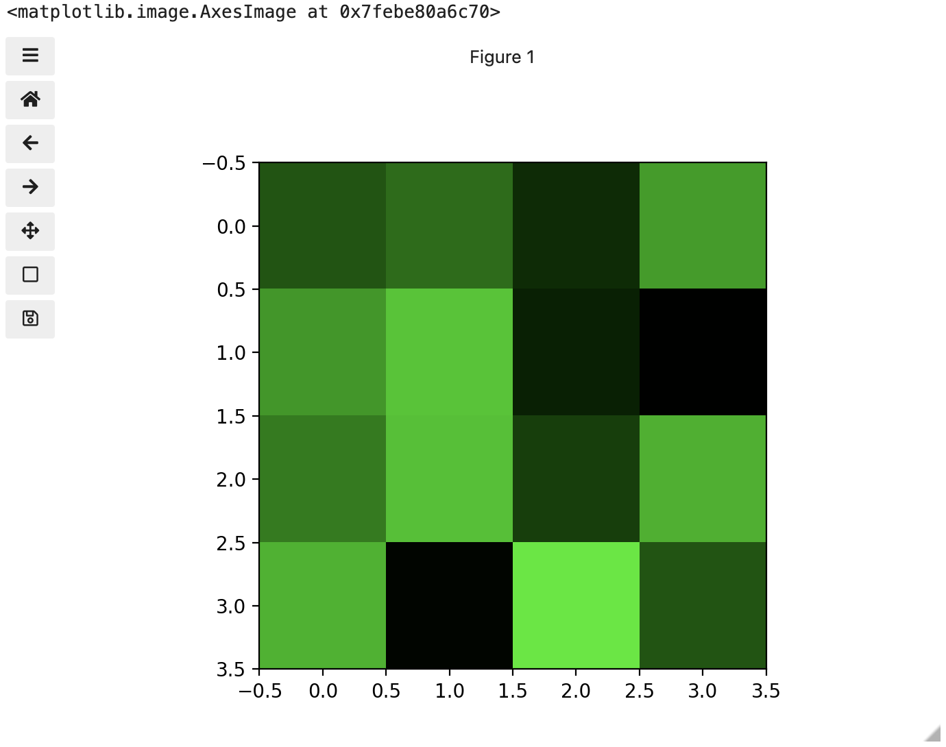
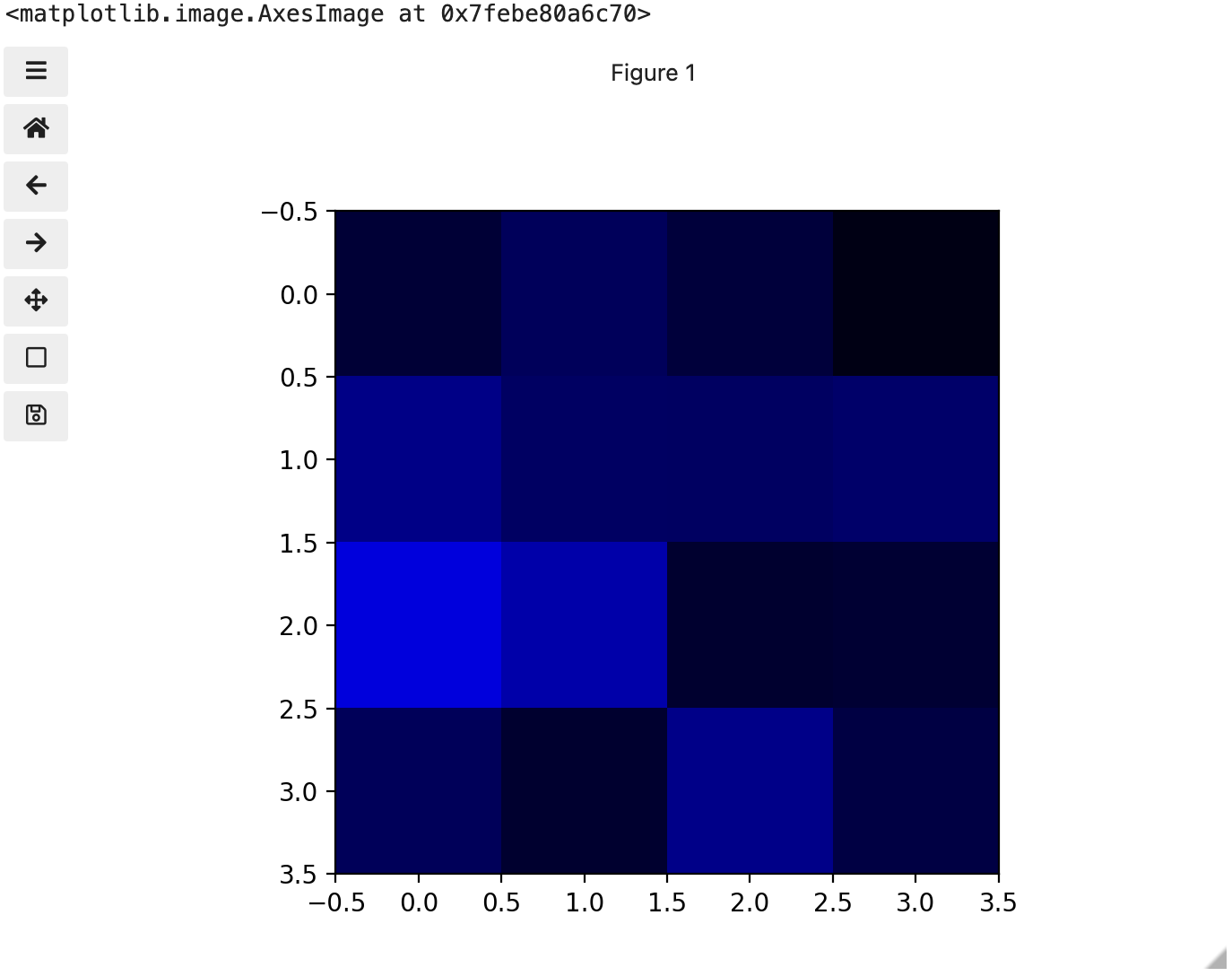
If we look at the upper [1, 3] square in all three figures, we can see each of those colour contributions in action. Notice that there are several squares in the blue figure that look even more intensely blue than square [1, 3]. When all three channels are combined though, the blue light of those squares is being diluted by the relative strength of red and green being mixed in with them.
24-bit RGB colour
This last colour model we used, known as the RGB (Red, Green, Blue) model, is the most common.
As we saw, the RGB model is an additive colour model, which means that the primary colours are mixed together to form other colours. Most frequently, the amount of the primary colour added is represented as an integer in the closed range [0, 255] as seen in the example. Therefore, there are 256 discrete amounts of each primary colour that can be added to produce another colour. The number of discrete amounts of each colour, 256, corresponds to the number of bits used to hold the colour channel value, which is eight (28=256). Since we have three channels with 8 bits for each (8+8+8=24), this is called 24-bit colour depth.
Any particular colour in the RGB model can be expressed by a triplet of integers in [0, 255], representing the red, green, and blue channels, respectively. A larger number in a channel means that more of that primary colour is present.
Thinking about RGB colours (5 min)
Suppose that we represent colours as triples (r, g, b), where each of r, g, and b is an integer in [0, 255]. What colours are represented by each of these triples? (Try to answer these questions without reading further.)
- (255, 0, 0)
- (0, 255, 0)
- (0, 0, 255)
- (255, 255, 255)
- (0, 0, 0)
- (128, 128, 128)
- (255, 0, 0) represents red, because the red channel is maximised, while the other two channels have the minimum values.
- (0, 255, 0) represents green.
- (0, 0, 255) represents blue.
- (255, 255, 255) is a little harder. When we mix the maximum value of all three colour channels, we see the colour white.
- (0, 0, 0) represents the absence of all colour, or black.
- (128, 128, 128) represents a medium shade of gray. Note that the 24-bit RGB colour model provides at least 254 shades of gray, rather than only fifty.
Note that the RGB colour model may run contrary to your experience, especially if you have mixed primary colours of paint to create new colours. In the RGB model, the lack of any colour is black, while the maximum amount of each of the primary colours is white. With physical paint, we might start with a white base, and then add differing amounts of other paints to produce a darker shade.
After completing the previous challenge, we can look at some further examples of 24-bit RGB colours, in a visual way. The image in the next challenge shows some colour names, their 24-bit RGB triplet values, and the colour itself.
RGB colour table (optional, not included in timing)
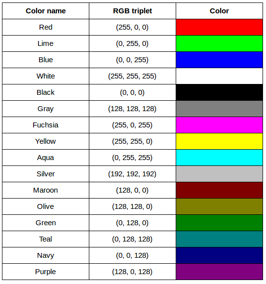
We cannot really provide a complete table. To see why, answer this question: How many possible colours can be represented with the 24-bit RGB model?
There are 24 total bits in an RGB colour of this type, and each bit can be on or off, and so there are 224 = 16,777,216 possible colours with our additive, 24-bit RGB colour model.
Although 24-bit colour depth is common, there are other options. For example, we might have 8-bit colour (3 bits for red and green, but only 2 for blue, providing 8 × 8 × 4 = 256 colours) or 16-bit colour (4 bits for red, green, and blue, plus 4 more for transparency, providing 16 × 16 × 16 = 4096 colours, with 16 transparency levels each). There are colour depths with more than eight bits per channel, but as the human eye can only discern approximately 10 million different colours, these are not often used.
If you are using an older or inexpensive laptop screen or LCD monitor to view images, it may only support 18-bit colour, capable of displaying 64 × 64 × 64 = 262,144 colours. 24-bit colour images will be converted in some manner to 18-bit, and thus the colour quality you see will not match what is actually in the image.
We can combine our coordinate system with the 24-bit RGB colour model to gain a conceptual understanding of the images we will be working with. An image is a rectangular array of pixels, each with its own coordinate. Each pixel in the image is a square point of coloured light, where the colour is specified by a 24-bit RGB triplet. Such an image is an example of raster graphics.
Image formats
Although the images we will manipulate in our programs are conceptualised as rectangular arrays of RGB triplets, they are not necessarily created, stored, or transmitted in that format. There are several image formats we might encounter, and we should know the basics of at least of few of them. Some formats we might encounter, and their file extensions, are shown in this table:
| Format | Extension |
|---|---|
| Device-Independent Bitmap (BMP) | .bmp |
| Joint Photographic Experts Group (JPEG) | .jpg or .jpeg |
| Tagged Image File Format (TIFF) | .tif or .tiff |
BMP
The file format that comes closest to our preceding conceptualisation of images is the Device-Independent Bitmap, or BMP, file format. BMP files store raster graphics images as long sequences of binary-encoded numbers that specify the colour of each pixel in the image. Since computer files are one-dimensional structures, the pixel colours are stored one row at a time. That is, the first row of pixels (those with y-coordinate 0) are stored first, followed by the second row (those with y-coordinate 1), and so on. Depending on how it was created, a BMP image might have 8-bit, 16-bit, or 24-bit colour depth.
24-bit BMP images have a relatively simple file format, can be viewed and loaded across a wide variety of operating systems, and have high quality. However, BMP images are not compressed, resulting in very large file sizes for any useful image resolutions.
The idea of image compression is important to us for two reasons: first, compressed images have smaller file sizes, and are therefore easier to store and transmit; and second, compressed images may not have as much detail as their uncompressed counterparts, and so our programs may not be able to detect some important aspect if we are working with compressed images. Since compression is important to us, we should take a brief detour and discuss the concept.
Image compression
Before discussing additional formats, familiarity with image compression will be helpful. Let’s delve into that subject with a challenge. For this challenge, you will need to know about bits / bytes and how those are used to express computer storage capacities. If you already know, you can skip to the challenge below.
Bits and bytes
Before we talk specifically about images, we first need to understand how numbers are stored in a modern digital computer. When we think of a number, we do so using a decimal, or base-10 place-value number system. For example, a number like 659 is 6 × 10² + 5 × 101 + 9 × 100. Each digit in the number is multiplied by a power of 10, based on where it occurs, and there are 10 digits that can occur in each position (0, 1, 2, 3, 4, 5, 6, 7, 8, 9).
In principle, computers could be constructed to represent numbers in exactly the same way. But, the electronic circuits inside a computer are much easier to construct if we restrict the numeric base to only two, instead of 10. (It is easier for circuitry to tell the difference between two voltage levels than it is to differentiate among 10 levels.) So, values in a computer are stored using a binary, or base-2 place-value number system.
In this system, each symbol in a number is called a bit instead of a digit, and there are only two values for each bit (0 and 1). We might imagine a four-bit binary number, 1101. Using the same kind of place-value expansion as we did above for 659, we see that 1101 = 1 × 23 + 1 × 22 + 0 × 21 + 1 × 20, which if we do the math is 8 + 4 + 0 + 1, or 13 in decimal.
Internally, computers have a minimum number of bits that they work with at a given time: eight. A group of eight bits is called a byte. The amount of memory (RAM) and drive space our computers have is quantified by terms like Megabytes (MB), Gigabytes (GB), and Terabytes (TB). The following table provides more formal definitions for these terms.
| Unit | Abbreviation | Size |
|---|---|---|
| Kilobyte | KB | 1024 bytes |
| Megabyte | MB | 1024 KB |
| Gigabyte | GB | 1024 MB |
| Terabyte | TB | 1024 GB |
BMP image size (optional, not included in timing)
Imagine that we have a fairly large, but very boring image: a 5,000 × 5,000 pixel image composed of nothing but white pixels. If we used an uncompressed image format such as BMP, with the 24-bit RGB colour model, how much storage would be required for the file?
In such an image, there are 5,000 × 5,000 = 25,000,000 pixels, and 24 bits for each pixel, leading to 25,000,000 × 24 = 600,000,000 bits, or 75,000,000 bytes (71.5MB). That is quite a lot of space for a very uninteresting image!
Since image files can be very large, various compression schemes exist for saving (approximately) the same information while using less space. These compression techniques can be categorised as lossless or lossy.
Lossless compression
In lossless image compression, we apply some algorithm (i.e., a computerised procedure) to the image, resulting in a file that is significantly smaller than the uncompressed BMP file equivalent would be. Then, when we wish to load and view or process the image, our program reads the compressed file, and reverses the compression process, resulting in an image that is identical to the original. Nothing is lost in the process – hence the term “lossless.”
The general idea of lossless compression is to somehow detect long patterns of bytes in a file that are repeated over and over, and then assign a smaller bit pattern to represent the longer sample. Then, the compressed file is made up of the smaller patterns, rather than the larger ones, thus reducing the number of bytes required to save the file. The compressed file also contains a table of the substituted patterns and the originals, so when the file is decompressed it can be made identical to the original before compression.
To provide you with a concrete example, consider the 71.5 MB white BMP image discussed above. When put through the zip compression utility on Microsoft Windows, the resulting .zip file is only 72 KB in size! That is, the .zip version of the image is three orders of magnitude smaller than the original, and it can be decompressed into a file that is byte-for-byte the same as the original. Since the original is so repetitious - simply the same colour triplet repeated 25,000,000 times - the compression algorithm can dramatically reduce the size of the file.
If you work with .zip or .gz archives, you are dealing with lossless compression.
Lossy compression
Lossy compression takes the original image and discards some of the detail in it, resulting in a smaller file format. The goal is to only throw away detail that someone viewing the image would not notice. Many lossy compression schemes have adjustable levels of compression, so that the image creator can choose the amount of detail that is lost. The more detail that is sacrificed, the smaller the image files will be - but of course, the detail and richness of the image will be lower as well.
This is probably fine for images that are shown on Web pages or printed off on 4 × 6 photo paper, but may or may not be fine for scientific work. You will have to decide whether the loss of image quality and detail are important to your work, versus the space savings afforded by a lossy compression format.
It is important to understand that once an image is saved in a lossy compression format, the lost detail is just that - lost. I.e., unlike lossless formats, given an image saved in a lossy format, there is no way to reconstruct the original image in a byte-by-byte manner.
JPEG
JPEG images are perhaps the most commonly encountered digital images today. JPEG uses lossy compression, and the degree of compression can be tuned to your liking. It supports 24-bit colour depth, and since the format is so widely used, JPEG images can be viewed and manipulated easily on all computing platforms.
Examining actual image sizes (optional, not included in timing)
Let us see the effects of image compression on image size with actual images. The following script creates a square white image 5000 x 5000 pixels, and then saves it as a BMP and as a JPEG image.
PYTHON
dim = 5000

img = np.zeros((dim, dim, 3), dtype="uint8")
img.fill(255)

iio.imwrite(uri="data/ws.bmp", image=img)
iio.imwrite(uri="data/ws.jpg", image=img)
Examine the file sizes of the two output files, ws.bmp
and ws.jpg. Does the BMP image size match our previous
prediction? How about the JPEG?
The BMP file, ws.bmp, is 75,000,054 bytes, which matches
our prediction very nicely. The JPEG file, ws.jpg, is
392,503 bytes, two orders of magnitude smaller than the bitmap
version.
Comparing lossless versus lossy compression (optional, not included in timing)
Let us see a hands-on example of lossless versus lossy compression.
Open a terminal (or Windows PowerShell) and navigate to the
data/ directory. The two output images, ws.bmp
and ws.jpg, should still be in the directory, along with
another image, tree.jpg.
We can apply lossless compression to any file by using the
zip command. Recall that the ws.bmp file
contains 75,000,054 bytes. Apply lossless compression to this image by
executing the following command: zip ws.zip ws.bmp
(Compress-Archive ws.bmp ws.zip with PowerShell). This
command tells the computer to create a new compressed file,
ws.zip, from the original bitmap image. Execute a similar
command on the tree JPEG file: zip tree.zip tree.jpg
(Compress-Archive tree.jpg tree.zip with PowerShell).
Having created the compressed file, use the ls -l
command (dir with PowerShell) to display the contents of
the directory. How big are the compressed files? How do those compare to
the size of ws.bmp and tree.jpg? What can you
conclude from the relative sizes?
Here is a partial directory listing, showing the sizes of the relevant files there:
OUTPUT
-rw-rw-r--  1 diva diva   154344 Jun 18 08:32 tree.jpg
-rw-rw-r--  1 diva diva   146049 Jun 18 08:53 tree.zip
-rw-rw-r--  1 diva diva 75000054 Jun 18 08:51 ws.bmp
-rw-rw-r--  1 diva diva    72986 Jun 18 08:53 ws.zip
We can see that the regularity of the bitmap image (remember, it is a
5,000 x 5,000 pixel image containing only white pixels) allows the
lossless compression scheme to compress the file quite effectively. On
the other hand, compressing tree.jpg does not create a much
smaller file; this is because the JPEG image was already in a compressed
format.
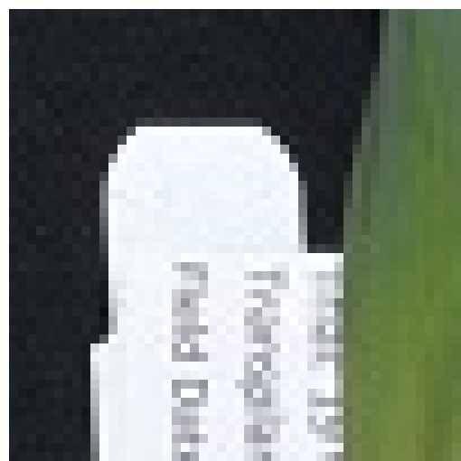
Here is an example showing how JPEG compression might impact image quality. Consider this image of several maize seedlings (scaled down here from 11,339 × 11,336 pixels in order to fit the display).
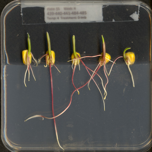
Now, let us zoom in and look at a small section of the label in the original, first in the uncompressed format:
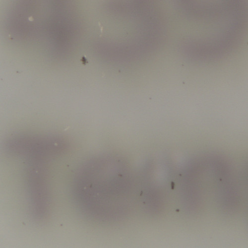
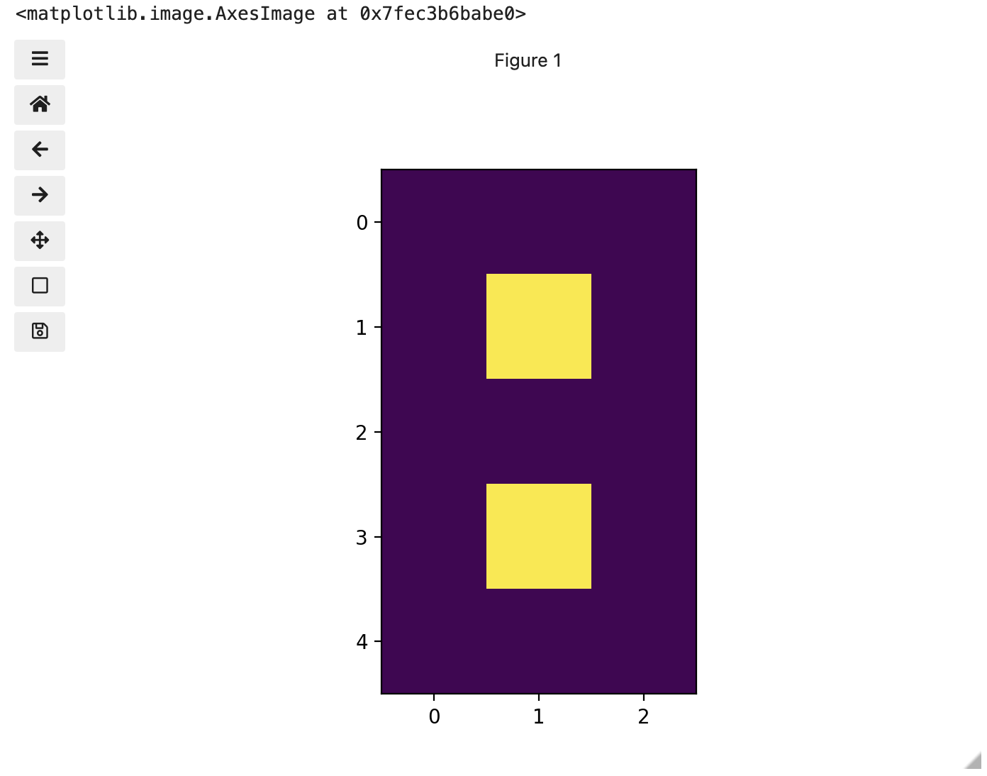
Here is the same area of the image, but in JPEG format. We used a fairly aggressive compression parameter to make the JPEG, in order to illustrate the problems you might encounter with the format.

The JPEG image is of clearly inferior quality. It has less colour variation and noticeable pixelation. Quality differences become even more marked when one examines the colour histograms for each image. A histogram shows how often each colour value appears in an image. The histograms for the uncompressed (left) and compressed (right) images are shown below:
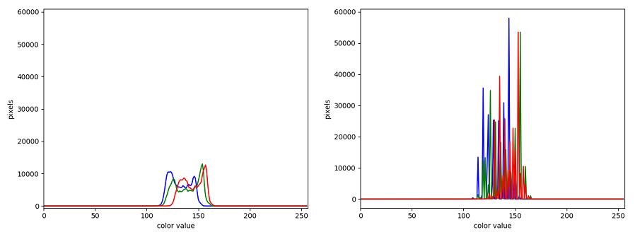
We learn how to make histograms such as these later on in the workshop. The differences in the colour histograms are even more apparent than in the images themselves; clearly the colours in the JPEG image are different from the uncompressed version.
If the quality settings for your JPEG images are high (and the compression rate therefore relatively low), the images may be of sufficient quality for your work. It all depends on how much quality you need, and what restrictions you have on image storage space. Another consideration may be where the images are stored. For example, if your images are stored in the cloud and therefore must be downloaded to your system before you use them, you may wish to use a compressed image format to speed up file transfer time.
PNG
PNG images are well suited for storing diagrams. It uses a lossless compression and is hence often used in web applications for non-photographic images. The format is able to store RGB and plain luminance (single channel, without an associated color) data, among others. Image data is stored row-wise and then, per row, a simple filter, like taking the difference of adjacent pixels, can be applied to increase the compressability of the data. The filtered data is then compressed in the next step and written out to the disk.
TIFF
TIFF images are popular with publishers, graphics designers, and photographers. TIFF images can be uncompressed, or compressed using either lossless or lossy compression schemes, depending on the settings used, and so TIFF images seem to have the benefits of both the BMP and JPEG formats. The main disadvantage of TIFF images (other than the size of images in the uncompressed version of the format) is that they are not universally readable by image viewing and manipulation software.
Metadata
JPEG and TIFF images support the inclusion of metadata in
images. Metadata is textual information that is contained within an
image file. Metadata holds information about the image itself, such as
when the image was captured, where it was captured, what type of camera
was used and with what settings, etc. We normally don’t see this
metadata when we view an image, but we can view it independently if we
wish to (see Accessing
Metadata, below). The important thing to be aware of at this
stage is that you cannot rely on the metadata of an image being fully
preserved when you use software to process that image. The image
reader/writer library that we use throughout this lesson,
imageio.v3, includes metadata when saving new images but
may fail to keep certain metadata fields. In any case, remember:
if metadata is important to you, take precautions to always
preserve the original files.
Accessing Metadata
imageio.v3 provides a way to display or explore the
metadata associated with an image. Metadata is served independently from
pixel data:
PYTHON
# read metadata
metadata = iio.immeta(uri="data/eight.tif")
# display the format-specific metadata
metadata
OUTPUT
{'is_fluoview': False,
 'is_nih': False,
 'is_micromanager': False,
 'is_ome': False,
 'is_lsm': False,
 'is_reduced': False,
 'is_shaped': True,
 'is_stk': False,
 'is_tiled': False,
 'is_mdgel': False,
 'compression': <COMPRESSION.NONE: 1>,
 'predictor': 1,
 'is_mediacy': False,
 'description': '{"shape": [5, 3]}',
 'description1': '',
 'is_imagej': False,
 'software': 'tifffile.py',
 'resolution_unit': 1,
 'resolution': (1.0, 1.0, 'NONE')}
Other software exists that can help you handle metadata, e.g., Fiji and ImageMagick. You may want to explore these options if you need to work with the metadata of your images.
Summary of image formats used in this lesson
The following table summarises the characteristics of the BMP, JPEG, and TIFF image formats:
| Format | Compression | Metadata | Advantages | Disadvantages |
|---|---|---|---|---|
| BMP | None | None | Universally viewable, high quality | Large file sizes |
| JPEG | Lossy | Yes | Universally viewable, smaller file size | Detail may be lost |
| PNG | Lossless | Yes | Universally viewable, open standard, smaller file size | Metadata less flexible than TIFF, RGB only |
| TIFF | None, lossy, or lossless | Yes | High quality or smaller file size | Not universally viewable |
Key Points
- Digital images are represented as rectangular arrays of square pixels.
- Digital images use a left-hand coordinate system, with the origin in the upper left corner, the x-axis running to the right, and the y-axis running down. Some learners may prefer to think in terms of counting down rows for the y-axis and across columns for the x-axis. Thus, we will make an effort to allow for both approaches in our lesson presentation.
- Most frequently, digital images use an additive RGB model, with eight bits for the red, green, and blue channels.
- scikit-image images are stored as multi-dimensional NumPy arrays.
- In scikit-image images, the red channel is specified first, then the green, then the blue, i.e., RGB.
- Lossless compression retains all the details in an image, but lossy compression results in loss of some of the original image detail.
- BMP images are uncompressed, meaning they have high quality but also that their file sizes are large.
- JPEG images use lossy compression, meaning that their file sizes are smaller, but image quality may suffer.
- TIFF images can be uncompressed or compressed with lossy or lossless compression.
- Depending on the camera or sensor, various useful pieces of information may be stored in an image file, in the image metadata.
Content from Working with scikit-image
Last updated on 2024-06-07 | Edit this page
Estimated time: 120 minutes
Overview
Questions
- How can the scikit-image Python computer vision library be used to work with images?
Objectives
- Read and save images with imageio.
- Display images with Matplotlib.
- Resize images with scikit-image.
- Perform simple image thresholding with NumPy array operations.
- Extract sub-images using array slicing.
We have covered much of how images are represented in computer software. In this episode we will learn some more methods for accessing and changing digital images.
First, import the packages needed for this episode
Reading, displaying, and saving images
Imageio provides intuitive functions for reading and writing (saving) images. All of the popular image formats, such as BMP, PNG, JPEG, and TIFF are supported, along with several more esoteric formats. Check the Supported Formats docs for a list of all formats. Matplotlib provides a large collection of plotting utilities.
Let us examine a simple Python program to load, display, and save an image to a different format. Here are the first few lines:
PYTHON
"""Python program to open, display, and save an image."""
# read image
chair = iio.imread(uri="data/chair.jpg")We use the iio.imread() function to read a JPEG image
entitled chair.jpg. Imageio reads the image, converts
it from JPEG into a NumPy array, and returns the array; we save the
array in a variable named chair.
Next, we will do something with the image:
Once we have the image in the program, we first call
fig, ax = plt.subplots() so that we will have a fresh
figure with a set of axes independent from our previous calls. Next we
call ax.imshow() in order to display the image.
Now, we will save the image in another format:
The final statement in the program,
iio.imwrite(uri="data/chair.tif", image=chair), writes the
image to a file named chair.tif in the data/
directory. The imwrite() function automatically determines
the type of the file, based on the file extension we provide. In this
case, the .tif extension causes the image to be saved as a
TIFF.
Metadata, revisited
Remember, as mentioned in the previous section, images saved with
imwrite() will not retain all metadata associated with the
original image that was loaded into Python! If the image metadata
is important to you, be sure to always keep an unchanged copy of
the original image!
Extensions do not always dictate file type
The iio.imwrite() function automatically uses the file
type we specify in the file name parameter’s extension. Note that this
is not always the case. For example, if we are editing a document in
Microsoft Word, and we save the document as paper.pdf
instead of paper.docx, the file is not saved as a
PDF document.
Named versus positional arguments
When we call functions in Python, there are two ways we can specify the necessary arguments. We can specify the arguments positionally, i.e., in the order the parameters appear in the function definition, or we can use named arguments.
For example, the iio.imwrite() function
definition specifies two parameters, the resource to save the image
to (e.g., a file name, an http address) and the image to write to disk.
So, we could save the chair image in the sample code above using
positional arguments like this:
iio.imwrite("data/chair.tif", image)
Since the function expects the first argument to be the file name,
there is no confusion about what "data/chair.jpg" means.
The same goes for the second argument.
The style we will use in this workshop is to name each argument, like this:
iio.imwrite(uri="data/chair.tif", image=image)
This style will make it easier for you to learn how to use the variety of functions we will cover in this workshop.
Resizing an image (10 min)
Using the chair.jpg image located in the data folder,
write a Python script to read your image into a variable named
chair. Then, resize the image to 10 percent of its current
size using these lines of code:
PYTHON
new_shape = (chair.shape[0] // 10, chair.shape[1] // 10, chair.shape[2])
resized_chair = ski.transform.resize(image=chair, output_shape=new_shape)
resized_chair = ski.util.img_as_ubyte(resized_chair)As it is used here, the parameters to the
ski.transform.resize() function are the image to transform,
chair, the dimensions we want the new image to have,
new_shape.
Callout
Note that the pixel values in the new image are an approximation of
the original values and should not be confused with actual, observed
data. This is because scikit-image interpolates the pixel values when
reducing or increasing the size of an image.
ski.transform.resize has a number of optional parameters
that allow the user to control this interpolation. You can find more
details in the scikit-image
documentation.
Image files on disk are normally stored as whole numbers for space
efficiency, but transformations and other math operations often result
in conversion to floating point numbers. Using the
ski.util.img_as_ubyte() method converts it back to whole
numbers before we save it back to disk. If we don’t convert it before
saving, iio.imwrite() may not recognise it as image
data.
Next, write the resized image out to a new file named
resized.jpg in your data directory. Finally, use
ax.imshow() with each of your image variables to display
both images in your notebook. Don’t forget to use
fig, ax = plt.subplots() so you don’t overwrite the first
image with the second. Images may appear the same size in jupyter, but
you can see the size difference by comparing the scales for each. You
can also see the difference in file storage size on disk by hovering
your mouse cursor over the original and the new files in the Jupyter
file browser, using ls -l in your shell (dir
with Windows PowerShell), or viewing file sizes in the OS file browser
if it is configured so.
Here is what your Python script might look like.
PYTHON
"""Python script to read an image, resize it, and save it under a different name."""
# read in image
chair = iio.imread(uri="data/chair.jpg")
# resize the image
new_shape = (chair.shape[0] // 10, chair.shape[1] // 10, chair.shape[2])
resized_chair = ski.transform.resize(image=chair, output_shape=new_shape)
resized_chair = ski.util.img_as_ubyte(resized_chair)
# write out image
iio.imwrite(uri="data/resized_chair.jpg", image=resized_chair)
# display images
fig, ax = plt.subplots()
ax.imshow(chair)
fig, ax = plt.subplots()
ax.imshow(resized_chair)The script resizes the data/chair.jpg image by a factor
of 10 in both dimensions, saves the result to the
data/resized_chair.jpg file, and displays original and
resized for comparision.
Manipulating pixels
In the Image Basics episode, we individually manipulated the colours of pixels by changing the numbers stored in the image’s NumPy array. Let’s apply the principles learned there along with some new principles to a real world example.
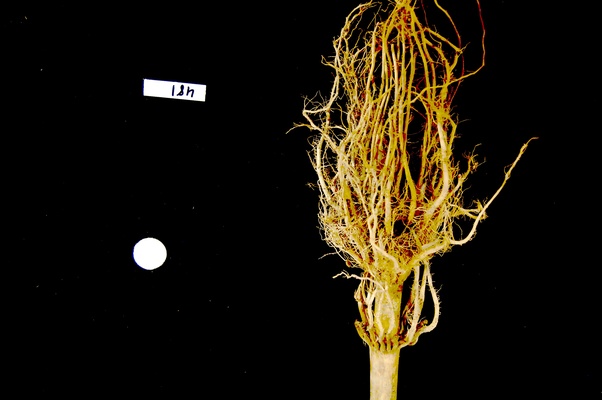
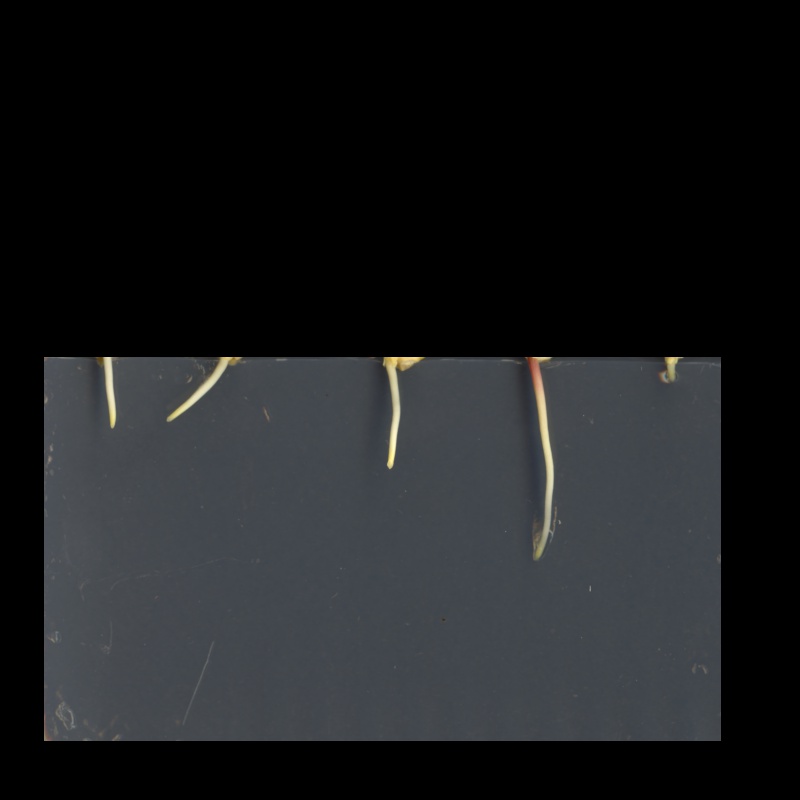
Suppose we are interested in this maize root cluster image. We want to be able to focus our program’s attention on the roots themselves, while ignoring the black background.
Since the image is stored as an array of numbers, we can simply look through the array for pixel colour values that are less than some threshold value. This process is called thresholding, and we will see more powerful methods to perform the thresholding task in the Thresholding episode. Here, though, we will look at a simple and elegant NumPy method for thresholding. Let us develop a program that keeps only the pixel colour values in an image that have value greater than or equal to 128. This will keep the pixels that are brighter than half of “full brightness”, i.e., pixels that do not belong to the black background.
We will start by reading the image and displaying it.
Loading images with imageio: Read-only arrays
When loading an image with imageio, in certain situations the image
is stored in a read-only array. If you attempt to manipulate the pixels
in a read-only array, you will receive an error message
ValueError: assignment destination is read-only. In order
to make the image array writeable, we can create a copy with
image = np.array(image) before manipulating the pixel
values.
PYTHON
"""Python script to ignore low intensity pixels in an image."""
# read input image
maize_roots = iio.imread(uri="data/maize-root-cluster.jpg")
maize_roots = np.array(maize_roots)
# display original image
fig, ax = plt.subplots()
ax.imshow(maize_roots)Now we can threshold the image and display the result.
PYTHON
# keep only high-intensity pixels
maize_roots[maize_roots < 128] = 0
# display modified image
fig, ax = plt.subplots()
ax.imshow(maize_roots)The NumPy command to ignore all low-intensity pixels is
roots[roots < 128] = 0. Every pixel colour value in the
whole 3-dimensional array with a value less that 128 is set to zero. In
this case, the result is an image in which the extraneous background
detail has been removed.
Converting colour images to grayscale
It is often easier to work with grayscale images, which have a single
channel, instead of colour images, which have three channels.
scikit-image offers the function ski.color.rgb2gray() to
achieve this. This function adds up the three colour channels in a way
that matches human colour perception, see the
scikit-image documentation for details. It returns a grayscale image
with floating point values in the range from 0 to 1. We can use the
function ski.util.img_as_ubyte() in order to convert it
back to the original data type and the data range back 0 to 255. Note
that it is often better to use image values represented by floating
point values, because using floating point numbers is numerically more
stable.
Colour and color
The Carpentries generally prefers UK English spelling, which is why
we use “colour” in the explanatory text of this lesson. However,
scikit-image contains many modules and functions that include the US
English spelling, color. The exact spelling matters here,
e.g. you will encounter an error if you try to run
ski.colour.rgb2gray(). To account for this, we will use the
US English spelling, color, in example Python code
throughout the lesson. You will encounter a similar approach with
“centre” and center.
PYTHON
"""Python script to load a color image as grayscale."""
# read input image
chair = iio.imread(uri="data/chair.jpg")
# display original image
fig, ax = plt.subplots()
ax.imshow(chair)
# convert to grayscale and display
gray_chair = ski.color.rgb2gray(chair)
fig, ax = plt.subplots()
ax.imshow(gray_chair, cmap="gray")We can also load colour images as grayscale directly by passing the
argument mode="L" to iio.imread().
PYTHON
"""Python script to load a color image as grayscale."""
# read input image, based on filename parameter
gray_chair = iio.imread(uri="data/chair.jpg", mode="L")
# display grayscale image
fig, ax = plt.subplots()
ax.imshow(gray_chair, cmap="gray")The first argument to iio.imread() is the filename of
the image. The second argument mode="L" determines the type
and range of the pixel values in the image (e.g., an 8-bit pixel has a
range of 0-255). This argument is forwarded to the pillow
backend, a Python imaging library for which mode “L” means 8-bit pixels
and single-channel (i.e., grayscale). The backend used by
iio.imread() may be specified as an optional argument: to
use pillow, you would pass plugin="pillow". If
the backend is not specified explicitly, iio.imread()
determines the backend to use based on the image type.
Loading images with imageio: Pixel type and depth
When loading an image with mode="L", the pixel values
are stored as 8-bit integer numbers that can take values in the range
0-255. However, pixel values may also be stored with other types and
ranges. For example, some scikit-image functions return the pixel values
as floating point numbers in the range 0-1. The type and range of the
pixel values are important for the colorscale when plotting, and for
masking and thresholding images as we will see later in the lesson. If
you are unsure about the type of the pixel values, you can inspect it
with print(image.dtype). For the example above, you should
find that it is dtype('uint8') indicating 8-bit integer
numbers.
Keeping only low intensity pixels (10 min)
A little earlier, we showed how we could use Python and scikit-image to turn on only the high intensity pixels from an image, while turning all the low intensity pixels off. Now, you can practice doing the opposite - keeping all the low intensity pixels while changing the high intensity ones.
The file data/sudoku.png is an RGB image of a sudoku
puzzle:
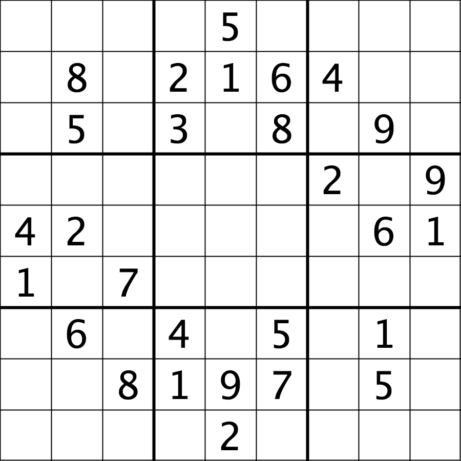
Your task is to load the image in grayscale format and turn all of the bright pixels in the image to a light gray colour. In other words, mask the bright pixels that have a pixel value greater than, say, 192 and set their value to 192 (the value 192 is chosen here because it corresponds to 75% of the range 0-255 of an 8-bit pixel). The results should look like this:
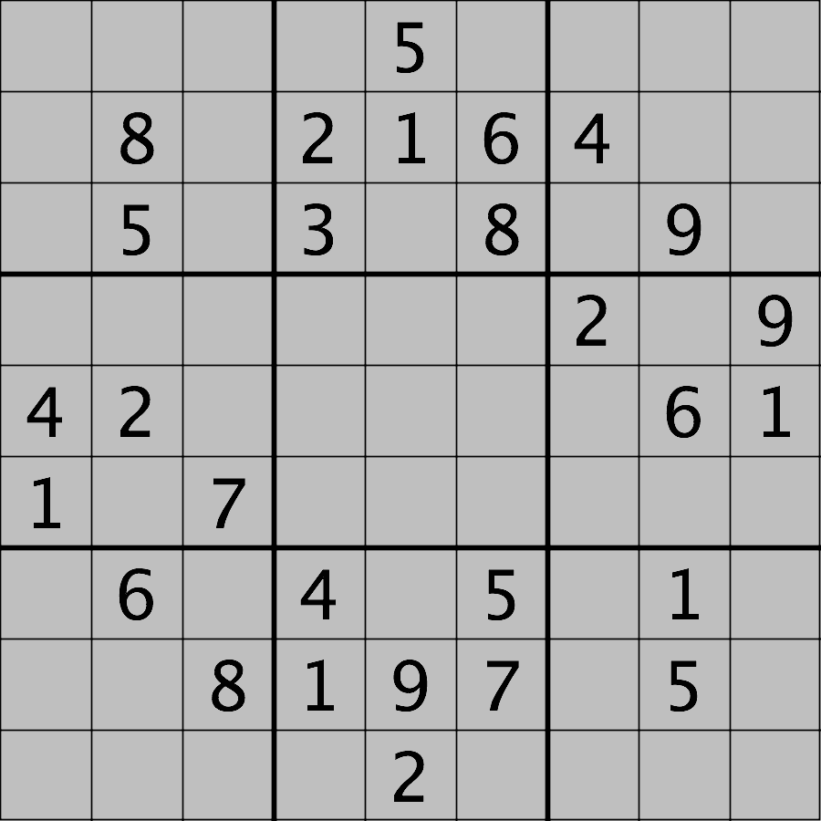
Hint: the cmap, vmin, and
vmax parameters of matplotlib.pyplot.imshow
will be needed to display the modified image as desired. See the Matplotlib
documentation for more details on cmap,
vmin, and vmax.
First, load the image file data/sudoku.png as a
grayscale image. Note we may want to create a copy of the image array to
avoid modifying our original variable and also because
imageio.v3.imread sometimes returns a non-writeable
image.
PYTHON
sudoku = iio.imread(uri="data/sudoku.png", mode="L")
sudoku_gray_background = np.array(sudoku)Then change all bright pixel values greater than 192 to 192:
Finally, display the original and modified images side by side. Note
that we have to specify vmin=0 and vmax=255 as
the range of the colorscale because it would otherwise automatically
adjust to the new range 0-192.
Plotting single channel images (cmap, vmin, vmax)
Compared to a colour image, a grayscale image contains only a single
intensity value per pixel. When we plot such an image with
ax.imshow, Matplotlib uses a colour map, to assign each
intensity value a colour. The default colour map is called “viridis” and
maps low values to purple and high values to yellow. We can instruct
Matplotlib to map low values to black and high values to white instead,
by calling ax.imshow with cmap="gray". The
documentation contains an overview of pre-defined colour maps.
Furthermore, Matplotlib determines the minimum and maximum values of
the colour map dynamically from the image, by default. That means that
in an image where the minimum is 64 and the maximum is 192, those values
will be mapped to black and white respectively (and not dark gray and
light gray as you might expect). If there are defined minimum and
maximum vales, you can specify them via vmin and
vmax to get the desired output.
If you forget about this, it can lead to unexpected results. Try
removing the vmax parameter from the sudoku challenge
solution and see what happens.
Access via slicing
As noted in the previous lesson scikit-image images are stored as NumPy arrays, so we can use array slicing to select rectangular areas of an image. Then, we can save the selection as a new image, change the pixels in the image, and so on. It is important to remember that coordinates are specified in (ry, cx) order and that colour values are specified in (r, g, b) order when doing these manipulations.
Consider this image of a whiteboard, and suppose that we want to create a sub-image with just the portion that says “odd + even = odd,” along with the red box that is drawn around the words.
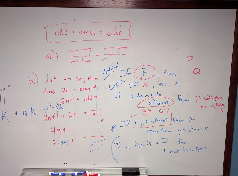
Using matplotlib.pyplot.imshow we can determine the
coordinates of the corners of the area we wish to extract by hovering
the mouse near the points of interest and noting the coordinates
(remember to run %matplotlib widget first if you haven’t
already). If we do that, we might settle on a rectangular area with an
upper-left coordinate of (135, 60) and a lower-right coordinate
of (480, 150), as shown in this version of the whiteboard
picture:
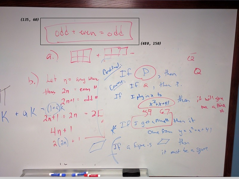
Note that the coordinates in the preceding image are specified in
(cx, ry) order. Now if our entire whiteboard image is stored as
a NumPy array named image, we can create a new image of the
selected region with a statement like this:
clip = image[60:151, 135:481, :]
Our array slicing specifies the range of y-coordinates or rows first,
60:151, and then the range of x-coordinates or columns,
135:481. Note we go one beyond the maximum value in each
dimension, so that the entire desired area is selected. The third part
of the slice, :, indicates that we want all three colour
channels in our new image.
A script to create the subimage would start by loading the image:
PYTHON
"""Python script demonstrating image modification and creation via NumPy array slicing."""
# load and display original image
board = iio.imread(uri="data/board.jpg")
board = np.array(board)
fig, ax = plt.subplots()
ax.imshow(board)Then we use array slicing to create a new image with our selected area and then display the new image.
PYTHON
# extract, display, and save sub-image
clipped_board = board[60:151, 135:481, :]
fig, ax = plt.subplots()
ax.imshow(clipped_board)
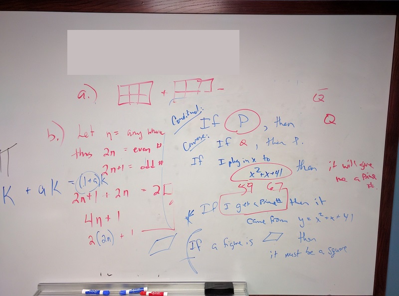
iio.imwrite(uri="data/clipped_board.tif", image=clipped_board)We can also change the values in an image, as shown next.
PYTHON
# replace clipped area with sampled color
color = board[330, 90]
board[60:151, 135:481] = color
fig, ax = plt.subplots()
ax.imshow(board)First, we sample a single pixel’s colour at a particular location of
the image, saving it in a variable named color, which
creates a 1 × 1 × 3 NumPy array with the blue, green, and red colour
values for the pixel located at (ry = 330, cx = 90). Then, with
the img[60:151, 135:481] = color command, we modify the
image in the specified area. From a NumPy perspective, this changes all
the pixel values within that range to array saved in the
color variable. In this case, the command “erases” that
area of the whiteboard, replacing the words with a beige colour, as
shown in the final image produced by the program:
Practicing with slices (10 min - optional, not included in timing)
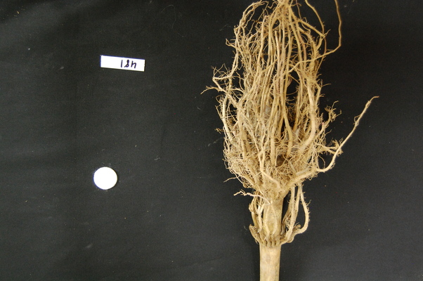
Using the techniques you just learned, write a script that creates, displays, and saves a sub-image containing only the plant and its roots from “data/maize-root-cluster.jpg”
Here is the completed Python program to select only the plant and roots in the image.
PYTHON
"""Python script to extract a sub-image containing only the plant and roots in an existing image."""
# load and display original image
maize_roots = iio.imread(uri="data/maize-root-cluster.jpg")
fig, ax = plt.subplots()
ax.imshow(maize_roots)
# extract and display sub-image
clipped_maize = maize_roots[0:400, 275:550, :]
fig, ax = plt.subplots()
ax.imshow(clipped_maize)
# save sub-image
iio.imwrite(uri="data/clipped_maize.jpg", image=clipped_maize)Key Points
- Images are read from disk with the
iio.imread()function. - We create a window that automatically scales the displayed image
with Matplotlib and calling
imshow()on the global figure object. - Colour images can be transformed to grayscale using
ski.color.rgb2gray()or, in many cases, be read as grayscale directly by passing the argumentmode="L"toiio.imread(). - We can resize images with the
ski.transform.resize()function. - NumPy array commands, such as
image[image < 128] = 0, can be used to manipulate the pixels of an image. - Array slicing can be used to extract sub-images or modify areas of
images, e.g.,
clip = image[60:150, 135:480, :]. - Metadata is not retained when images are loaded as NumPy arrays
using
iio.imread().
Content from Drawing and Bitwise Operations
Last updated on 2024-06-07 | Edit this page
Estimated time: 90 minutes
Overview
Questions
- How can we draw on scikit-image images and use bitwise operations and masks to select certain parts of an image?
Objectives
- Create a blank, black scikit-image image.
- Draw rectangles and other shapes on scikit-image images.
- Explain how a white shape on a black background can be used as a mask to select specific parts of an image.
- Use bitwise operations to apply a mask to an image.
The next series of episodes covers a basic toolkit of scikit-image operators. With these tools, we will be able to create programs to perform simple analyses of images based on changes in colour or shape.
First, import the packages needed for this episode
PYTHON
import imageio.v3 as iio
import ipympl
import matplotlib.pyplot as plt
import numpy as np
import skimage as ski

%matplotlib widgetHere, we import the same packages as earlier in the lesson.
Drawing on images
Often we wish to select only a portion of an image to analyze, and ignore the rest. Creating a rectangular sub-image with slicing, as we did in the Working with scikit-image episode is one option for simple cases. Another option is to create another special image, of the same size as the original, with white pixels indicating the region to save and black pixels everywhere else. Such an image is called a mask. In preparing a mask, we sometimes need to be able to draw a shape - a circle or a rectangle, say - on a black image. scikit-image provides tools to do that.
Consider this image of maize seedlings:
Now, suppose we want to analyze only the area of the image containing the roots themselves; we do not care to look at the kernels, or anything else about the plants. Further, we wish to exclude the frame of the container holding the seedlings as well. Hovering over the image with our mouse, could tell us that the upper-left coordinate of the sub-area we are interested in is (44, 357), while the lower-right coordinate is (720, 740). These coordinates are shown in (x, y) order.
A Python program to create a mask to select only that area of the image would start with a now-familiar section of code to open and display the original image:
PYTHON
# Load and display the original image
maize_seedlings = iio.imread(uri="data/maize-seedlings.tif")
fig, ax = plt.subplots()
ax.imshow(maize_seedlings)We load and display the initial image in the same way we have done before.
NumPy allows indexing of images/arrays with “boolean” arrays of the
same size. Indexing with a boolean array is also called mask indexing.
The “pixels” in such a mask array can only take two values:
True or False. When indexing an image with
such a mask, only pixel values at positions where the mask is
True are accessed. But first, we need to generate a mask
array of the same size as the image. Luckily, the NumPy library provides
a function to create just such an array. The next section of code shows
how:
The first argument to the ones() function is the shape
of the original image, so that our mask will be exactly the same size as
the original. Notice, that we have only used the first two indices of
our shape. We omitted the channel dimension. Indexing with such a mask
will change all channel values simultaneously. The second argument,
dtype = "bool", indicates that the elements in the array
should be booleans - i.e., values are either True or
False. Thus, even though we use np.ones() to
create the mask, its pixel values are in fact not 1 but
True. You could check this, e.g., by
print(mask[0, 0]).
Next, we draw a filled, rectangle on the mask:
PYTHON
# Draw filled rectangle on the mask image
rr, cc = ski.draw.rectangle(start=(357, 44), end=(740, 720))
mask[rr, cc] = False
# Display mask image
fig, ax = plt.subplots()
ax.imshow(mask, cmap="gray")Here is what our constructed mask looks like: 
The parameters of the rectangle() function
(357, 44) and (740, 720), are the coordinates
of the upper-left (start) and lower-right
(end) corners of a rectangle in (ry, cx) order.
The function returns the rectangle as row (rr) and column
(cc) coordinate arrays.
Check the documentation!
When using an scikit-image function for the first time - or the fifth
time - it is wise to check how the function is used, via the scikit-image
documentation or other usage examples on programming-related sites
such as Stack Overflow. Basic
information about scikit-image functions can be found interactively in
Python, via commands like help(ski) or
help(ski.draw.rectangle). Take notes in your lab notebook.
And, it is always wise to run some test code to verify that the
functions your program uses are behaving in the manner you intend.
Variable naming conventions!
You may have wondered why we called the return values of the
rectangle function rr and cc?! You may have
guessed that r is short for row and
c is short for column. However, the rectangle
function returns mutiple rows and columns; thus we used a convention of
doubling the letter r to rr (and
c to cc) to indicate that those are multiple
values. In fact it may have even been clearer to name those variables
rows and columns; however this would have been
also much longer. Whatever you decide to do, try to stick to some
already existing conventions, such that it is easier for other people to
understand your code.
Other drawing operations (15 min)
There are other functions for drawing on images, in addition to the
ski.draw.rectangle() function. We can draw circles, lines,
text, and other shapes as well. These drawing functions may be useful
later on, to help annotate images that our programs produce. Practice
some of these functions here.
Circles can be drawn with the ski.draw.disk() function,
which takes two parameters: the (ry, cx) point of the centre of the
circle, and the radius of the circle. There is an optional
shape parameter that can be supplied to this function. It
will limit the output coordinates for cases where the circle dimensions
exceed the ones of the image.
Lines can be drawn with the ski.draw.line() function,
which takes four parameters: the (ry, cx) coordinate of one end of the
line, and the (ry, cx) coordinate of the other end of the line.
Other drawing functions supported by scikit-image can be found in the scikit-image reference pages.
First let’s make an empty, black image with a size of 800x600 pixels.
Recall that a colour image has three channels for the colours red,
green, and blue (RGB, cf. Image
Basics). Hence we need to create a 3D array of shape
(600, 800, 3) where the last dimension represents the RGB
colour channels.
Now your task is to draw some other coloured shapes and lines on the image, perhaps something like this:
Drawing a circle:
PYTHON
# Draw a blue circle with centre (200, 300) in (ry, cx) coordinates, and radius 100
rr, cc = ski.draw.disk(center=(200, 300), radius=100, shape=canvas.shape[0:2])
canvas[rr, cc] = (0, 0, 255)Drawing a line:
PYTHON
# Draw a green line from (400, 200) to (500, 700) in (ry, cx) coordinates
rr, cc = ski.draw.line(r0=400, c0=200, r1=500, c1=700)
canvas[rr, cc] = (0, 255, 0)We could expand this solution, if we wanted, to draw rectangles,
circles and lines at random positions within our black canvas. To do
this, we could use the random python module, and the
function random.randrange, which can produce random numbers
within a certain range.
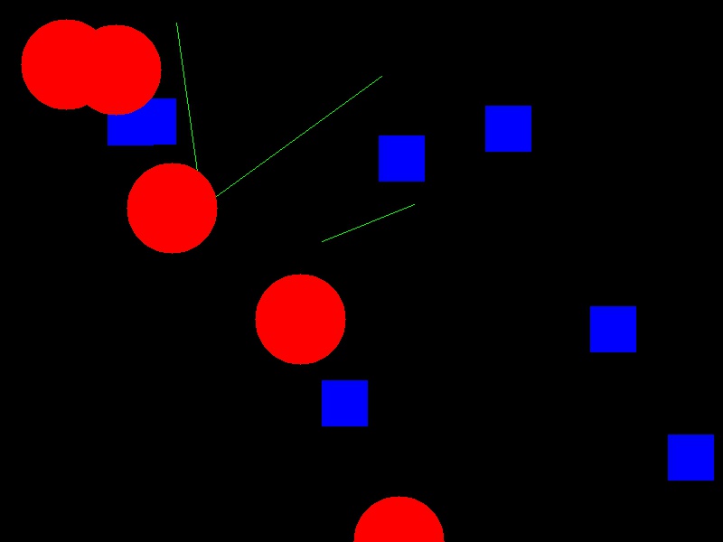
Let’s draw 15 randomly placed circles:
PYTHON
import random
# create the black canvas
canvas = np.zeros(shape=(600, 800, 3), dtype="uint8")
# draw a blue circle at a random location 15 times
for i in range(15):
rr, cc = ski.draw.disk(center=(
random.randrange(600),
random.randrange(800)),
radius=50,
shape=canvas.shape[0:2],
)
canvas[rr, cc] = (0, 0, 255)
# display the results
fig, ax = plt.subplots()
ax.imshow(canvas)We could expand this even further to also randomly choose whether to
plot a rectangle, a circle, or a square. Again, we do this with the
random module, now using the function
random.random that returns a random number between 0.0 and
1.0.
PYTHON
import random
# Draw 15 random shapes (rectangle, circle or line) at random positions
for i in range(15):
# generate a random number between 0.0 and 1.0 and use this to decide if we
# want a circle, a line or a sphere
x = random.random()
if x < 0.33:
# draw a blue circle at a random location
rr, cc = ski.draw.disk(center=(
random.randrange(600),
random.randrange(800)),
radius=50,
shape=canvas.shape[0:2],
)
color = (0, 0, 255)
elif x < 0.66:
# draw a green line at a random location
rr, cc = ski.draw.line(
r0=random.randrange(600),
c0=random.randrange(800),
r1=random.randrange(600),
c1=random.randrange(800),
)
color = (0, 255, 0)
else:
# draw a red rectangle at a random location
rr, cc = ski.draw.rectangle(
start=(random.randrange(600), random.randrange(800)),
extent=(50, 50),
shape=canvas.shape[0:2],
)
color = (255, 0, 0)
canvas[rr, cc] = color
# display the results
fig, ax = plt.subplots()
ax.imshow(canvas)Image modification
All that remains is the task of modifying the image using our mask in
such a way that the areas with True pixels in the mask are
not shown in the image any more.
How does a mask work? (optional, not included in timing)
Now, consider the mask image we created above. The values of the mask
that corresponds to the portion of the image we are interested in are
all False, while the values of the mask that corresponds to
the portion of the image we want to remove are all
True.
How do we change the original image using the mask?
When indexing the image using the mask, we access only those pixels
at positions where the mask is True. So, when indexing with
the mask, one can set those values to 0, and effectively remove them
from the image.
Now we can write a Python program to use a mask to retain only the portions of our maize roots image that actually contains the seedling roots. We load the original image and create the mask in the same way as before:
PYTHON
# Load the original image
maize_seedlings = iio.imread(uri="data/maize-seedlings.tif")
# Create the basic mask
mask = np.ones(shape=maize_seedlings.shape[0:2], dtype="bool")
# Draw a filled rectangle on the mask image
rr, cc = ski.draw.rectangle(start=(357, 44), end=(740, 720))
mask[rr, cc] = FalseThen, we use NumPy indexing to remove the portions of the image,
where the mask is True:
Then, we display the masked image.
The resulting masked image should look like this:
Masking an image of your own (optional, not included in timing)
Now, it is your turn to practice. Using your mobile phone, tablet, webcam, or digital camera, take an image of an object with a simple overall geometric shape (think rectangular or circular). Copy that image to your computer, write some code to make a mask, and apply it to select the part of the image containing your object. For example, here is an image of a remote control:
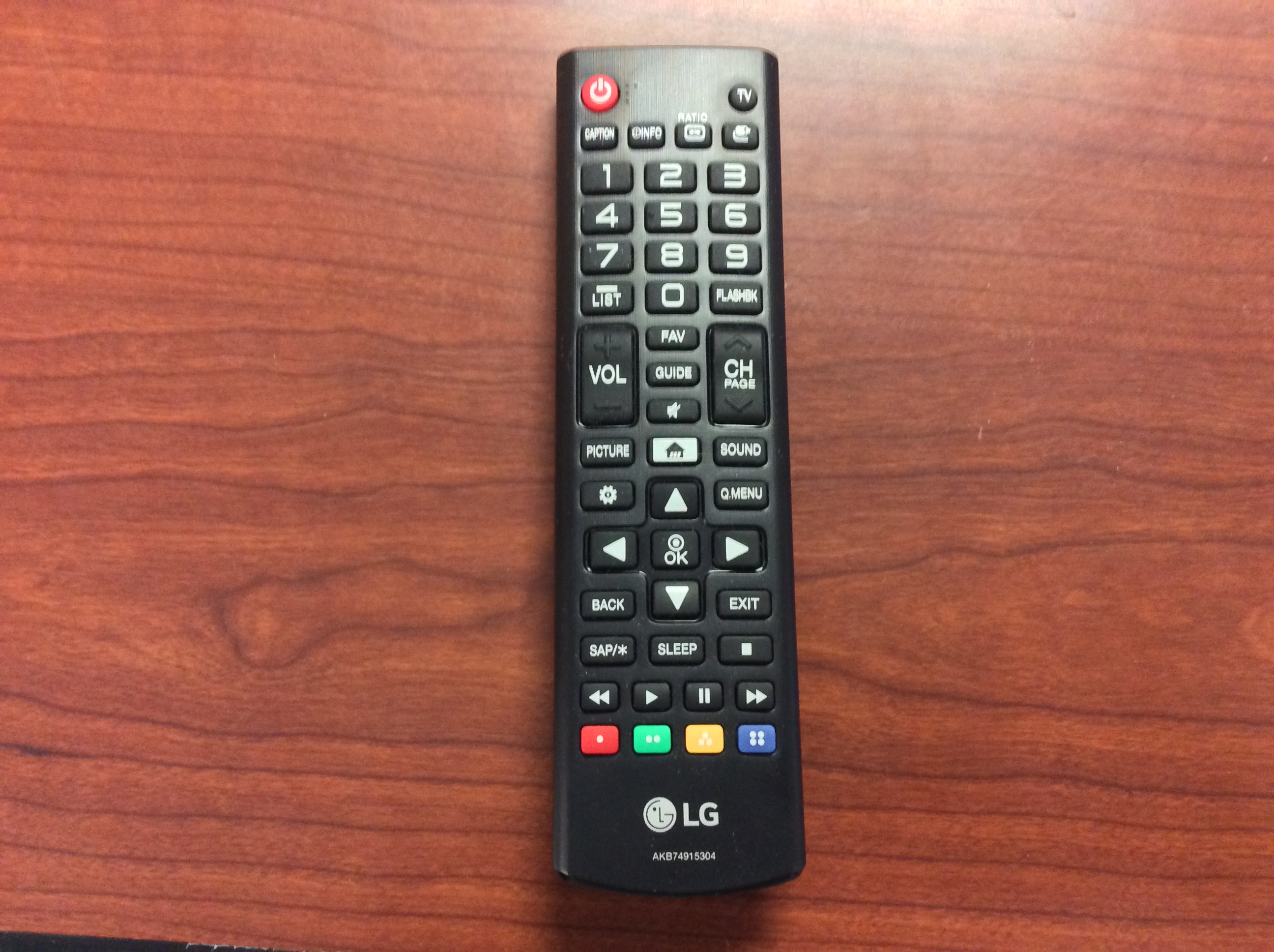
And, here is the end result of a program masking out everything but the remote:
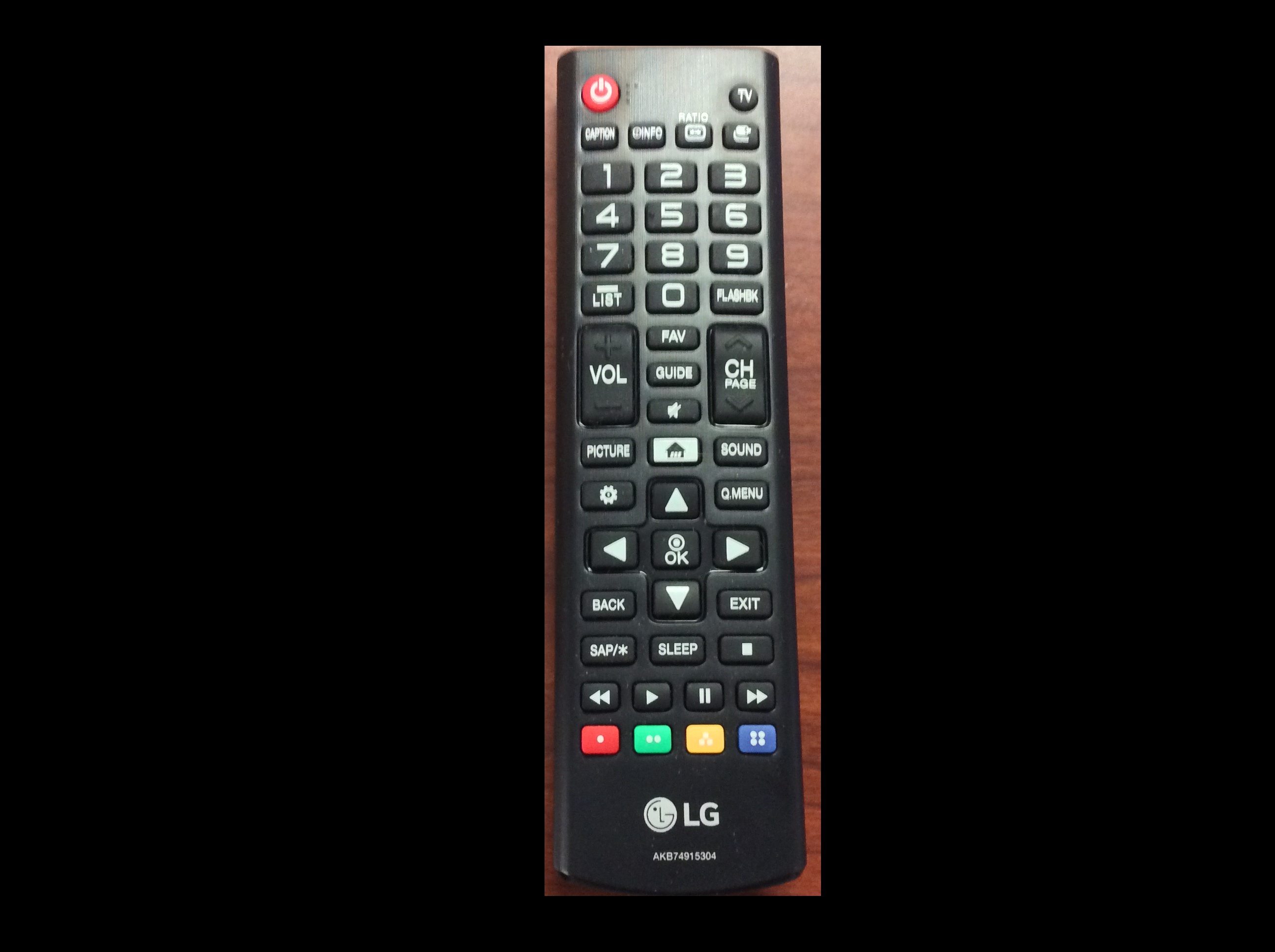
Here is a Python program to produce the cropped remote control image shown above. Of course, your program should be tailored to your image.
PYTHON
# Load the image
remote = iio.imread(uri="data/remote-control.jpg")
remote = np.array(remote)
# Create the basic mask
mask = np.ones(shape=remote.shape[0:2], dtype="bool")
# Draw a filled rectangle on the mask image
rr, cc = ski.draw.rectangle(start=(93, 1107), end=(1821, 1668))
mask[rr, cc] = False
# Apply the mask
remote[mask] = 0
# Display the result
fig, ax = plt.subplots()
ax.imshow(remote)Masking a 96-well plate image (30 min)
Consider this image of a 96-well plate that has been scanned on a flatbed scanner.
PYTHON
# Load the image
wellplate = iio.imread(uri="data/wellplate-01.jpg")
wellplate = np.array(wellplate)
# Display the image
fig, ax = plt.subplots()
ax.imshow(wellplate)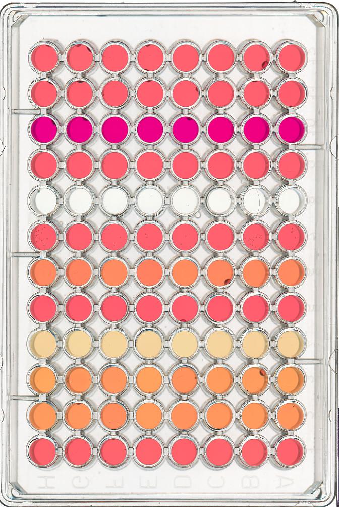
Suppose that we are interested in the colours of the solutions in each of the wells. We do not care about the colour of the rest of the image, i.e., the plastic that makes up the well plate itself.
Your task is to write some code that will produce a mask that will
mask out everything except for the wells. To help with this, you should
use the text file data/centers.txt that contains the (cx,
ry) coordinates of the centre of each of the 96 wells in this image. You
may assume that each of the wells has a radius of 16 pixels.
Your program should produce output that looks like this:
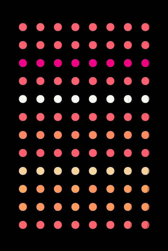
Hint: You can load data/centers.txt using:
PYTHON
# load the well coordinates as a NumPy array
centers = np.loadtxt("data/centers.txt", delimiter=" ")
# read in original image
wellplate = iio.imread(uri="data/wellplate-01.jpg")
wellplate = np.array(wellplate)
# create the mask image
mask = np.ones(shape=wellplate.shape[0:2], dtype="bool")
# iterate through the well coordinates
for cx, ry in centers:
# draw a circle on the mask at the well center
rr, cc = ski.draw.disk(center=(ry, cx), radius=16, shape=wellplate.shape[:2])
mask[rr, cc] = False
# apply the mask
wellplate[mask] = 0
# display the result
fig, ax = plt.subplots()
ax.imshow(wellplate)Masking a 96-well plate image, take two (optional, not included in timing)
If you spent some time looking at the contents of the
data/centers.txt file from the previous challenge, you may
have noticed that the centres of each well in the image are very
regular. Assuming that the images are scanned in such a way
that the wells are always in the same place, and that the image is
perfectly oriented (i.e., it does not slant one way or another), we
could produce our well plate mask without having to read in the
coordinates of the centres of each well. Assume that the centre of the
upper left well in the image is at location cx = 91 and ry = 108, and
that there are 70 pixels between each centre in the cx dimension and 72
pixels between each centre in the ry dimension. Each well still has a
radius of 16 pixels. Write a Python program that produces the same
output image as in the previous challenge, but without having
to read in the centers.txt file. Hint: use nested for
loops.
Here is a Python program that is able to create the masked image
without having to read in the centers.txt file.
PYTHON
# read in original image
wellplate = iio.imread(uri="data/wellplate-01.jpg")
wellplate = np.array(wellplate)
# create the mask image
mask = np.ones(shape=wellplate.shape[0:2], dtype="bool")
# upper left well coordinates
cx0 = 91
ry0 = 108
# spaces between wells
deltaCX = 70
deltaRY = 72
cx = cx0
ry = ry0
# iterate each row and column
for row in range(12):
# reset cx to leftmost well in the row
cx = cx0
for col in range(8):
# ... and drawing a circle on the mask
rr, cc = ski.draw.disk(center=(ry, cx), radius=16, shape=wellplate.shape[0:2])
mask[rr, cc] = False
cx += deltaCX
# after one complete row, move to next row
ry += deltaRY
# apply the mask
wellplate[mask] = 0
# display the result
fig, ax = plt.subplots()
ax.imshow(wellplate)Key Points
- We can use the NumPy
zeros()function to create a blank, black image. - We can draw on scikit-image images with functions such as
ski.draw.rectangle(),ski.draw.disk(),ski.draw.line(), and more. - The drawing functions return indices to pixels that can be set directly.
Content from Creating Histograms
Last updated on 2024-03-14 | Edit this page
Estimated time: 80 minutes
Overview
Questions
- How can we create grayscale and colour histograms to understand the distribution of colour values in an image?
Objectives
- Explain what a histogram is.
- Load an image in grayscale format.
- Create and display grayscale and colour histograms for entire images.
- Create and display grayscale and colour histograms for certain areas of images, via masks.
In this episode, we will learn how to use scikit-image functions to create and display histograms for images.
First, import the packages needed for this episode
Introduction to Histograms
As it pertains to images, a histogram is a graphical representation showing how frequently various colour values occur in the image. We saw in the Image Basics episode that we could use a histogram to visualise the differences in uncompressed and compressed image formats. If your project involves detecting colour changes between images, histograms will prove to be very useful, and histograms are also quite handy as a preparatory step before performing thresholding.
Grayscale Histograms
We will start with grayscale images, and then move on to colour
images. We will use this image of a plant seedling as an example: 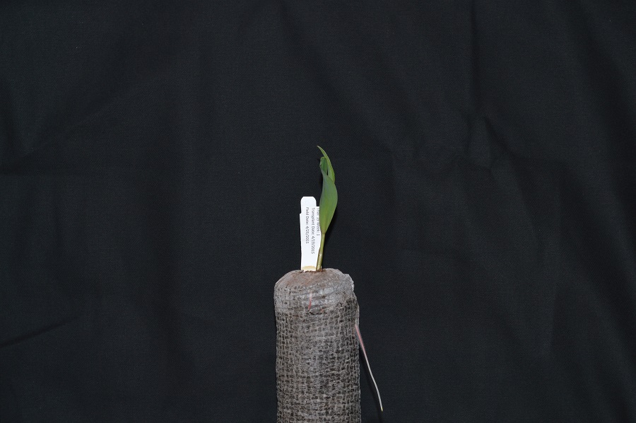
Here we load the image in grayscale instead of full colour, and display it:
PYTHON
# read the image of a plant seedling as grayscale from the outset
plant_seedling = iio.imread(uri="data/plant-seedling.jpg", mode="L")
# convert the image to float dtype with a value range from 0 to 1
plant_seedling = ski.util.img_as_float(plant_seedling)
# display the image
fig, ax = plt.subplots()
ax.imshow(plant_seedling, cmap="gray")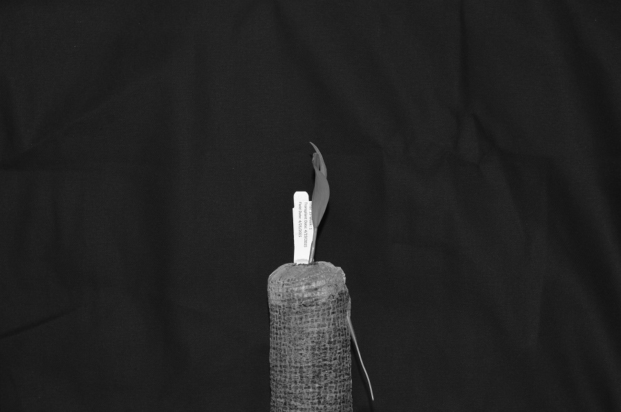
Again, we use the iio.imread() function to load our
image. Then, we convert the grayscale image of integer dtype, with 0-255
range, into a floating-point one with 0-1 range, by calling the function
ski.util.img_as_float. We can also calculate histograms for
8 bit images as we will see in the subsequent exercises.
We now use the function np.histogram to compute the
histogram of our image which, after all, is a NumPy array:
PYTHON
# create the histogram
histogram, bin_edges = np.histogram(plant_seedling, bins=256, range=(0, 1))The parameter bins determines the number of “bins” to
use for the histogram. We pass in 256 because we want to
see the pixel count for each of the 256 possible values in the grayscale
image.
The parameter range is the range of values each of the
pixels in the image can have. Here, we pass 0 and 1, which is the value
range of our input image after conversion to floating-point.
The first output of the np.histogram function is a
one-dimensional NumPy array, with 256 rows and one column, representing
the number of pixels with the intensity value corresponding to the
index. I.e., the first number in the array is the number of pixels found
with intensity value 0, and the final number in the array is the number
of pixels found with intensity value 255. The second output of
np.histogram is an array with the bin edges and one column
and 257 rows (one more than the histogram itself). There are no gaps
between the bins, which means that the end of the first bin, is the
start of the second and so on. For the last bin, the array also has to
contain the stop, so it has one more element, than the histogram.
Next, we turn our attention to displaying the histogram, by taking advantage of the plotting facilities of the Matplotlib library.
PYTHON
# configure and draw the histogram figure
fig, ax = plt.subplots()
ax.set_title("Grayscale Histogram")
ax.set_xlabel("grayscale value")
ax.set_ylabel("pixel count")
ax.set_xlim([0.0, 1.0]) # <- named arguments do not work here
ax.plot(bin_edges[0:-1], histogram) # <- or hereWe create the plot with plt.subplots(), then label the
figure and the coordinate axes with ax.set_title(),
ax.set_xlabel(), and ax.set_ylabel()
functions. The last step in the preparation of the figure is to set the
limits on the values on the x-axis with the
ax.set_xlim([0.0, 1.0]) function call.
Variable-length argument lists
Note that we cannot used named parameters for the
ax.set_xlim() or ax.plot() functions. This is
because these functions are defined to take an arbitrary number of
unnamed arguments. The designers wrote the functions this way
because they are very versatile, and creating named parameters for all
of the possible ways to use them would be complicated.
Finally, we create the histogram plot itself with
ax.plot(bin_edges[0:-1], histogram). We use the
left bin edges as x-positions for the histogram values
by indexing the bin_edges array to ignore the last value
(the right edge of the last bin). When we run the
program on this image of a plant seedling, it produces this
histogram:
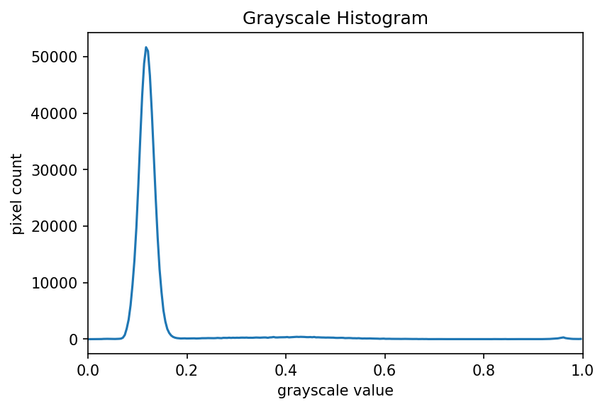
Histograms in Matplotlib
Matplotlib provides a dedicated function to compute and display
histograms: ax.hist(). We will not use it in this lesson in
order to understand how to calculate histograms in more detail. In
practice, it is a good idea to use this function, because it visualises
histograms more appropriately than ax.plot(). Here, you
could use it by calling
ax.hist(image.flatten(), bins=256, range=(0, 1)) instead of
np.histogram() and ax.plot()
(*.flatten() is a NumPy function that converts our
two-dimensional image into a one-dimensional array).
Using a mask for a histogram (15 min)
Looking at the histogram above, you will notice that there is a large number of very dark pixels, as indicated in the chart by the spike around the grayscale value 0.12. That is not so surprising, since the original image is mostly black background. What if we want to focus more closely on the leaf of the seedling? That is where a mask enters the picture!
First, hover over the plant seedling image with your mouse to determine the (x, y) coordinates of a bounding box around the leaf of the seedling. Then, using techniques from the Drawing and Bitwise Operations episode, create a mask with a white rectangle covering that bounding box.
After you have created the mask, apply it to the input image before
passing it to the np.histogram function.
PYTHON
# read the image as grayscale from the outset
plant_seedling = iio.imread(uri="data/plant-seedling.jpg", mode="L")
# convert the image to float dtype with a value range from 0 to 1
plant_seedling = ski.util.img_as_float(plant_seedling)
# display the image
fig, ax = plt.subplots()
ax.imshow(plant_seedling, cmap="gray")
# create mask here, using np.zeros() and ski.draw.rectangle()
mask = np.zeros(shape=plant_seedling.shape, dtype="bool")
rr, cc = ski.draw.rectangle(start=(199, 410), end=(384, 485))
mask[rr, cc] = True
# display the mask
fig, ax = plt.subplots()
ax.imshow(mask, cmap="gray")
# mask the image and create the new histogram
histogram, bin_edges = np.histogram(plant_seedling[mask], bins=256, range=(0.0, 1.0))
# configure and draw the histogram figure
fig, ax = plt.subplots()
ax.set_title("Grayscale Histogram")
ax.set_xlabel("grayscale value")
ax.set_ylabel("pixel count")
ax.set_xlim([0.0, 1.0])
ax.plot(bin_edges[0:-1], histogram)Your histogram of the masked area should look something like this:
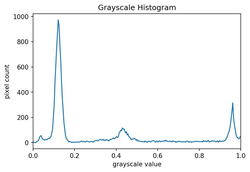
Colour Histograms
We can also create histograms for full colour images, in addition to grayscale histograms. We have seen colour histograms before, in the Image Basics episode. A program to create colour histograms starts in a familiar way:
PYTHON
# read original image, in full color
plant_seedling = iio.imread(uri="data/plant-seedling.jpg")
# display the image
fig, ax = plt.subplots()
ax.imshow(plant_seedling)We read the original image, now in full colour, and display it.
Next, we create the histogram, by calling the
np.histogram function three times, once for each of the
channels. We obtain the individual channels, by slicing the image along
the last axis. For example, we can obtain the red colour channel by
calling r_chan = image[:, :, 0].
PYTHON
# tuple to select colors of each channel line
colors = ("red", "green", "blue")
# create the histogram plot, with three lines, one for
# each color
fig, ax = plt.subplots()
ax.set_xlim([0, 256])
for channel_id, color in enumerate(colors):
histogram, bin_edges = np.histogram(
plant_seedling[:, :, channel_id], bins=256, range=(0, 256)
)
ax.plot(bin_edges[0:-1], histogram, color=color)
ax.set_title("Color Histogram")
ax.set_xlabel("Color value")
ax.set_ylabel("Pixel count")We will draw the histogram line for each channel in a different colour, and so we create a tuple of the colours to use for the three lines with the
colors = ("red", "green", "blue")
line of code. Then, we limit the range of the x-axis with the
ax.set_xlim() function call.
Next, we use the for control structure to iterate
through the three channels, plotting an appropriately-coloured histogram
line for each. This may be new Python syntax for you, so we will take a
moment to discuss what is happening in the for
statement.
The Python built-in enumerate() function takes a list
and returns an iterator of tuples, where the first
element of the tuple is the index and the second element is the element
of the list.
Iterators, tuples, and
enumerate()
In Python, an iterator, or an iterable object, is
something that can be iterated over with the for control
structure. A tuple is a sequence of objects, just like a list.
However, a tuple cannot be changed, and a tuple is indicated by
parentheses instead of square brackets. The enumerate()
function takes an iterable object, and returns an iterator of tuples
consisting of the 0-based index and the corresponding object.
For example, consider this small Python program:
Executing this program would produce the following output:
OUTPUT
(0, 'a')
(1, 'b')
(2, 'c')
(3, 'd')
(4, 'e')In our colour histogram program, we are using a tuple,
(channel_id, color), as the for variable. The
first time through the loop, the channel_id variable takes
the value 0, referring to the position of the red colour
channel, and the color variable contains the string
"red". The second time through the loop the values are the
green channels index 1 and "green", and the
third time they are the blue channel index 2 and
"blue".
Inside the for loop, our code looks much like it did for
the grayscale example. We calculate the histogram for the current
channel with the
histogram, bin_edges = np.histogram(image[:, :, channel_id], bins=256, range=(0, 256))
function call, and then add a histogram line of the correct colour to the plot with the
ax.plot(bin_edges[0:-1], histogram, color=color)
function call. Note the use of our loop variables,
channel_id and color.
Finally we label our axes and display the histogram, shown here:
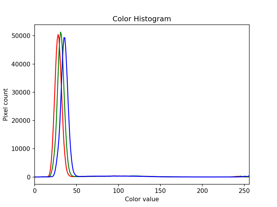
Colour histogram with a mask (25 min)
We can also apply a mask to the images we apply the colour histogram process to, in the same way we did for grayscale histograms. Consider this image of a well plate, where various chemical sensors have been applied to water and various concentrations of hydrochloric acid and sodium hydroxide:
PYTHON
# read the image
wellplate = iio.imread(uri="data/wellplate-02.tif")
# display the image
fig, ax = plt.subplots()
ax.imshow(wellplate)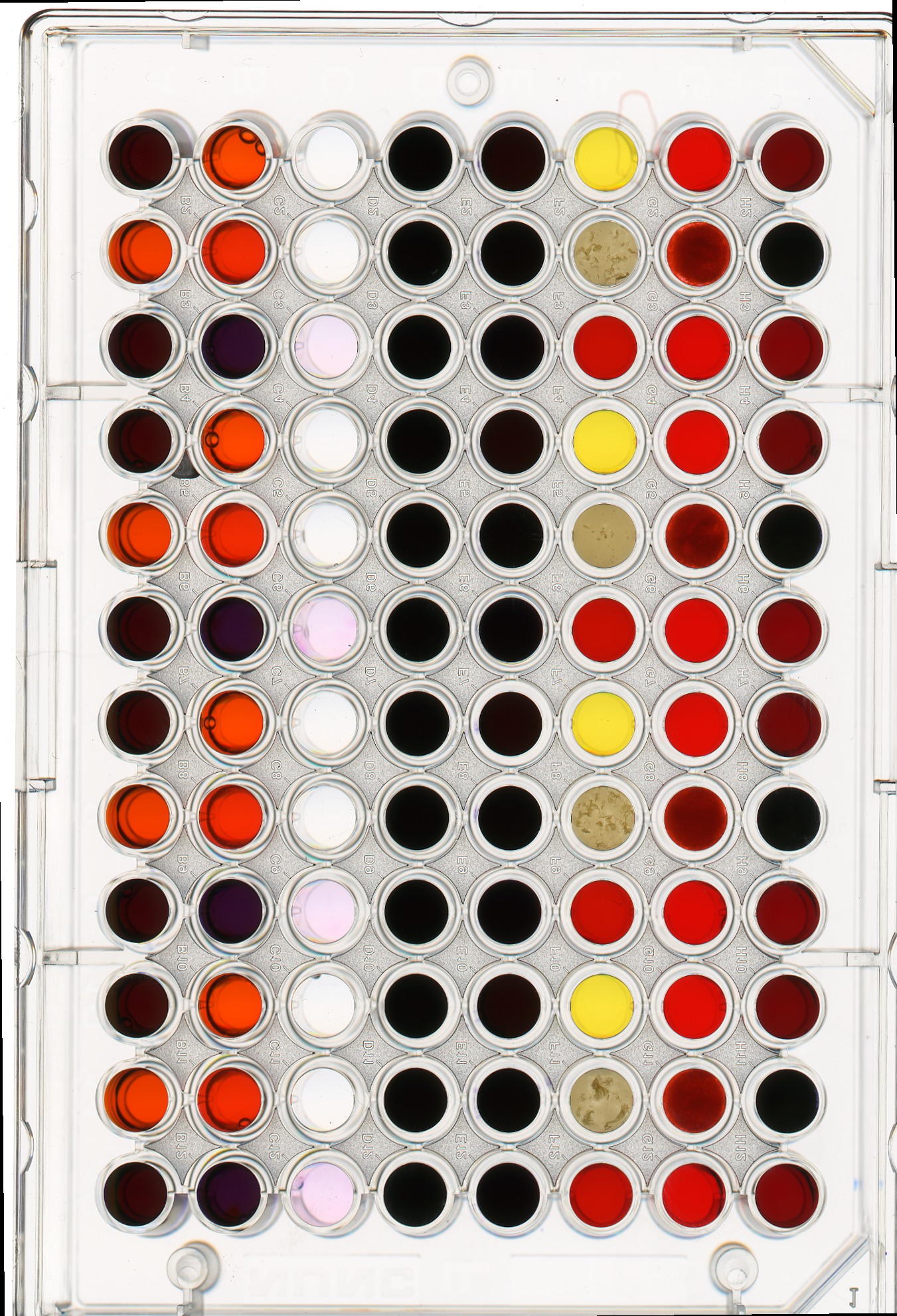
Suppose we are interested in the colour histogram of one of the sensors in the well plate image, specifically, the seventh well from the left in the topmost row, which shows Erythrosin B reacting with water.
Hover over the image with your mouse to find the centre of that well and the radius (in pixels) of the well. Then create a circular mask to select only the desired well. Then, use that mask to apply the colour histogram operation to that well.
Your masked image should look like this:
And, the program should produce a colour histogram that looks like this:
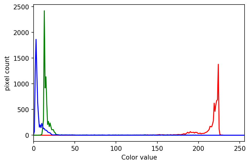
PYTHON
# create a circular mask to select the 7th well in the first row
mask = np.zeros(shape=wellplate.shape[0:2], dtype="bool")
circle = ski.draw.disk(center=(240, 1053), radius=49, shape=wellplate.shape[0:2])
mask[circle] = 1
# just for display:
# make a copy of the image, call it masked_image, and
# zero values where mask is False
masked_img = np.array(wellplate)
masked_img[~mask] = 0
# create a new figure and display masked_img, to verify the
# validity of your mask
fig, ax = plt.subplots()
ax.imshow(masked_img)
# list to select colors of each channel line
colors = ("red", "green", "blue")
# create the histogram plot, with three lines, one for
# each color
fig, ax = plt.subplots()
ax.set_xlim([0, 256])
for (channel_id, color) in enumerate(colors):
# use your circular mask to apply the histogram
# operation to the 7th well of the first row
histogram, bin_edges = np.histogram(
wellplate[:, :, channel_id][mask], bins=256, range=(0, 256)
)
ax.plot(histogram, color=color)
ax.set_xlabel("color value")
ax.set_ylabel("pixel count")Key Points
- In many cases, we can load images in grayscale by passing the
mode="L"argument to theiio.imread()function. - We can create histograms of images with the
np.histogramfunction. - We can display histograms using
ax.plot()with thebin_edgesandhistogramvalues returned bynp.histogram(). - The plot can be customised using
ax.set_xlabel(),ax.set_ylabel(),ax.set_xlim(),ax.set_ylim(), andax.set_title(). - We can separate the colour channels of an RGB image using slicing operations and create histograms for each colour channel separately.
Content from Blurring Images
Last updated on 2024-06-18 | Edit this page
Estimated time: 60 minutes
Overview
Questions
- How can we apply a low-pass blurring filter to an image?
Objectives
- Explain why applying a low-pass blurring filter to an image is beneficial.
- Apply a Gaussian blur filter to an image using scikit-image.
In this episode, we will learn how to use scikit-image functions to blur images.
When processing an image, we are often interested in identifying objects represented within it so that we can perform some further analysis of these objects, e.g., by counting them, measuring their sizes, etc. An important concept associated with the identification of objects in an image is that of edges: the lines that represent a transition from one group of similar pixels in the image to another different group. One example of an edge is the pixels that represent the boundaries of an object in an image, where the background of the image ends and the object begins.
When we blur an image, we make the colour transition from one side of
an edge in the image to another smooth rather than sudden. The effect is
to average out rapid changes in pixel intensity. Blurring is a very
common operation we need to perform before other tasks such as thresholding. There are several
different blurring functions in the ski.filters module, so
we will focus on just one here, the Gaussian blur.
Filters
In the day-to-day, macroscopic world, we have physical filters which separate out objects by size. A filter with small holes allows only small objects through, leaving larger objects behind. This is a good analogy for image filters. A high-pass filter will retain the smaller details in an image, filtering out the larger ones. A low-pass filter retains the larger features, analogous to what’s left behind by a physical filter mesh. High- and low-pass, here, refer to high and low spatial frequencies in the image. Details associated with high spatial frequencies are small, a lot of these features would fit across an image. Features associated with low spatial frequencies are large - maybe a couple of big features per image.
Blurring
To blur is to make something less clear or distinct. This could be interpreted quite broadly in the context of image analysis - anything that reduces or distorts the detail of an image might apply. Applying a low-pass filter, which removes detail occurring at high spatial frequencies, is perceived as a blurring effect. A Gaussian blur is a filter that makes use of a Gaussian kernel.
Kernels
A kernel can be used to implement a filter on an image. A kernel, in this context, is a small matrix which is combined with the image using a mathematical technique: convolution. Different sizes, shapes and contents of kernel produce different effects. The kernel can be thought of as a little image in itself, and will favour features of similar size and shape in the main image. On convolution with an image, a big, blobby kernel will retain big, blobby, low spatial frequency features.
Gaussian blur
Consider this image of a cat, in particular the area of the image outlined by the white square.
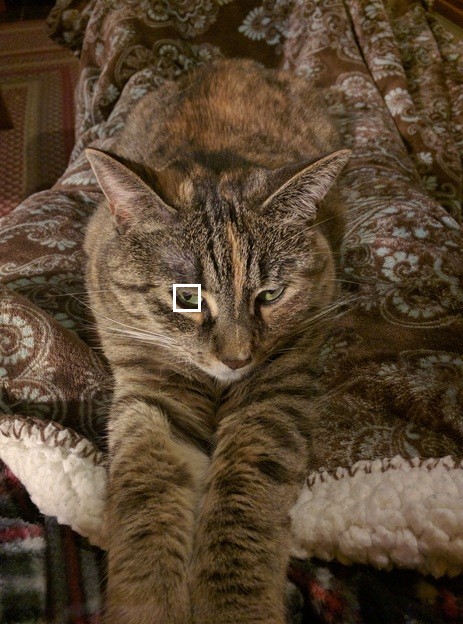
Now, zoom in on the area of the cat’s eye, as shown in the left-hand image below. When we apply a filter, we consider each pixel in the image, one at a time. In this example, the pixel we are currently working on is highlighted in red, as shown in the right-hand image.
When we apply a filter, we consider rectangular groups of pixels surrounding each pixel in the image, in turn. The kernel is another group of pixels (a separate matrix / small image), of the same dimensions as the rectangular group of pixels in the image, that moves along with the pixel being worked on by the filter. The width and height of the kernel must be an odd number, so that the pixel being worked on is always in its centre. In the example shown above, the kernel is square, with a dimension of seven pixels.
To apply the kernel to the current pixel, an average of the colour values of the pixels surrounding it is calculated, weighted by the values in the kernel. In a Gaussian blur, the pixels nearest the centre of the kernel are given more weight than those far away from the centre. The rate at which this weight diminishes is determined by a Gaussian function, hence the name Gaussian blur.
A Gaussian function maps random variables into a normal distribution
or “Bell Curve”. 
The shape of the function is described by a mean value μ, and a variance value σ². The mean determines the central point of the bell curve on the X axis, and the variance describes the spread of the curve.
In fact, when using Gaussian functions in Gaussian blurring, we use a 2D Gaussian function to account for X and Y dimensions, but the same rules apply. The mean μ is always 0, and represents the middle of the 2D kernel. Increasing values of σ² in either dimension increases the amount of blurring in that dimension.
The averaging is done on a channel-by-channel basis, and the average channel values become the new value for the pixel in the filtered image. Larger kernels have more values factored into the average, and this implies that a larger kernel will blur the image more than a smaller kernel.
To get an idea of how this works, consider this plot of the two-dimensional Gaussian function:
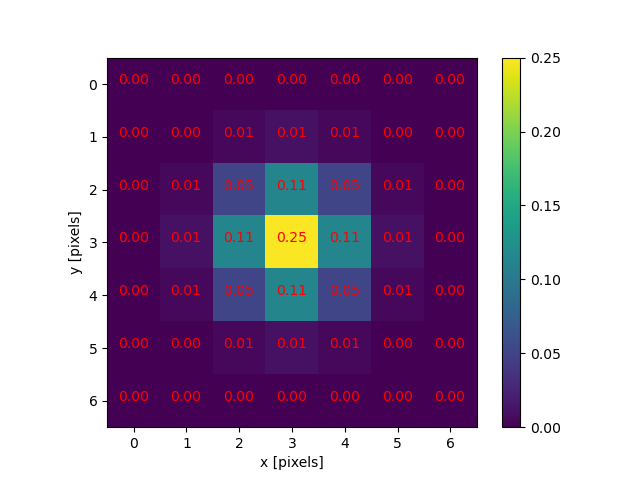
Imagine that plot laid over the kernel for the Gaussian blur filter. The height of the plot corresponds to the weight given to the underlying pixel in the kernel. I.e., the pixels close to the centre become more important to the filtered pixel colour than the pixels close to the outer limits of the kernel. The shape of the Gaussian function is controlled via its standard deviation, or sigma. A large sigma value results in a flatter shape, while a smaller sigma value results in a more pronounced peak. The mathematics involved in the Gaussian blur filter are not quite that simple, but this explanation gives you the basic idea.
To illustrate the blurring process, consider the blue channel colour values from the seven-by-seven region of the cat image above:
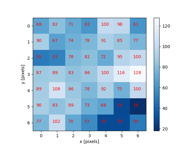
The filter is going to determine the new blue channel value for the centre pixel – the one that currently has the value 86. The filter calculates a weighted average of all the blue channel values in the kernel giving higher weight to the pixels near the centre of the kernel.
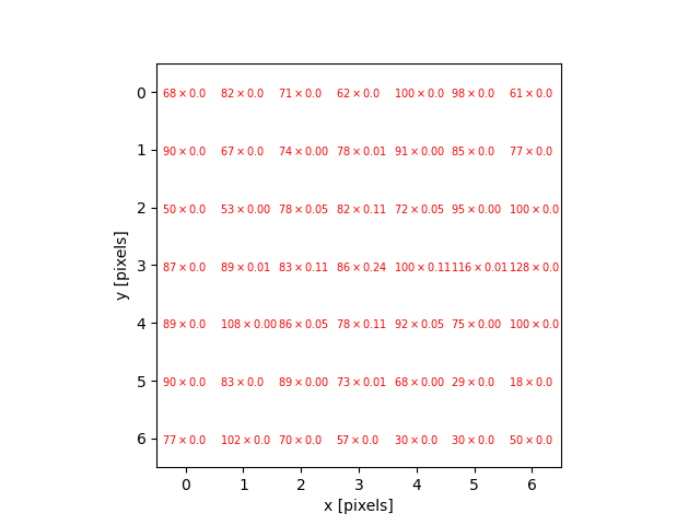
This weighted average, the sum of the multiplications, becomes the new value for the centre pixel (3, 3). The same process would be used to determine the green and red channel values, and then the kernel would be moved over to apply the filter to the next pixel in the image.
Take care to avoid mixing up the term “edge” to describe the edges of objects within an image and the outer boundaries of the images themselves. Lack of a clear distinction here may be confusing for learners.
Image edges
Something different needs to happen for pixels near the outer limits of the image, since the kernel for the filter may be partially off the image. For example, what happens when the filter is applied to the upper-left pixel of the image? Here are the blue channel pixel values for the upper-left pixel of the cat image, again assuming a seven-by-seven kernel:
OUTPUT
x x x x x x x
x x x x x x x
x x x x x x x
x x x 4 5 9 2
x x x 5 3 6 7
x x x 6 5 7 8
x x x 5 4 5 3The upper-left pixel is the one with value 4. Since the pixel is at the upper-left corner, there are no pixels underneath much of the kernel; here, this is represented by x’s. So, what does the filter do in that situation?
The default mode is to fill in the nearest pixel value from the image. For each of the missing x’s the image value closest to the x is used. If we fill in a few of the missing pixels, you will see how this works:
OUTPUT
x x x 4 x x x
x x x 4 x x x
x x x 4 x x x
4 4 4 4 5 9 2
x x x 5 3 6 7
x x x 6 5 7 8
x x x 5 4 5 3Another strategy to fill those missing values is to reflect the pixels that are in the image to fill in for the pixels that are missing from the kernel.
OUTPUT
x x x 5 x x x
x x x 6 x x x
x x x 5 x x x
2 9 5 4 5 9 2
x x x 5 3 6 7
x x x 6 5 7 8
x x x 5 4 5 3A similar process would be used to fill in all of the other missing pixels from the kernel. Other border modes are available; you can learn more about them in the scikit-image documentation.
This animation shows how the blur kernel moves along in the original image in order to calculate the colour channel values for the blurred image.
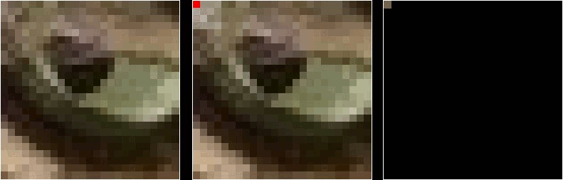
scikit-image has built-in functions to perform blurring for us, so we do not have to perform all of these mathematical operations ourselves. Let’s work through an example of blurring an image with the scikit-image Gaussian blur function.
First, import the packages needed for this episode:
PYTHON
import imageio.v3 as iio
import ipympl
import matplotlib.pyplot as plt
import skimage as ski
%matplotlib widgetThen, we load the image, and display it:
PYTHON
image = iio.imread(uri="data/gaussian-original.png")
# display the image
fig, ax = plt.subplots()
ax.imshow(image)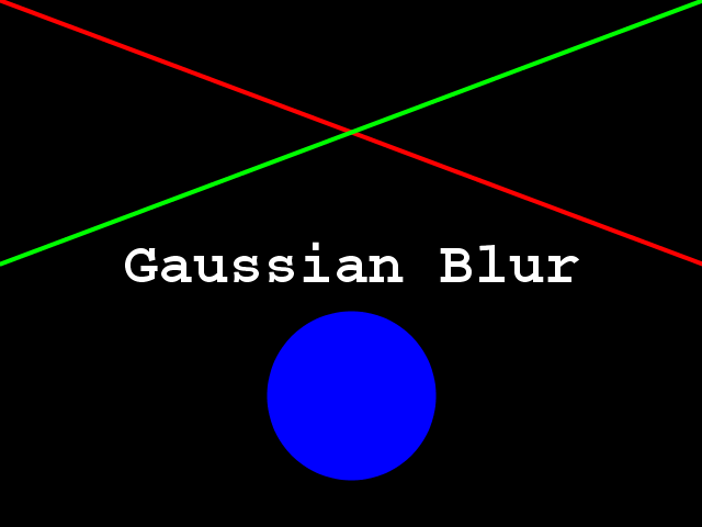
Next, we apply the gaussian blur:
PYTHON
sigma = 3.0
# apply Gaussian blur, creating a new image
blurred = ski.filters.gaussian(
image, sigma=(sigma, sigma), truncate=3.5, channel_axis=-1)The first two arguments to ski.filters.gaussian() are
the image to blur, image, and a tuple defining the sigma to
use in ry- and cx-direction, (sigma, sigma). The third
parameter truncate is meant to pass the radius of the
kernel in number of sigmas. A Gaussian function is defined from
-infinity to +infinity, but our kernel (which must have a finite,
smaller size) can only approximate the real function. Therefore, we must
choose a certain distance from the centre of the function where we stop
this approximation, and set the final size of our kernel. In the above
example, we set truncate to 3.5, which means the kernel
size will be 2 * sigma * 3.5. For example, for a sigma of
1.0 the resulting kernel size would be 7, while for a sigma
of 2.0 the kernel size would be 14. The default value for
truncate in scikit-image is 4.0.
The last argument we passed to ski.filters.gaussian() is
used to specify the dimension which contains the (colour) channels.
Here, it is the last dimension; recall that, in Python, the
-1 index refers to the last position. In this case, the
last dimension is the third dimension (index 2), since our
image has three dimensions:
OUTPUT
3Finally, we display the blurred image:
Visualising Blurring
Somebody said once “an image is worth a thousand words”. What is actually happening to the image pixels when we apply blurring may be difficult to grasp. Let’s now visualise the effects of blurring from a different perspective.
Let’s use the petri-dish image from previous episodes:
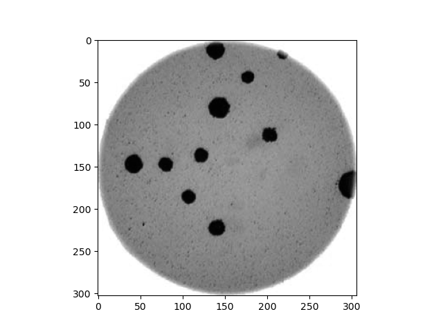
What we want to see here is the pixel intensities from a lateral
perspective: we want to see the profile of intensities. For instance,
let’s look for the intensities of the pixels along the horizontal line
at Y=150:
PYTHON
# read colonies color image and convert to grayscale
image = iio.imread('data/colonies-01.tif')
image_gray = ski.color.rgb2gray(image)
# define the pixels for which we want to view the intensity (profile)
xmin, xmax = (0, image_gray.shape[1])
Y = ymin = ymax = 150
# view the image indicating the profile pixels position
fig, ax = plt.subplots()
ax.imshow(image_gray, cmap='gray')
ax.plot([xmin, xmax], [ymin, ymax], color='red')The intensity of those pixels we can see with a simple line plot:
PYTHON
# select the vector of pixels along "Y"
image_gray_pixels_slice = image_gray[Y, :]
# guarantee the intensity values are in the [0:255] range (unsigned integers)
image_gray_pixels_slice = ski.img_as_ubyte(image_gray_pixels_slice)
fig, ax = plt.subplots()
ax.plot(image_gray_pixels_slice, color='red')
ax.set_ylim(255, 0)
ax.set_ylabel('L')
ax.set_xlabel('X')
And now, how does the same set of pixels look in the corresponding blurred image:
PYTHON
# first, create a blurred version of (grayscale) image
image_blur = ski.filters.gaussian(image_gray, sigma=3)
# like before, plot the pixels profile along "Y"
image_blur_pixels_slice = image_blur[Y, :]
image_blur_pixels_slice = ski.img_as_ubyte(image_blur_pixels_slice)
fig, ax = plt.subplots()
ax.plot(image_blur_pixels_slice, 'red')
ax.set_ylim(255, 0)
ax.set_ylabel('L')
ax.set_xlabel('X')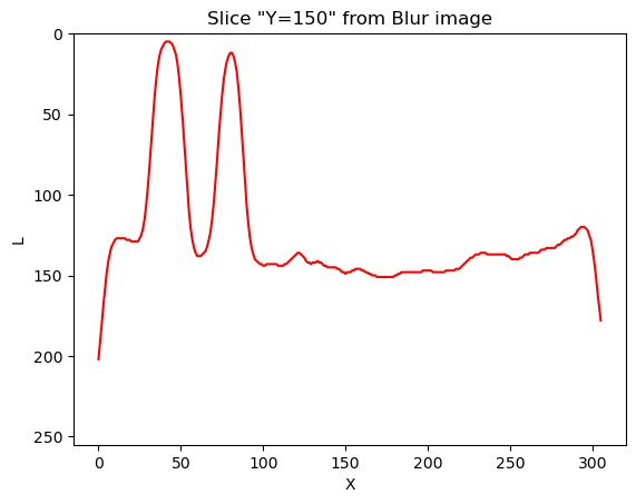
And that is why blurring is also called smoothing. This is how low-pass filters affect neighbouring pixels.
Now that we have seen the effects of blurring an image from two different perspectives, front and lateral, let’s take yet another look using a 3D visualisation.
3D Plots with matplotlib
The code to generate these 3D plots is outside the scope of this lesson but can be viewed by following the links in the captions.
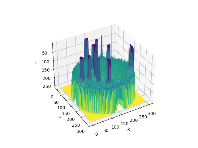
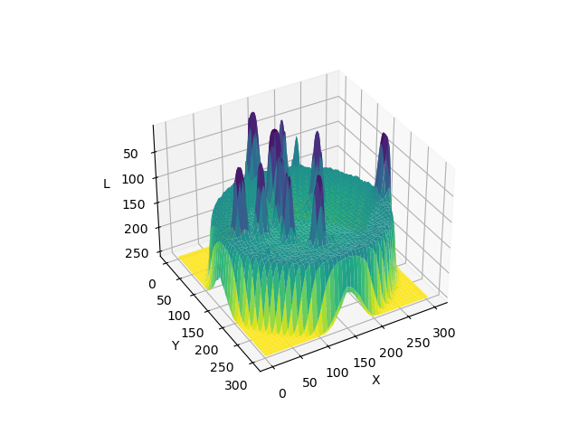
Experimenting with sigma values (10 min)
The size and shape of the kernel used to blur an image can have a significant effect on the result of the blurring and any downstream analysis carried out on the blurred image. The next two exercises ask you to experiment with the sigma values of the kernel, which is a good way to develop your understanding of how the choice of kernel can influence the result of blurring.
First, try running the code above with a range of smaller and larger sigma values. Generally speaking, what effect does the sigma value have on the blurred image?
Generally speaking, the larger the sigma value, the more blurry the result. A larger sigma will tend to get rid of more noise in the image, which will help for other operations we will cover soon, such as thresholding. However, a larger sigma also tends to eliminate some of the detail from the image. So, we must strike a balance with the sigma value used for blur filters.
Experimenting with kernel shape (10 min - optional, not included in timing)
Now, what is the effect of applying an asymmetric kernel to blurring an image? Try running the code above with different sigmas in the ry and cx direction. For example, a sigma of 1.0 in the ry direction, and 6.0 in the cx direction.
PYTHON
# apply Gaussian blur, with a sigma of 1.0 in the ry direction, and 6.0 in the cx direction
blurred = ski.filters.gaussian(
image, sigma=(1.0, 6.0), truncate=3.5, channel_axis=-1
)
# display blurred image
fig, ax = plt.subplots()
ax.imshow(blurred)
These unequal sigma values produce a kernel that is rectangular instead of square. The result is an image that is much more blurred in the X direction than in the Y direction. For most use cases, a uniform blurring effect is desirable and this kind of asymmetric blurring should be avoided. However, it can be helpful in specific circumstances, e.g., when noise is present in your image in a particular pattern or orientation, such as vertical lines, or when you want to remove uniform noise without blurring edges present in the image in a particular orientation.
Other methods of blurring
The Gaussian blur is a way to apply a low-pass filter in
scikit-image. It is often used to remove Gaussian (i.e., random) noise
in an image. For other kinds of noise, e.g., “salt and pepper”, a median
filter is typically used. See the
skimage.filters documentation for a list of available
filters.
Key Points
- Applying a low-pass blurring filter smooths edges and removes noise from an image.
- Blurring is often used as a first step before we perform thresholding or edge detection.
- The Gaussian blur can be applied to an image with the
ski.filters.gaussian()function. - Larger sigma values may remove more noise, but they will also remove detail from an image.
Content from Thresholding
Last updated on 2024-03-12 | Edit this page
Estimated time: 110 minutes
Overview
Questions
- How can we use thresholding to produce a binary image?
Objectives
- Explain what thresholding is and how it can be used.
- Use histograms to determine appropriate threshold values to use for the thresholding process.
- Apply simple, fixed-level binary thresholding to an image.
- Explain the difference between using the operator
>or the operator<to threshold an image represented by a NumPy array. - Describe the shape of a binary image produced by thresholding via
>or<. - Explain when Otsu’s method for automatic thresholding is appropriate.
- Apply automatic thresholding to an image using Otsu’s method.
- Use the
np.count_nonzero()function to count the number of non-zero pixels in an image.
In this episode, we will learn how to use scikit-image functions to apply thresholding to an image. Thresholding is a type of image segmentation, where we change the pixels of an image to make the image easier to analyze. In thresholding, we convert an image from colour or grayscale into a binary image, i.e., one that is simply black and white. Most frequently, we use thresholding as a way to select areas of interest of an image, while ignoring the parts we are not concerned with. We have already done some simple thresholding, in the “Manipulating pixels” section of the Working with scikit-image episode. In that case, we used a simple NumPy array manipulation to separate the pixels belonging to the root system of a plant from the black background. In this episode, we will learn how to use scikit-image functions to perform thresholding. Then, we will use the masks returned by these functions to select the parts of an image we are interested in.
First, import the packages needed for this episode
Simple thresholding
Consider the image data/shapes-01.jpg with a series of
crudely cut shapes set against a white background.
PYTHON
# load the image
shapes01 = iio.imread(uri="data/shapes-01.jpg")
fig, ax = plt.subplots()
ax.imshow(shapes01)
Now suppose we want to select only the shapes from the image. In
other words, we want to leave the pixels belonging to the shapes “on,”
while turning the rest of the pixels “off,” by setting their colour
channel values to zeros. The scikit-image library has several different
methods of thresholding. We will start with the simplest version, which
involves an important step of human input. Specifically, in this simple,
fixed-level thresholding, we have to provide a threshold value
t.
The process works like this. First, we will load the original image, convert it to grayscale, and de-noise it as in the Blurring Images episode.
PYTHON
# convert the image to grayscale
gray_shapes = ski.color.rgb2gray(shapes01)
# blur the image to denoise
blurred_shapes = ski.filters.gaussian(gray_shapes, sigma=1.0)
fig, ax = plt.subplots()
ax.imshow(blurred_shapes, cmap="gray")
Next, we would like to apply the threshold t such that
pixels with grayscale values on one side of t will be
turned “on”, while pixels with grayscale values on the other side will
be turned “off”. How might we do that? Remember that grayscale images
contain pixel values in the range from 0 to 1, so we are looking for a
threshold t in the closed range [0.0, 1.0]. We see in the
image that the geometric shapes are “darker” than the white background
but there is also some light gray noise on the background. One way to
determine a “good” value for t is to look at the grayscale
histogram of the image and try to identify what grayscale ranges
correspond to the shapes in the image or the background.
The histogram for the shapes image shown above can be produced as in the Creating Histograms episode.
PYTHON
# create a histogram of the blurred grayscale image
histogram, bin_edges = np.histogram(blurred_shapes, bins=256, range=(0.0, 1.0))
fig, ax = plt.subplots()
ax.plot(bin_edges[0:-1], histogram)
ax.set_title("Grayscale Histogram")
ax.set_xlabel("grayscale value")
ax.set_ylabel("pixels")
ax.set_xlim(0, 1.0)
Since the image has a white background, most of the pixels in the
image are white. This corresponds nicely to what we see in the
histogram: there is a peak near the value of 1.0. If we want to select
the shapes and not the background, we want to turn off the white
background pixels, while leaving the pixels for the shapes turned on.
So, we should choose a value of t somewhere before the
large peak and turn pixels above that value “off”. Let us choose
t=0.8.
To apply the threshold t, we can use the NumPy
comparison operators to create a mask. Here, we want to turn “on” all
pixels which have values smaller than the threshold, so we use the less
operator < to compare the blurred_image to
the threshold t. The operator returns a mask, that we
capture in the variable binary_mask. It has only one
channel, and each of its values is either 0 or 1. The binary mask
created by the thresholding operation can be shown with
ax.imshow, where the False entries are shown
as black pixels (0-valued) and the True entries are shown
as white pixels (1-valued).
PYTHON
# create a mask based on the threshold
t = 0.8
binary_mask = blurred_shapes < t
fig, ax = plt.subplots()
ax.imshow(binary_mask, cmap="gray")
You can see that the areas where the shapes were in the original area are now white, while the rest of the mask image is black.
What makes a good threshold?
As is often the case, the answer to this question is “it depends”. In
the example above, we could have just switched off all the white
background pixels by choosing t=1.0, but this would leave
us with some background noise in the mask image. On the other hand, if
we choose too low a value for the threshold, we could lose some of the
shapes that are too bright. You can experiment with the threshold by
re-running the above code lines with different values for
t. In practice, it is a matter of domain knowledge and
experience to interpret the peaks in the histogram so to determine an
appropriate threshold. The process often involves trial and error, which
is a drawback of the simple thresholding method. Below we will introduce
automatic thresholding, which uses a quantitative, mathematical
definition for a good threshold that allows us to determine the value of
t automatically. It is worth noting that the principle for
simple and automatic thresholding can also be used for images with pixel
ranges other than [0.0, 1.0]. For example, we could perform thresholding
on pixel intensity values in the range [0, 255] as we have already seen
in the Working with
scikit-image episode.
We can now apply the binary_mask to the original
coloured image as we have learned in the
Drawing and Bitwise Operations episode. What we are left
with is only the coloured shapes from the original.
PYTHON
# use the binary_mask to select the "interesting" part of the image
selection = shapes01.copy()
selection[~binary_mask] = 0
fig, ax = plt.subplots()
ax.imshow(selection)
More practice with simple thresholding (15 min)
Now, it is your turn to practice. Suppose we want to use simple
thresholding to select only the coloured shapes (in this particular case
we consider grayish to be a colour, too) from the image
data/shapes-02.jpg:
First, plot the grayscale histogram as in the Creating Histogram episode and
examine the distribution of grayscale values in the image. What do you
think would be a good value for the threshold t?
The histogram for the data/shapes-02.jpg image can be
shown with
PYTHON
shapes = iio.imread(uri="data/shapes-02.jpg")
gray_shapes = ski.color.rgb2gray(shapes)
histogram, bin_edges = np.histogram(gray_shapes, bins=256, range=(0.0, 1.0))
fig, ax = plt.subplots()
ax.plot(bin_edges[0:-1], histogram)
ax.set_title("Graylevel histogram")
ax.set_xlabel("gray value")
ax.set_ylabel("pixel count")
ax.set_xlim(0, 1.0)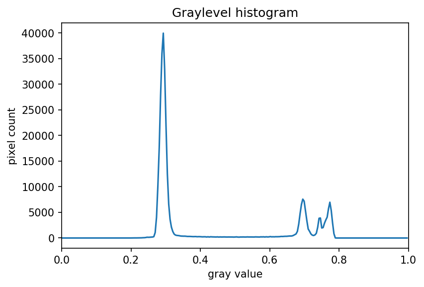
We can see a large spike around 0.3, and a smaller spike around 0.7.
The spike near 0.3 represents the darker background, so it seems like a
value close to t=0.5 would be a good choice.
More practice with simple thresholding (15 min) (continued)
Next, create a mask to turn the pixels above the threshold
t on and pixels below the threshold t off.
Note that unlike the image with a white background we used above, here
the peak for the background colour is at a lower gray level than the
shapes. Therefore, change the comparison operator less <
to greater > to create the appropriate mask. Then apply
the mask to the image and view the thresholded image. If everything
works as it should, your output should show only the coloured shapes on
a black background.
Here are the commands to create and view the binary mask
PYTHON
t = 0.5
binary_mask = gray_shapes > t
fig, ax = plt.subplots()
ax.imshow(binary_mask, cmap="gray")
And here are the commands to apply the mask and view the thresholded image
PYTHON
shapes02 = iio.imread(uri="data/shapes-02.jpg")
selection = shapes02.copy()
selection[~binary_mask] = 0
fig, ax = plt.subplots()
ax.imshow(selection)
Automatic thresholding
The downside of the simple thresholding technique is that we have to
make an educated guess about the threshold t by inspecting
the histogram. There are also automatic thresholding methods
that can determine the threshold automatically for us. One such method
is Otsu’s
method. It is particularly useful for situations where the
grayscale histogram of an image has two peaks that correspond to
background and objects of interest.
Denoising an image before thresholding
In practice, it is often necessary to denoise the image before thresholding, which can be done with one of the methods from the Blurring Images episode.
Consider the image data/maize-root-cluster.jpg of a
maize root system which we have seen before in the Working with scikit-image
episode.
PYTHON
maize_roots = iio.imread(uri="data/maize-root-cluster.jpg")
fig, ax = plt.subplots()
ax.imshow(maize_roots)We use Gaussian blur with a sigma of 1.0 to denoise the root image. Let us look at the grayscale histogram of the denoised image.
PYTHON
# convert the image to grayscale
gray_image = ski.color.rgb2gray(maize_roots)
# blur the image to denoise
blurred_image = ski.filters.gaussian(gray_image, sigma=1.0)
# show the histogram of the blurred image
histogram, bin_edges = np.histogram(blurred_image, bins=256, range=(0.0, 1.0))
fig, ax = plt.subplots()
ax.plot(bin_edges[0:-1], histogram)
ax.set_title("Graylevel histogram")
ax.set_xlabel("gray value")
ax.set_ylabel("pixel count")
ax.set_xlim(0, 1.0)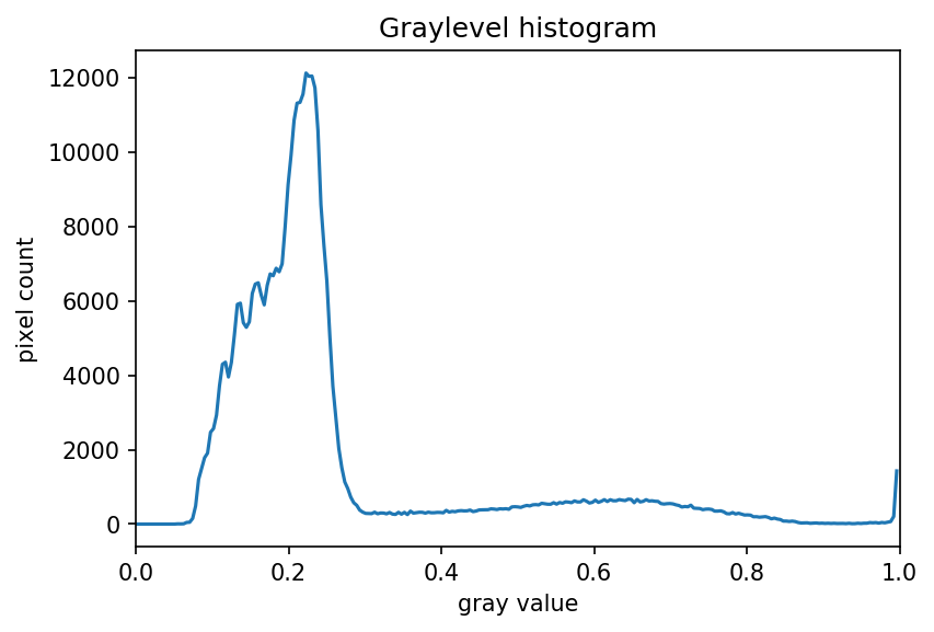
The histogram has a significant peak around 0.2 and then a broader “hill” around 0.6 followed by a smaller peak near 1.0. Looking at the grayscale image, we can identify the peak at 0.2 with the background and the broader peak with the foreground. Thus, this image is a good candidate for thresholding with Otsu’s method. The mathematical details of how this works are complicated (see the scikit-image documentation if you are interested), but the outcome is that Otsu’s method finds a threshold value between the two peaks of a grayscale histogram which might correspond well to the foreground and background depending on the data and application.
The histogram of the maize root image may prompt questions from learners about the interpretation of the peaks and the broader region around 0.6. The focus here is on the separation of background and foreground pixel values. We note that Otsu’s method does not work well for the image with the shapes used earlier in this episode, as the foreground pixel values are more distributed. These examples could be augmented with a discussion of unimodal, bimodal, and multimodal histograms. While these points can lead to fruitful considerations, the text in this episode attempts to reduce cognitive load and deliberately simplifies the discussion.
The ski.filters.threshold_otsu() function can be used to
determine the threshold automatically via Otsu’s method. Then NumPy
comparison operators can be used to apply it as before. Here are the
Python commands to determine the threshold t with Otsu’s
method.
PYTHON
# perform automatic thresholding
t = ski.filters.threshold_otsu(blurred_image)
print("Found automatic threshold t = {}.".format(t))OUTPUT
Found automatic threshold t = 0.4172454549881862.For this root image and a Gaussian blur with the chosen sigma of 1.0,
the computed threshold value is 0.42. No we can create a binary mask
with the comparison operator >. As we have seen before,
pixels above the threshold value will be turned on, those below the
threshold will be turned off.
PYTHON
# create a binary mask with the threshold found by Otsu's method
binary_mask = blurred_image > t
fig, ax = plt.subplots()
ax.imshow(binary_mask, cmap="gray")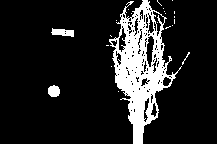
Finally, we use the mask to select the foreground:
PYTHON
# apply the binary mask to select the foreground
selection = maize_roots.copy()
selection[~binary_mask] = 0
fig, ax = plt.subplots()
ax.imshow(selection)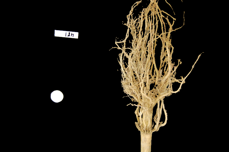
Application: measuring root mass
Let us now turn to an application where we can apply thresholding and
other techniques we have learned to this point. Consider these four
maize root system images, which you can find in the files
data/trial-016.jpg, data/trial-020.jpg,
data/trial-216.jpg, and
data/trial-293.jpg.
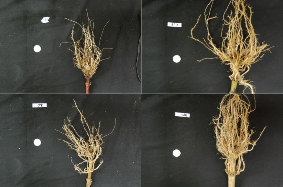
Suppose we are interested in the amount of plant material in each image, and in particular how that amount changes from image to image. Perhaps the images represent the growth of the plant over time, or perhaps the images show four different maize varieties at the same phase of their growth. The question we would like to answer is, “how much root mass is in each image?”
We will first construct a Python program to measure this value for a single image. Our strategy will be this:
- Read the image, converting it to grayscale as it is read. For this application we do not need the colour image.
- Blur the image.
- Use Otsu’s method of thresholding to create a binary image, where the pixels that were part of the maize plant are white, and everything else is black.
- Save the binary image so it can be examined later.
- Count the white pixels in the binary image, and divide by the number of pixels in the image. This ratio will be a measure of the root mass of the plant in the image.
- Output the name of the image processed and the root mass ratio.
Our intent is to perform these steps and produce the numeric result - a measure of the root mass in the image - without human intervention. Implementing the steps within a Python function will enable us to call this function for different images.
Here is a Python function that implements this root-mass-measuring strategy. Since the function is intended to produce numeric output without human interaction, it does not display any of the images. Almost all of the commands should be familiar, and in fact, it may seem simpler than the code we have worked on thus far, because we are not displaying any of the images.
PYTHON
def measure_root_mass(filename, sigma=1.0):
# read the original image, converting to grayscale on the fly
image = iio.imread(uri=filename, mode="L")
# blur before thresholding
blurred_image = ski.filters.gaussian(image, sigma=sigma)
# perform automatic thresholding to produce a binary image
t = ski.filters.threshold_otsu(blurred_image)
binary_mask = blurred_image > t
# determine root mass ratio
root_pixels = np.count_nonzero(binary_mask)
w = binary_mask.shape[1]
h = binary_mask.shape[0]
density = root_pixels / (w * h)
return densityThe function begins with reading the original image from the file
filename. We use iio.imread() with the
optional argument mode="L" to automatically convert it to
grayscale. Next, the grayscale image is blurred with a Gaussian filter
with the value of sigma that is passed to the function.
Then we determine the threshold t with Otsu’s method and
create a binary mask just as we did in the previous section. Up to this
point, everything should be familiar.
The final part of the function determines the root mass ratio in the
image. Recall that in the binary_mask, every pixel has
either a value of zero (black/background) or one (white/foreground). We
want to count the number of white pixels, which can be accomplished with
a call to the NumPy function np.count_nonzero. Then we
determine the width and height of the image by using the elements of
binary_mask.shape (that is, the dimensions of the NumPy
array that stores the image). Finally, the density ratio is calculated
by dividing the number of white pixels by the total number of pixels
w*h in the image. The function returns then root density of
the image.
We can call this function with any filename and provide a sigma value
for the blurring. If no sigma value is provided, the default value 1.0
will be used. For example, for the file data/trial-016.jpg
and a sigma value of 1.5, we would call the function like this:
OUTPUT
0.0482436835106383`Now we can use the function to process the series of four images shown above. In a real-world scientific situation, there might be dozens, hundreds, or even thousands of images to process. To save us the tedium of calling the function for each image by hand, we can write a loop that processes all files automatically. The following code block assumes that the files are located in the same directory and the filenames all start with the trial- prefix and end with the .jpg suffix.
PYTHON
all_files = glob.glob("data/trial-*.jpg")
for filename in all_files:
density = measure_root_mass(filename=filename, sigma=1.5)
# output in format suitable for .csv
print(filename, density, sep=",")OUTPUT
data/trial-016.jpg,0.0482436835106383
data/trial-020.jpg,0.06346941489361702
data/trial-216.jpg,0.14073969414893617
data/trial-293.jpg,0.13607895611702128Ignoring more of the images – brainstorming (10 min)
Let us take a closer look at the binary masks produced by the
measure_root_mass function.

You may have noticed in the section on automatic thresholding that the thresholded image does include regions of the image aside of the plant root: the numbered labels and the white circles in each image are preserved during the thresholding, because their grayscale values are above the threshold. Therefore, our calculated root mass ratios include the white pixels of the label and white circle that are not part of the plant root. Those extra pixels affect how accurate the root mass calculation is!
How might we remove the labels and circles before calculating the ratio, so that our results are more accurate? Think about some options given what we have learned so far.
One approach we might take is to try to completely mask out a region from each image, particularly, the area containing the white circle and the numbered label. If we had coordinates for a rectangular area on the image that contained the circle and the label, we could mask the area out by using techniques we learned in the Drawing and Bitwise Operations episode.
However, a closer inspection of the binary images raises some issues with that approach. Since the roots are not always constrained to a certain area in the image, and since the circles and labels are in different locations each time, we would have difficulties coming up with a single rectangle that would work for every image. We could create a different masking rectangle for each image, but that is not a practicable approach if we have hundreds or thousands of images to process.
Another approach we could take is to apply two thresholding steps to
the image. Look at the graylevel histogram of the file
data/trial-016.jpg shown above again: Notice the peak near
1.0? Recall that a grayscale value of 1.0 corresponds to white pixels:
the peak corresponds to the white label and circle. So, we could use
simple binary thresholding to mask the white circle and label from the
image, and then we could use Otsu’s method to select the pixels in the
plant portion of the image.
Note that most of this extra work in processing the image could have been avoided during the experimental design stage, with some careful consideration of how the resulting images would be used. For example, all of the following measures could have made the images easier to process, by helping us predict and/or detect where the label is in the image and subsequently mask it from further processing:
- Using labels with a consistent size and shape
- Placing all the labels in the same position, relative to the sample
- Using a non-white label, with non-black writing
Ignoring more of the images – implementation (30 min - optional, not included in timing)
Implement an enhanced version of the function
measure_root_mass that applies simple binary thresholding
to remove the white circle and label from the image before applying
Otsu’s method.
We can apply a simple binary thresholding with a threshold
t=0.95 to remove the label and circle from the image. We
can then use the binary mask to calculate the Otsu threshold without the
pixels from the label and circle.
PYTHON
def enhanced_root_mass(filename, sigma):
# read the original image, converting to grayscale on the fly
image = iio.imread(uri=filename, mode="L")
# blur before thresholding
blurred_image = ski.filters.gaussian(image, sigma=sigma)
# perform binary thresholding to mask the white label and circle
binary_mask = blurred_image < 0.95
# perform automatic thresholding using only the pixels with value True in the binary mask
t = ski.filters.threshold_otsu(blurred_image[binary_mask])
# update binary mask to identify pixels which are both less than 0.95 and greater than t
binary_mask = (blurred_image < 0.95) & (blurred_image > t)
# determine root mass ratio
root_pixels = np.count_nonzero(binary_mask)
w = binary_mask.shape[1]
h = binary_mask.shape[0]
density = root_pixels / (w * h)
return density
all_files = glob.glob("data/trial-*.jpg")
for filename in all_files:
density = enhanced_root_mass(filename=filename, sigma=1.5)
# output in format suitable for .csv
print(filename, density, sep=",")The output of the improved program does illustrate that the white circles and labels were skewing our root mass ratios:
OUTPUT
data/trial-016.jpg,0.046250166223404256
data/trial-020.jpg,0.05886968085106383
data/trial-216.jpg,0.13712117686170214
data/trial-293.jpg,0.13190342420212767The & operator above means that we have defined a
logical AND statement. This combines the two tests of pixel intensities
in the blurred image such that both must be true for a pixel’s position
to be set to True in the resulting mask.
Result of t < blurred_image
|
Result of blurred_image < 0.95
|
Resulting value in binary_mask
|
|---|---|---|
| False | True | False |
| True | False | False |
| True | True | True |
Knowing how to construct this kind of logical operation can be very helpful in image processing. The University of Minnesota Library’s guide to Boolean operators is a good place to start if you want to learn more.
Here are the binary images produced by the additional thresholding. Note that we have not completely removed the offending white pixels. Outlines still remain. However, we have reduced the number of extraneous pixels, which should make the output more accurate.
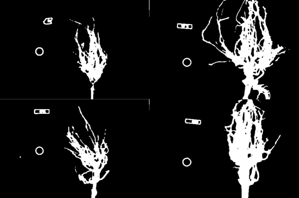
Thresholding a bacteria colony image (15 min)
In the images directory data/, you will find an image
named colonies-01.tif.
This is one of the images you will be working with in the morphometric challenge at the end of the workshop.
- Plot and inspect the grayscale histogram of the image to determine a good threshold value for the image.
- Create a binary mask that leaves the pixels in the bacteria colonies “on” while turning the rest of the pixels in the image “off”.
Here is the code to create the grayscale histogram:
PYTHON
bacteria = iio.imread(uri="data/colonies-01.tif")
gray_image = ski.color.rgb2gray(bacteria)
blurred_image = ski.filters.gaussian(gray_image, sigma=1.0)
histogram, bin_edges = np.histogram(blurred_image, bins=256, range=(0.0, 1.0))
fig, ax = plt.subplots()
ax.plot(bin_edges[0:-1], histogram)
ax.set_title("Graylevel histogram")
ax.set_xlabel("gray value")
ax.set_ylabel("pixel count")
ax.set_xlim(0, 1.0)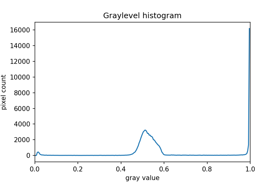
The peak near one corresponds to the white image background, and the
broader peak around 0.5 corresponds to the yellow/brown culture medium
in the dish. The small peak near zero is what we are after: the dark
bacteria colonies. A reasonable choice thus might be to leave pixels
below t=0.2 on.
Here is the code to create and show the binarized image using the
< operator with a threshold t=0.2:
PYTHON
t = 0.2
binary_mask = blurred_image < t
fig, ax = plt.subplots()
ax.imshow(binary_mask, cmap="gray")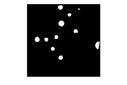
When you experiment with the threshold a bit, you can see that in particular the size of the bacteria colony near the edge of the dish in the top right is affected by the choice of the threshold.
Key Points
- Thresholding produces a binary image, where all pixels with intensities above (or below) a threshold value are turned on, while all other pixels are turned off.
- The binary images produced by thresholding are held in two-dimensional NumPy arrays, since they have only one colour value channel. They are boolean, hence they contain the values 0 (off) and 1 (on).
- Thresholding can be used to create masks that select only the interesting parts of an image, or as the first step before edge detection or finding contours.
Content from Connected Component Analysis
Last updated on 2024-03-12 | Edit this page
Estimated time: 125 minutes
Overview
Questions
- How to extract separate objects from an image and describe these objects quantitatively.
Objectives
- Understand the term object in the context of images.
- Learn about pixel connectivity.
- Learn how Connected Component Analysis (CCA) works.
- Use CCA to produce an image that highlights every object in a different colour.
- Characterise each object with numbers that describe its appearance.
Objects
In the Thresholding episode we have covered dividing an image into foreground and background pixels. In the shapes example image, we considered the coloured shapes as foreground objects on a white background.
In thresholding we went from the original image to this version:
Here, we created a mask that only highlights the parts of the image
that we find interesting, the objects. All objects have pixel
value of True while the background pixels are
False.
By looking at the mask image, one can count the objects that are present in the image (7). But how did we actually do that, how did we decide which lump of pixels constitutes a single object?
Pixel Neighborhoods
In order to decide which pixels belong to the same object, one can exploit their neighborhood: pixels that are directly next to each other and belong to the foreground class can be considered to belong to the same object.
Let’s discuss the concept of pixel neighborhoods in more detail.
Consider the following mask “image” with 8 rows, and 8 columns. For the
purpose of illustration, the digit 0 is used to represent
background pixels, and the letter X is used to represent
object pixels foreground).
OUTPUT
0 0 0 0 0 0 0 0
0 X X 0 0 0 0 0
0 X X 0 0 0 0 0
0 0 0 X X X 0 0
0 0 0 X X X X 0
0 0 0 0 0 0 0 0The pixels are organised in a rectangular grid. In order to
understand pixel neighborhoods we will introduce the concept of “jumps”
between pixels. The jumps follow two rules: First rule is that one jump
is only allowed along the column, or the row. Diagonal jumps are not
allowed. So, from a centre pixel, denoted with o, only the
pixels indicated with a 1 are reachable:
OUTPUT
- 1 -
1 o 1
- 1 -The pixels on the diagonal (from o) are not reachable
with a single jump, which is denoted by the -. The pixels
reachable with a single jump form the 1-jump
neighborhood.
The second rule states that in a sequence of jumps, one may only jump
in row and column direction once -> they have to be
orthogonal. An example of a sequence of orthogonal jumps is
shown below. Starting from o the first jump goes along the
row to the right. The second jump then goes along the column direction
up. After this, the sequence cannot be continued as a jump has already
been made in both row and column direction.
OUTPUT
- - 2
- o 1
- - -All pixels reachable with one, or two jumps form the
2-jump neighborhood. The grid below illustrates the
pixels reachable from the centre pixel o with a single
jump, highlighted with a 1, and the pixels reachable with 2
jumps with a 2.
OUTPUT
2 1 2
1 o 1
2 1 2We want to revisit our example image mask from above and apply the
two different neighborhood rules. With a single jump connectivity for
each pixel, we get two resulting objects, highlighted in the image with
A’s and B’s.
OUTPUT
0 0 0 0 0 0 0 0
0 A A 0 0 0 0 0
0 A A 0 0 0 0 0
0 0 0 B B B 0 0
0 0 0 B B B B 0
0 0 0 0 0 0 0 0In the 1-jump version, only pixels that have direct neighbors along
rows or columns are considered connected. Diagonal connections are not
included in the 1-jump neighborhood. With two jumps, however, we only
get a single object A because pixels are also considered
connected along the diagonals.
OUTPUT
0 0 0 0 0 0 0 0
0 A A 0 0 0 0 0
0 A A 0 0 0 0 0
0 0 0 A A A 0 0
0 0 0 A A A A 0
0 0 0 0 0 0 0 0Object counting (optional, not included in timing)
How many objects with 1 orthogonal jump, how many with 2 orthogonal jumps?
OUTPUT
0 0 0 0 0 0 0 0
0 X 0 0 0 X X 0
0 0 X 0 0 0 0 0
0 X 0 X X X 0 0
0 X 0 X X 0 0 0
0 0 0 0 0 0 0 01 jump
- 1
- 5
- 2
- 5
Object counting (optional, not included in timing) (continued)
2 jumps
- 2
- 3
- 5
- 2
Jumps and neighborhoods
We have just introduced how you can reach different neighboring pixels by performing one or more orthogonal jumps. We have used the terms 1-jump and 2-jump neighborhood. There is also a different way of referring to these neighborhoods: the 4- and 8-neighborhood. With a single jump you can reach four pixels from a given starting pixel. Hence, the 1-jump neighborhood corresponds to the 4-neighborhood. When two orthogonal jumps are allowed, eight pixels can be reached, so the 2-jump neighborhood corresponds to the 8-neighborhood.
Connected Component Analysis
In order to find the objects in an image, we want to employ an
operation that is called Connected Component Analysis (CCA). This
operation takes a binary image as an input. Usually, the
False value in this image is associated with background
pixels, and the True value indicates foreground, or object
pixels. Such an image can be produced, e.g., with thresholding. Given a
thresholded image, the connected component analysis produces a new
labeled image with integer pixel values. Pixels with the same
value, belong to the same object. scikit-image provides connected
component analysis in the function ski.measure.label(). Let
us add this function to the already familiar steps of thresholding an
image.
First, import the packages needed for this episode:
PYTHON
import imageio.v3 as iio
import ipympl
import matplotlib.pyplot as plt
import numpy as np
import skimage as ski

%matplotlib widgetIn this episode, we will use the ski.measure.label
function to perform the CCA.
Next, we define a reusable Python function
connected_components:
PYTHON
def connected_components(filename, sigma=1.0, t=0.5, connectivity=2):
# load the image
image = iio.imread(filename)
# convert the image to grayscale
gray_image = ski.color.rgb2gray(image)
# denoise the image with a Gaussian filter
blurred_image = ski.filters.gaussian(gray_image, sigma=sigma)
# mask the image according to threshold
binary_mask = blurred_image < t
# perform connected component analysis
labeled_image, count = ski.measure.label(binary_mask,
connectivity=connectivity, return_num=True)
return labeled_image, countThe first four lines of code are familiar from the Thresholding episode.
Then we call the ski.measure.label function. This
function has one positional argument where we pass the
binary_mask, i.e., the binary image to work on. With the
optional argument connectivity, we specify the neighborhood
in units of orthogonal jumps. For example, by setting
connectivity=2 we will consider the 2-jump neighborhood
introduced above. The function returns a labeled_image
where each pixel has a unique value corresponding to the object it
belongs to. In addition, we pass the optional parameter
return_num=True to return the maximum label index as
count.
Optional parameters and return values
The optional parameter return_num changes the data type
that is returned by the function ski.measure.label. The
number of labels is only returned if return_num is
True. Otherwise, the function only returns the labeled image.
This means that we have to pay attention when assigning the return value
to a variable. If we omit the optional parameter return_num
or pass return_num=False, we can call the function as
If we pass return_num=True, the function returns a tuple
and we can assign it as
If we used the same assignment as in the first case, the variable
labeled_image would become a tuple, in which
labeled_image[0] is the image and
labeled_image[1] is the number of labels. This could cause
confusion if we assume that labeled_image only contains the
image and pass it to other functions. If you get an
AttributeError: 'tuple' object has no attribute 'shape' or
similar, check if you have assigned the return values consistently with
the optional parameters.
We can call the above function connected_components and
display the labeled image like so:
PYTHON
labeled_image, count = connected_components(filename="data/shapes-01.jpg", sigma=2.0, t=0.9, connectivity=2)
fig, ax = plt.subplots()
ax.imshow(labeled_image)
ax.set_axis_off();If you are using an older version of Matplotlib you might get a
warning
UserWarning: Low image data range; displaying image with stretched contrast.
or just see a visually empty image.
What went wrong? When you hover over the image, the pixel values are
shown as numbers in the lower corner of the viewer. You can see that
some pixels have values different from 0, so they are not
actually all the same value. Let’s find out more by examining
labeled_image. Properties that might be interesting in this
context are dtype, the minimum and maximum value. We can
print them with the following lines:
PYTHON
print("dtype:", labeled_image.dtype)
print("min:", np.min(labeled_image))
print("max:", np.max(labeled_image))Examining the output can give us a clue why the image appears empty.
OUTPUT
dtype: int32
min: 0
max: 11The dtype of labeled_image is
int32. This means that values in this image range from
-2 ** 31 to 2 ** 31 - 1. Those are really big
numbers. From this available space we only use the range from
0 to 11. When showing this image in the
viewer, it may squeeze the complete range into 256 gray values.
Therefore, the range of our numbers does not produce any visible
variation. One way to rectify this is to explicitly specify the data
range we want the colormap to cover:
PYTHON
fig, ax = plt.subplots()
ax.imshow(labeled_image, vmin=np.min(labeled_image), vmax=np.max(labeled_image))Note this is the default behaviour for newer versions of
matplotlib.pyplot.imshow. Alternatively we could convert
the image to RGB and then display it.
Suppressing outputs in Jupyter Notebooks
We just used ax.set_axis_off(); to hide the axis from
the image for a visually cleaner figure. The semicolon is added to
supress the output(s) of the statement, in this case
the axis limits. This is specific to Jupyter Notebooks.
We can use the function ski.color.label2rgb() to convert
the 32-bit grayscale labeled image to standard RGB colour (recall that
we already used the ski.color.rgb2gray() function to
convert to grayscale). With ski.color.label2rgb(), all
objects are coloured according to a list of colours that can be
customised. We can use the following commands to convert and show the
image:
PYTHON
# convert the label image to color image
colored_label_image = ski.color.label2rgb(labeled_image, bg_label=0)
fig, ax = plt.subplots()
ax.imshow(colored_label_image)
ax.set_axis_off();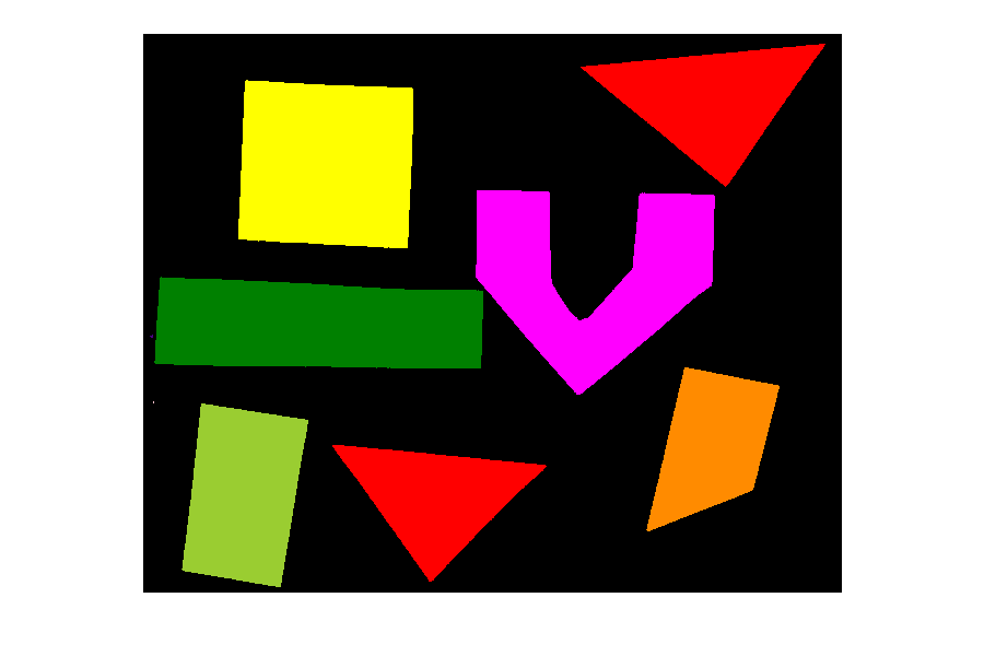
How many objects are in that image (15 min)
Now, it is your turn to practice. Using the function
connected_components, find two ways of printing out the
number of objects found in the image.
What number of objects would you expect to get?
How does changing the sigma and threshold
values influence the result?
As you might have guessed, the return value count
already contains the number of objects found in the image. So it can
simply be printed with
But there is also a way to obtain the number of found objects from
the labeled image itself. Recall that all pixels that belong to a single
object are assigned the same integer value. The connected component
algorithm produces consecutive numbers. The background gets the value
0, the first object gets the value 1, the
second object the value 2, and so on. This means that by
finding the object with the maximum value, we also know how many objects
there are in the image. We can thus use the np.max function
from NumPy to find the maximum value that equals the number of found
objects:
Invoking the function with sigma=2.0, and
threshold=0.9, both methods will print
OUTPUT
Found 11 objects in the image.Lowering the threshold will result in fewer objects. The higher the threshold is set, the more objects are found. More and more background noise gets picked up as objects. Larger sigmas produce binary masks with less noise and hence a smaller number of objects. Setting sigma too high bears the danger of merging objects.
You might wonder why the connected component analysis with
sigma=2.0, and threshold=0.9 finds 11 objects,
whereas we would expect only 7 objects. Where are the four additional
objects? With a bit of detective work, we can spot some small objects in
the image, for example, near the left border.
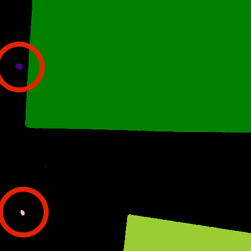
For us it is clear that these small spots are artifacts and not
objects we are interested in. But how can we tell the computer? One way
to calibrate the algorithm is to adjust the parameters for blurring
(sigma) and thresholding (t), but you may have
noticed during the above exercise that it is quite hard to find a
combination that produces the right output number. In some cases,
background noise gets picked up as an object. And with other parameters,
some of the foreground objects get broken up or disappear completely.
Therefore, we need other criteria to describe desired properties of the
objects that are found.
Morphometrics - Describe object features with numbers
Morphometrics is concerned with the quantitative analysis of objects
and considers properties such as size and shape. For the example of the
images with the shapes, our intuition tells us that the objects should
be of a certain size or area. So we could use a minimum area as a
criterion for when an object should be detected. To apply such a
criterion, we need a way to calculate the area of objects found by
connected components. Recall how we determined the root mass in the Thresholding episode by
counting the pixels in the binary mask. But here we want to calculate
the area of several objects in the labeled image. The scikit-image
library provides the function ski.measure.regionprops to
measure the properties of labeled regions. It returns a list of
RegionProperties that describe each connected region in the
images. The properties can be accessed using the attributes of the
RegionProperties data type. Here we will use the properties
"area" and "label". You can explore the
scikit-image documentation to learn about other properties
available.
We can get a list of areas of the labeled objects as follows:
PYTHON
# compute object features and extract object areas
object_features = ski.measure.regionprops(labeled_image)
object_areas = [objf["area"] for objf in object_features]
object_areasThis will produce the output
OUTPUT
[318542, 1, 523204, 496613, 517331, 143, 256215, 1, 68, 338784, 265755]Plot a histogram of the object area distribution (10 min)
Similar to how we determined a “good” threshold in the Thresholding episode, it is often helpful to inspect the histogram of an object property. For example, we want to look at the distribution of the object areas.
- Create and examine a histogram of the object areas
obtained with
ski.measure.regionprops. - What does the histogram tell you about the objects?
The histogram can be plotted with
PYTHON
fig, ax = plt.subplots()
ax.hist(object_areas)
ax.set_xlabel("Area (pixels)")
ax.set_ylabel("Number of objects");
The histogram shows the number of objects (vertical axis) whose area is within a certain range (horizontal axis). The height of the bars in the histogram indicates the prevalence of objects with a certain area. The whole histogram tells us about the distribution of object sizes in the image. It is often possible to identify gaps between groups of bars (or peaks if we draw the histogram as a continuous curve) that tell us about certain groups in the image.
In this example, we can see that there are four small objects that
contain less than 50000 pixels. Then there is a group of four (1+1+2)
objects in the range between 200000 and 400000, and three objects with a
size around 500000. For our object count, we might want to disregard the
small objects as artifacts, i.e, we want to ignore the leftmost bar of
the histogram. We could use a threshold of 50000 as the minimum area to
count. In fact, the object_areas list already tells us that
there are fewer than 200 pixels in these objects. Therefore, it is
reasonable to require a minimum area of at least 200 pixels for a
detected object. In practice, finding the “right” threshold can be
tricky and usually involves an educated guess based on domain
knowledge.
Filter objects by area (10 min)
Now we would like to use a minimum area criterion to obtain a more accurate count of the objects in the image.
- Find a way to calculate the number of objects by only counting objects above a certain area.
One way to count only objects above a certain area is to first create a list of those objects, and then take the length of that list as the object count. This can be done as follows:
PYTHON
min_area = 200
large_objects = []
for objf in object_features:
if objf["area"] > min_area:
large_objects.append(objf["label"])
print("Found", len(large_objects), "objects!")Another option is to use NumPy arrays to create the list of large
objects. We first create an array object_areas containing
the object areas, and an array object_labels containing the
object labels. The labels of the objects are also returned by
ski.measure.regionprops. We have already seen that we can
create boolean arrays using comparison operators. Here we can use
object_areas > min_area to produce an array that has the
same dimension as object_labels. It can then used to select
the labels of objects whose area is greater than min_area
by indexing:
PYTHON
object_areas = np.array([objf["area"] for objf in object_features])
object_labels = np.array([objf["label"] for objf in object_features])
large_objects = object_labels[object_areas > min_area]
print("Found", len(large_objects), "objects!")The advantage of using NumPy arrays is that for loops
and if statements in Python can be slow, and in practice
the first approach may not be feasible if the image contains a large
number of objects. In that case, NumPy array functions turn out to be
very useful because they are much faster.
In this example, we can also use the np.count_nonzero
function that we have seen earlier together with the >
operator to count the objects whose area is above
min_area.
For all three alternatives, the output is the same and gives the expected count of 7 objects.
Using functions from NumPy and other Python packages
Functions from Python packages such as NumPy are often more efficient
and require less code to write. It is a good idea to browse the
reference pages of numpy and skimage to look
for an availabe function that can solve a given task.
Remove small objects (20 min)
We might also want to exclude (mask) the small objects when plotting the labeled image.
- Enhance the
connected_componentsfunction such that it automatically removes objects that are below a certain area that is passed to the function as an optional parameter.
To remove the small objects from the labeled image, we change the value of all pixels that belong to the small objects to the background label 0. One way to do this is to loop over all objects and set the pixels that match the label of the object to 0.
PYTHON
for object_id, objf in enumerate(object_features, start=1):
if objf["area"] < min_area:
labeled_image[labeled_image == objf["label"]] = 0Here NumPy functions can also be used to eliminate for
loops and if statements. Like above, we can create an array
of the small object labels with the comparison
object_areas < min_area. We can use another NumPy
function, np.isin, to set the pixels of all small objects
to 0. np.isin takes two arrays and returns a boolean array
with values True if the entry of the first array is found
in the second array, and False otherwise. This array can
then be used to index the labeled_image and set the entries
that belong to small objects to 0.
PYTHON
object_areas = np.array([objf["area"] for objf in object_features])
object_labels = np.array([objf["label"] for objf in object_features])
small_objects = object_labels[object_areas < min_area]
labeled_image[np.isin(labeled_image, small_objects)] = 0An even more elegant way to remove small objects from the image is to
leverage the ski.morphology module. It provides a function
ski.morphology.remove_small_objects that does exactly what
we are looking for. It can be applied to a binary image and returns a
mask in which all objects smaller than min_area are
excluded, i.e, their pixel values are set to False. We can
then apply ski.measure.label to the masked image:
PYTHON
object_mask = ski.morphology.remove_small_objects(binary_mask, min_size=min_area)
labeled_image, n = ski.measure.label(object_mask,
connectivity=connectivity, return_num=True)Using the scikit-image features, we can implement the
enhanced_connected_component as follows:
PYTHON
def enhanced_connected_components(filename, sigma=1.0, t=0.5, connectivity=2, min_area=0):
image = iio.imread(filename)
gray_image = ski.color.rgb2gray(image)
blurred_image = ski.filters.gaussian(gray_image, sigma=sigma)
binary_mask = blurred_image < t
object_mask = ski.morphology.remove_small_objects(binary_mask, min_size=min_area)
labeled_image, count = ski.measure.label(object_mask,
connectivity=connectivity, return_num=True)
return labeled_image, countWe can now call the function with a chosen min_area and
display the resulting labeled image:
PYTHON
labeled_image, count = enhanced_connected_components(filename="data/shapes-01.jpg", sigma=2.0, t=0.9,
connectivity=2, min_area=min_area)
colored_label_image = ski.color.label2rgb(labeled_image, bg_label=0)
fig, ax = plt.subplots()
ax.imshow(colored_label_image)
ax.set_axis_off();
print("Found", count, "objects in the image.")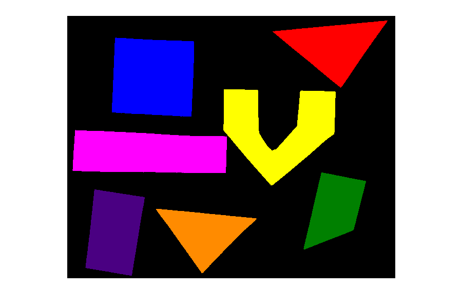
OUTPUT
Found 7 objects in the image.Note that the small objects are “gone” and we obtain the correct number of 7 objects in the image.
Colour objects by area (optional, not included in timing)
Finally, we would like to display the image with the objects coloured according to the magnitude of their area. In practice, this can be used with other properties to give visual cues of the object properties.
We already know how to get the areas of the objects from the
regionprops. We just need to insert a zero area value for
the background (to colour it like a zero size object). The background is
also labeled 0 in the labeled_image, so we
insert the zero area value in front of the first element of
object_areas with np.insert. Then we can
create a colored_area_image where we assign each pixel
value the area by indexing the object_areas with the label
values in labeled_image.
PYTHON
object_areas = np.array([objf["area"] for objf in ski.measure.regionprops(labeled_image)])
# prepend zero to object_areas array for background pixels
object_areas = np.insert(0, obj=1, values=object_areas)
# create image where the pixels in each object are equal to that object's area
colored_area_image = object_areas[labeled_image]
fig, ax = plt.subplots()
im = ax.imshow(colored_area_image)
cbar = fig.colorbar(im, ax=ax, shrink=0.85)
cbar.ax.set_title("Area")
ax.set_axis_off();
Callout
You may have noticed that in the solution, we have used the
labeled_image to index the array object_areas.
This is an example of advanced
indexing in NumPy The result is an array of the same shape as the
labeled_image whose pixel values are selected from
object_areas according to the object label. Hence the
objects will be colored by area when the result is displayed. Note that
advanced indexing with an integer array works slightly different than
the indexing with a Boolean array that we have used for masking. While
Boolean array indexing returns only the entries corresponding to the
True values of the index, integer array indexing returns an
array with the same shape as the index. You can read more about advanced
indexing in the NumPy
documentation.
Key Points
- We can use
ski.measure.labelto find and label connected objects in an image. - We can use
ski.measure.regionpropsto measure properties of labeled objects. - We can use
ski.morphology.remove_small_objectsto mask small objects and remove artifacts from an image. - We can display the labeled image to view the objects coloured by label.
Content from Capstone Challenge
Last updated on 2024-03-12 | Edit this page
Estimated time: 50 minutes
Overview
Questions
- How can we automatically count bacterial colonies with image analysis?
Objectives
- Bring together everything you’ve learnt so far to count bacterial colonies in 3 images.
In this episode, we will provide a final challenge for you to attempt, based on all the skills you have acquired so far. This challenge will be related to the shape of objects in images (morphometrics).
Morphometrics: Bacteria Colony Counting
As mentioned in the workshop introduction, your morphometric challenge is to determine how many bacteria colonies are in each of these images:
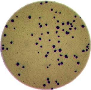
The image files can be found at data/colonies-01.tif,
data/colonies-02.tif, and
data/colonies-03.tif.
Morphometrics for bacterial colonies
Write a Python program that uses scikit-image to count the number of bacteria colonies in each image, and for each, produce a new image that highlights the colonies. The image should look similar to this one:
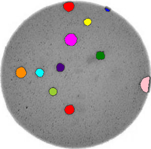
Additionally, print out the number of colonies for each image.
Use what you have learnt about histograms, thresholding and connected component analysis. Try to put your code into a re-usable function, so that it can be applied conveniently to any image file.
First, let’s work through the process for one image:
PYTHON
import imageio.v3 as iio
import ipympl
import matplotlib.pyplot as plt
import numpy as np
import skimage as ski

%matplotlib widget
bacteria_image = iio.imread(uri="data/colonies-01.tif")
# display the image
fig, ax = plt.subplots()
ax.imshow(bacteria_image)Next, we need to threshold the image to create a mask that covers only the dark bacterial colonies. This is easier using a grayscale image, so we convert it here:
PYTHON
gray_bacteria = ski.color.rgb2gray(bacteria_image)

# display the gray image
fig, ax = plt.subplots()
ax.imshow(gray_bacteria, cmap="gray")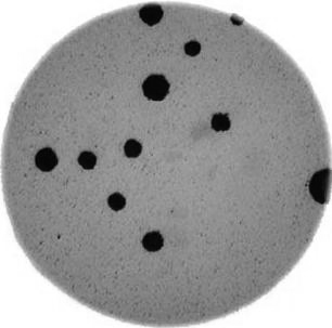
Next, we blur the image and create a histogram:
PYTHON
blurred_image = ski.filters.gaussian(gray_bacteria, sigma=1.0)
histogram, bin_edges = np.histogram(blurred_image, bins=256, range=(0.0, 1.0))
fig, ax = plt.subplots()
ax.plot(bin_edges[0:-1], histogram)
ax.set_title("Graylevel histogram")
ax.set_xlabel("gray value")
ax.set_ylabel("pixel count")
ax.set_xlim(0, 1.0)
In this histogram, we see three peaks - the left one (i.e. the darkest pixels) is our colonies, the central peak is the yellow/brown culture medium in the dish, and the right one (i.e. the brightest pixels) is the white image background. Therefore, we choose a threshold that selects the small left peak:
This mask shows us where the colonies are in the image - but how can we count how many there are? This requires connected component analysis:
Finally, we create the summary image of the coloured colonies on top of the grayscale image:
PYTHON
# color each of the colonies a different color
colored_label_image = ski.color.label2rgb(labeled_image, bg_label=0)
# give our grayscale image rgb channels, so we can add the colored colonies
summary_image = ski.color.gray2rgb(gray_bacteria)
summary_image[mask] = colored_label_image[mask]

# plot overlay
fig, ax = plt.subplots()
ax.imshow(summary_image)
Now that we’ve completed the task for one image, we need to repeat this for the remaining two images. This is a good point to collect the lines above into a re-usable function:
PYTHON
def count_colonies(image_filename):
    bacteria_image = iio.imread(image_filename)
    gray_bacteria = ski.color.rgb2gray(bacteria_image)
    blurred_image = ski.filters.gaussian(gray_bacteria, sigma=1.0)
    mask = blurred_image < 0.2
    labeled_image, count = ski.measure.label(mask, return_num=True)
    print(f"There are {count} colonies in {image_filename}")

    colored_label_image = ski.color.label2rgb(labeled_image, bg_label=0)
    summary_image = ski.color.gray2rgb(gray_bacteria)
    summary_image[mask] = colored_label_image[mask]
    fig, ax = plt.subplots()
    ax.imshow(summary_image)
Now we can do this analysis on all the images via a for loop:
PYTHON
for image_filename in ["data/colonies-01.tif", "data/colonies-02.tif", "data/colonies-03.tif"]:
    count_colonies(image_filename=image_filename)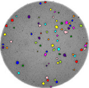
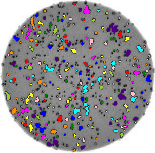
You’ll notice that for the images with more colonies, the results aren’t perfect. For example, some small colonies are missing, and there are likely some small black spots being labelled incorrectly as colonies. You could expand this solution to, for example, use an automatically determined threshold for each image, which may fit each better. Also, you could filter out colonies below a certain size (as we did in the Connected Component Analysis episode). You’ll also see that some touching colonies are merged into one big colony. This could be fixed with more complicated segmentation methods (outside of the scope of this lesson) like watershed.
Colony counting with minimum size and automated threshold (optional, not included in timing)
Modify your function from the previous exercise for colony counting to (i) exclude objects smaller than a specified size and (ii) use an automated thresholding approach, e.g. Otsu, to mask the colonies.
Here is a modified function with the requested features. Note when calculating the Otsu threshold we don’t include the very bright pixels outside the dish.
PYTHON
def count_colonies_enhanced(image_filename, sigma=1.0, min_colony_size=10, connectivity=2):

    bacteria_image = iio.imread(image_filename)
    gray_bacteria = ski.color.rgb2gray(bacteria_image)
    blurred_image = ski.filters.gaussian(gray_bacteria, sigma=sigma)

    # create mask excluding the very bright pixels outside the dish
    # we dont want to include these when calculating the automated threshold
    mask = blurred_image < 0.90
    # calculate an automated threshold value within the dish using the Otsu method
    t = ski.filters.threshold_otsu(blurred_image[mask])
    # update mask to select pixels both within the dish and less than t
    mask = np.logical_and(mask, blurred_image < t)
    # remove objects smaller than specified area
    mask = ski.morphology.remove_small_objects(mask, min_size=min_colony_size)

    labeled_image, count = ski.measure.label(mask, return_num=True)
    print(f"There are {count} colonies in {image_filename}")
    colored_label_image = ski.color.label2rgb(labeled_image, bg_label=0)
    summary_image = ski.color.gray2rgb(gray_bacteria)
    summary_image[mask] = colored_label_image[mask]
    fig, ax = plt.subplots()
    ax.imshow(summary_image)
Key Points
- Using thresholding, connected component analysis and other tools we can automatically segment images of bacterial colonies.
- These methods are useful for many scientific problems, especially those involving morphometrics.