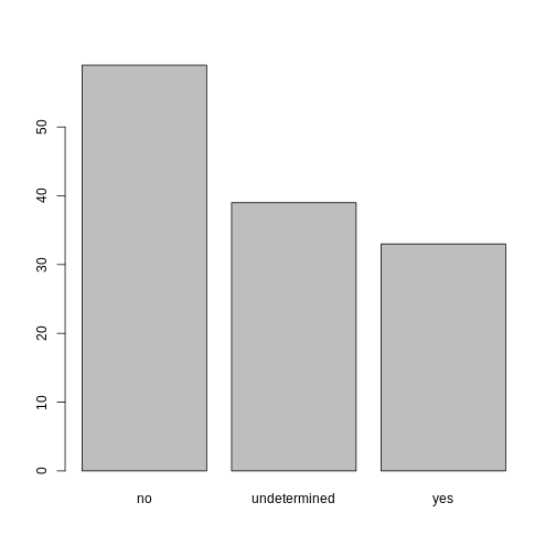
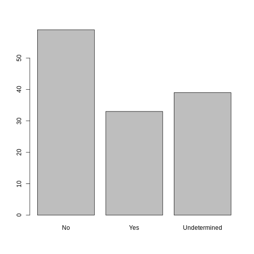
Image 1 of 1: ‘A 3 by 3 data frame with columns showing numeric, character and logical values.’
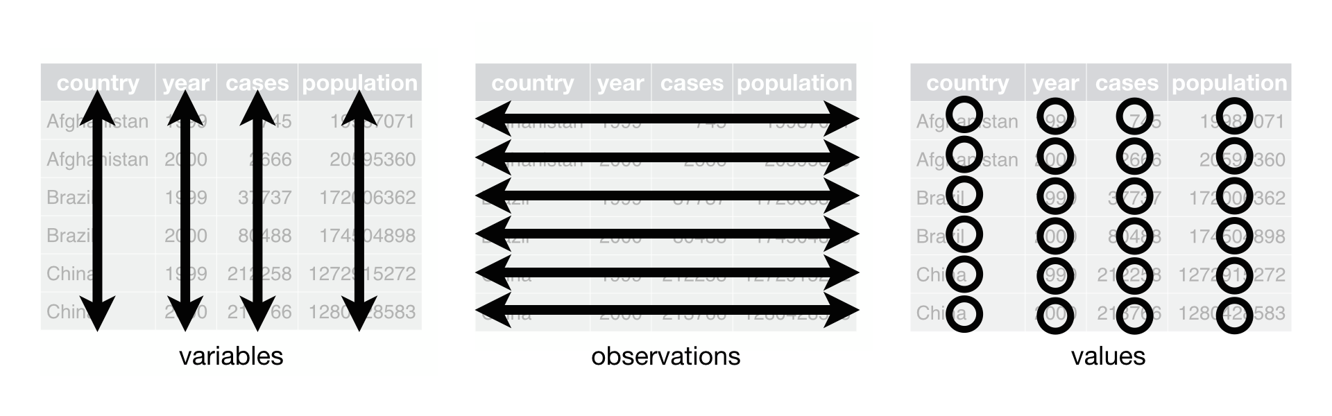
Figure 2
Image 1 of 1: ‘Monsters at a fork in the road, with signs saying here, and not here. One direction, not here, leads to a scary dark forest with spiders and absolute filepaths, while the other leads to a sunny, green meadow, and a city below a rainbow and a world free of absolute filepaths. Art by Allison Horst’
Long and wide
dataframe layouts mainly affect readability. You may find that visually
you may prefer the “wide” format, since you can see more of the data on
the screen. However, all of the R functions we have used thus far expect
for your data to be in a “long” data format. This is because the long
format is more machine readable and is closer to the formatting of
databases.
Figure 3
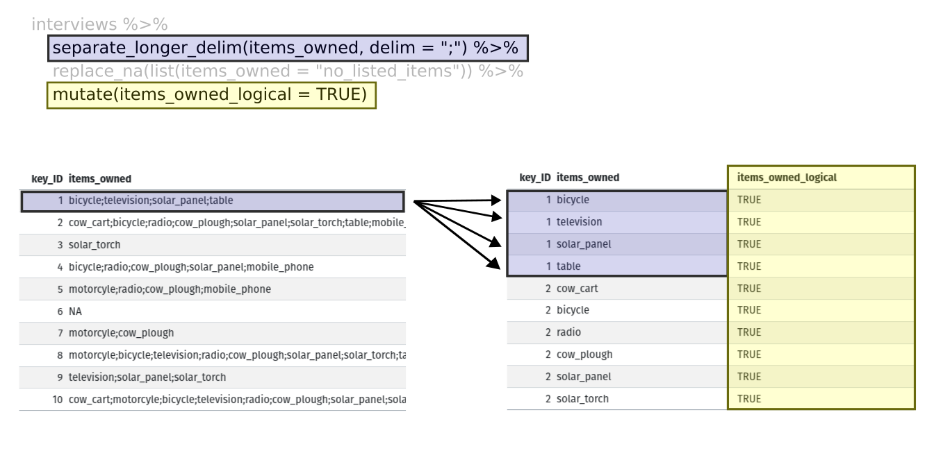
Image 1 of 1: ‘Two tables shown side-by-side. The first row of the left table is highlighted in blue, and the first four rows of the right table are also highlighted in blue to show how each of the values of 'items owned' are given their own row with the separate longer delim function. The 'items owned logical' column is highlighted in yellow on the right table to show how the mutate function adds a new column.’
Figure 4
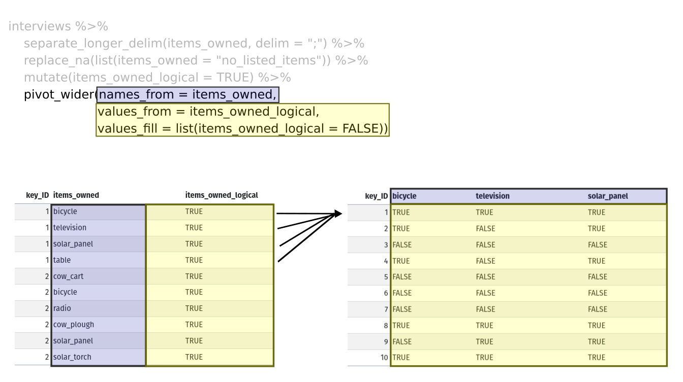
Image 1 of 1: ‘Two tables shown side-by-side. The 'items owned' column is highlighted in blue on the left table, and the column names are highlighted in blue on the right table to show how the values of the 'items owned' become the column names in the output of the pivot wider function. The 'items owned logical' column is highlighted in yellow on the left table, and the values of the bicycle, television, and solar panel columns are highlighted in yellow on the right table to show how the values of the 'items owned logical' column became the values of all three of the aforementioned columns.’


 R for Data Science,
Wickham H and Grolemund G (https://r4ds.had.co.nz/index.html)
© Wickham, Grolemund 2017 This image is licenced under
Attribution-NonCommercial-NoDerivs 3.0 United States (CC-BY-NC-ND 3.0
US)
R for Data Science,
Wickham H and Grolemund G (https://r4ds.had.co.nz/index.html)
© Wickham, Grolemund 2017 This image is licenced under
Attribution-NonCommercial-NoDerivs 3.0 United States (CC-BY-NC-ND 3.0
US)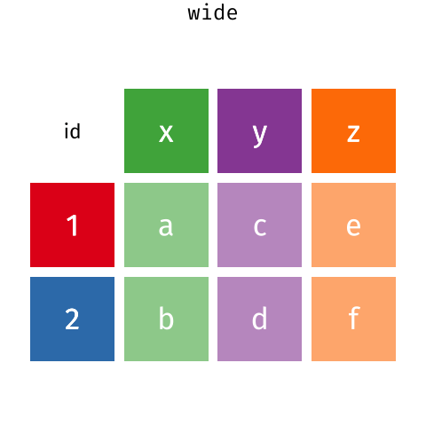 Long and wide
dataframe layouts mainly affect readability. You may find that visually
you may prefer the “wide” format, since you can see more of the data on
the screen. However, all of the R functions we have used thus far expect
for your data to be in a “long” data format. This is because the long
format is more machine readable and is closer to the formatting of
databases.
Long and wide
dataframe layouts mainly affect readability. You may find that visually
you may prefer the “wide” format, since you can see more of the data on
the screen. However, all of the R functions we have used thus far expect
for your data to be in a “long” data format. This is because the long
format is more machine readable and is closer to the formatting of
databases.