- Get familiarized with metadata - Acacia drepanolobium Surveys
- UHURU Acacia Experiment Data
- UHURU Tree Survey Data
Introduction to the UHURU dataset
Data
- For the next set of lessons we’ll be working with data on acacia size from an experiment in Kenya
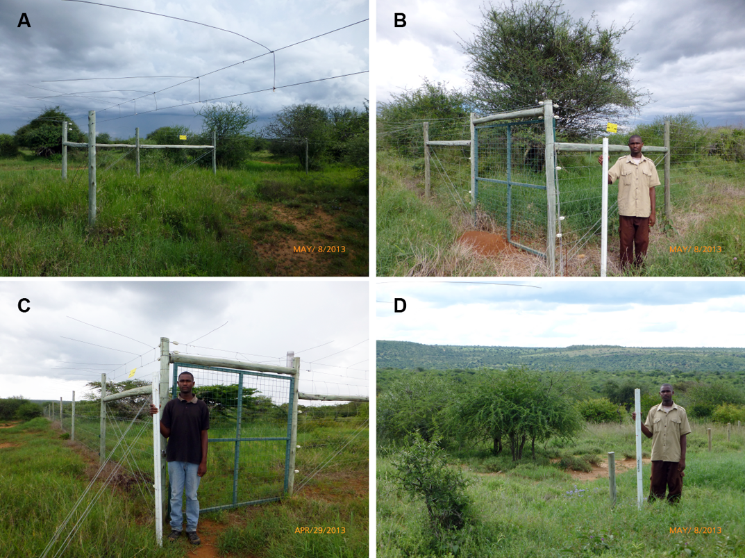
- The experiment is designed to understand the influence of herbivores on vegetation by excluding different sized herbivores
- There are 3 different treatments:
- The top-left image shows Megaherbivore exclosures, which use wires 2m high to keep elephants
- The top-right image shows Mesoherbivore exclosures, which use fenses starting 1/3m off the ground to exclude things like impalla
- The bottom-left image shows full exclosures, which use fenses all the way to the ground to keep out all mammalian herbivores
- And the bottom-right image shows control plots
- So far we’ve been working with datasets that are separated by commas
- Click on surveys.csv to show csv format
- But if we look at this new dataset it looks different
-
- Click on Acacia Dataset to Open in Text Editor
- This data is tab separated, so we’ll need to treat it differently when we import it
- To do this we manually set the character separating each column using the optional
separgument - So we’ll call our data frame
acaciaand assign it the output fromread.csv - We still give it the name of the file in quotes as the first argument
- Then we add a comma and
sep = "\t" \tis who we indicate a Tab character in programming
acacia <- read.csv("ACACIA_DREPANOLOBIUM_SURVEY.txt", sep="\t")
- We can also see that it includes information on whether or not the plant is dead in the HEIGHT column
- Is that good data structure?
- If you said “No”, you’re right, information on if the tree is dead should be stored in a separate column
- For now, we’ll just treat the “dead” entries as null values
- We can do this by using another optional argument
na.strings - So let’s modify our
read.csvstatement by addingna.strings = c("dead"). - This will replace the string
"dead"withNA - It gets passed as a vector because this allows multiple different values to be set as nulls
acacia <- read.csv("ACACIA_DREPANOLOBIUM_SURVEY.txt", sep="\t", na.strings = c("dead"))
- If we open the resulting table we can see that it includes information on:
- the time and location of the sampling
- the experimental treatment
- the size of each Acacia including a height, the canopy diameter measured in the direction (or axis) or the largest diameter and the diameter of the axis perpendicular to that, and the circumference of the shrub
- information on the number of flowers, buds, and fruits
- And finally information on the species of ant associated with the shrub because there is a very interesting ant-acacia mutualism where the Acacia special structures that serve as houses for the ants and the ants swarm herbivores that try to eat the acacia
ggplot
- Very popular plotting package
- Good plots quickly
- Declarative - describe what you want not how to build it
- Contrasts w/Imperative - how to build it step by step
- Install
ggplot2usinginstall.packages
Basics
- We load the
ggplot2package just like we loadeddplyr
library(ggplot2)
- We’ll also load the UHURU like we discussed in the video on the dataset
acacia <- read.csv("ACACIA_DREPANOLOBIUM_SURVEY.txt", sep="\t", na.strings = c("dead"))
- To build a plot using
ggplotwe start with theggplot()function
ggplot()
ggplot()creates a base ggplot object that we can then add things to-
Like a blank canvas
- We can also add optional arguments for information to be shared across different components of the plot
- The two main arguments we typically use here are
data- which is the name of the data frame we are working with, soacaciamapping- which describes which columns of the data are used for different aspects of the plot- We create a
mappingby using theaesfunction, which stands for “aesthetic”, and then linking columns to pieces of the plot - We’ll start with telling ggplot what value should be on the x and y axes
- Let’s plot the relationship betwen the circumference of an acacia and its height
ggplot(data = acacia, mapping = aes(x = CIRC, y = HEIGHT))
- This still doesn’t create a figure, it’s just a blank canvas and some information on default values for data and mapping columns to pieces of the plot
- We can add data to the plot using layers
- We do this by adding a
+after the theggplotfunction and then adding something called ageom, which stands forgeometry - To make a scatter plot we use
geom_point
ggplot(data = acacia, mapping = aes(x = CIRC, y = HEIGHT)) +
  geom_point()
-
It is standard to hit
Enterafter the plus so that each layer shows up on its own line - To change things about the layer we can pass additional arguments to the
geom - We can do things like change
- the
sizeof the points, we’ll set it to3 - the
colorof the points, we’ll set it to"blue" - the transparency of the points, which is called
alpha, we’ll set it to 0.5
- the
ggplot(data = acacia, mapping = aes(x = CIRC, y = HEIGHT)) +
  geom_point(size = 3, color = "blue", alpha = 0.5)
- To add labels (like documentation for your graphs!) we use the
labsfunction
ggplot(data = acacia, mapping = aes(x = CIRC, y = HEIGHT)) +
  geom_point(size = 3, color = "blue", alpha = 0.5) +
  labs(x = "Circumference [cm]", y = "Height [m]",
       title = "Acacia Survey at UHURU")
Rescaling axes
ggplot(data = acacia, mapping = aes(x = CIRC, y = HEIGHT)) +
  geom_point(size = 3, color = "blue", alpha = 0.5) +
  scale_y_log10() +
  scale_x_log10()
- Not changing the data itself, just the presentation of it
Do Tasks 1-2 in Acacia and ants.
Grouping
- Group on a single graph
- Look at influence of experimental treatment
ggplot(acacia, aes(x = CIRC, y = HEIGHT, color = TREATMENT)) +
  geom_point(size = 3, alpha = 0.5)
- Facet specification
ggplot(acacia, aes(x = CIRC, y = HEIGHT)) +
  geom_point(size = 3, alpha = 0.5) +
  facet_wrap(~TREATMENT)
- Where are all the acacia in the open plots? (eaten?)
Do Tasks 3-4 in Acacia and ants.
Statistical transformations
- We’ve seen that ggplot makes graphs by combining information on
- Data
- Mapping of parts of that data to aspects of the plot
- A geometric object to represent the data
ggplot(acacia, aes(x = CIRC, y = HEIGHT)) +
  geom_point()
-
Many kinds of geometric object (type
geom_and show completions) - Each geom includes a statistical transformations
- So far we’ve only seen
identity: the raw form of the data or no transformation
- Transformations exist to make things like histograms, bar plots, etc.
-
Occur as defaults in associated geoms
- To look at the number of acacia in each treatment use a bar plot
ggplot(acacia, aes(x = TREATMENT)) +
  geom_bar()
- Uses the transformation
stat_count()- Counts the number of rows for each treatment
- To look at the distribution of circumferences in the dataset use a histogram
ggplot(acacia, aes(x = CIRC)) +
  geom_histogram(fill = "red")
- Uses
stat_bins()for data transformation- Splits circumferences into bins and counts rows in each bin
- Set number of
binsorbinwidth
ggplot(acacia, aes(x = CIRC)) +
  geom_histogram(fill = "red", bins = 15)
ggplot(acacia, aes(x = CIRC)) +
  geom_histogram(fill = "red", binwidth = 5)
- These can be combined with all of the other
ggplot2features we’ve learned
Do Tasks 1-2 in Acacia and ants histograms.
Position
- geom’s also come with a default position
- In many cases the position is
"identity", which just means the object is plotted in the position determined by the data, but not always - Let’s remake our histogram, but color the bars by the treatment
ggplot(acacia, aes(x = CIRC, color = TREATMENT)) +
  geom_histogram(binwidth = 5)
- You can see that the total height of the bars stayed the same
- That’s because ggplot has just colored the pieces of each bar that correspond to each treatment
- It does this because the default
positionforgeom_histogramis"stacked", which stacks the bars on top of one another and therefore makes a stacked histogram. - If we want separate overlapping histograms then we need to change the position
ggplot(acacia, aes(x = CIRC, color = TREATMENT)) +
  geom_histogram(binwidth = 5, position = "identity")
- And then add some transparency so we can see all of the histograms
ggplot(acacia, aes(x = CIRC, color = TREATMENT)) +
  geom_histogram(binwidth = 5, position = "identity", alpha = 0.5)
Layers
- So far we’ve only plotted one layer or geom at a time, but we can combine multiple layers in a single plot
ggplot()sets defaults for all layers- Can combine multiple layers using
+ - The first geom is plotted first and then additional geoms are layered on top
- Combine different kinds of layers
- Add a linear model
ggplot(acacia, aes(x = CIRC, y = HEIGHT)) +
  geom_point() +
  geom_smooth(method = "lm")
- Both the
geom_pointlayer and thegeom_smoothlayer use the defaults formggplot - Both use
acaciafor data andx = CIRC, y = HEIGHTfor the aesthetic -
geom_smoothuses the statistical transformationstat_smooth()to produce a smoothed representation of the data - Do this by treatment
ggplot(acacia, aes(x = CIRC, y = HEIGHT, color = TREATMENT)) +
  geom_point() +
  geom_smooth(method = "lm")
- Because the color aesthetic is the default it is inherited by geom_smooth
- One set of points and one model for each treatment
Changing values across layers
- We can also plot data from different columns or even data frames on the same graph
- To do this we need to better understand how layers and defaults work
- So far we’ve put all of the information on data and aesthetic mapping into
ggplot()
ggplot(data = acacia, mapping = aes(x = CIRC, y = HEIGHT)) +
  geom_point() +
  geom_smooth(method = "lm")
- This sets the default data frame and aesthetic, which is then used by
geom_point()andgeom_smooth() - Alternatively instead of setting the default we could just give these values
directly to
geom_point()and `geom_smo
ggplot() +
  geom_point(data = acacia,
             mapping = aes(x = CIRC, y = HEIGHT,
                           color = TREATMENT)) +
  geom_smooth(method = "lm")
-
We can see that this information is no longer shared with other geoms since it is no longer the default, so we’ve asked for a smooth of nothing and so no smoother is shown
- Can use this combine different aesthetics
- Make a single model across all treatments while still coloring points
ggplot() +
  geom_point(data = acacia,
             mapping = aes(x = CIRC, y = HEIGHT,
                           color = TREATMENT)) +
  geom_smooth(data = acacia,
              mapping = aes(x = CIRC, y = HEIGHT))
coloris only set in the aesthethic for the point layer-
So the smooth layer is made across all x and y values
-
Check if this makes sense to everyone
- This same sort of change can be used to plot different columns on the same plot by changing the values of x or y
- If we wanted to plot two different columns as Y we could change the value of y in the aesthetic
-
If we wanted to use data from two different data frames we could change the value of data
- We can also keep all of the values that are shared as defaults if we want to
ggplot(data = acacia, mapping = aes(x = CIRC, y = HEIGHT)) +
  geom_point(mapping = aes(color = TREATMENT)) +
  geom_smooth(method = "lm")
Do Task 3 in Acacia and ants histograms.
Understanding defaults (optional if students struggling after exercise)
- Let’s move some things around to help understand where to put different information data and mapping
ggplot(data = acacia, mapping = aes(x = CIRC, y = AXIS1)) +
  geom_point() +
  geom_smooth(method = "lm")
- What happens if we move
dataandmappingto one layer
ggplot() +
  geom_point(data = acacia, mapping = aes(x = CIRC, y = AXIS1)) +
  geom_smooth(method = "lm")
- What about the other layer
ggplot() +
  geom_point() +
  geom_smooth(data = acacia, mapping = aes(x = CIRC, y = AXIS1), method = "lm")
- What if we move one to each layer (error)
ggplot() +
  geom_point(data = acacia) +
  geom_smooth(mapping = aes(x = CIRC, y = AXIS1), method = "lm")
- So, each geom needs access to
dataandmapping - If they are not in the geom then the geom uses the defaults
ggplot() - If we want different
dataormappingfor different layers then provide different values to different geoms
ggplot(data = acacia, mapping = aes(x = CIRC)) +
  geom_point(mapping = aes(y = AXIS1), color = "black") +
  geom_point(mapping = aes(y = AXIS2), color = "grey")
Grammar of graphics
- Uniquely describe any plot based on a defined set of information
- Leland Wilkinson
- Geometric object(s)
- Data
- Mapping
- Statistical transformation
- Position (allows you to shift objects, e.g., spread out overlapping data points)
- Facets
- Coordinates (coordinate systems other than cartesian, also allows zooming)
Saving plots as new files
ggsave("acacia_by_treatment.jpg")
- The type of the file is determined by the file extension
ggsave("acacia_by_treatment.pdf")
- Lots of optional arguments including size
ggsave("acacia_by_treatment.pdf", height = 5, width = 5)
Assign the rest of the exercises.