Mammal Body Size Distribution (Graphing)
This is a follow up to Mammal Body Size by Continent.
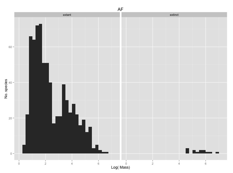
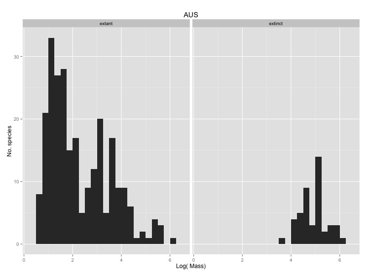
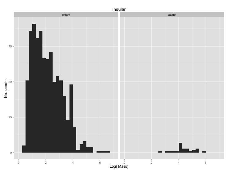
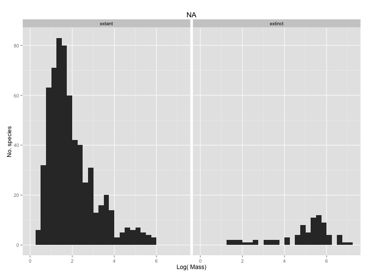
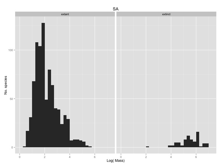
We have previously compared the average masses of extant and extinct species on
different continents to try to understand whether size has an influence on
extinction in mammals. Looking at the averages was a good start, but we really
need to look at the full distributions of masses of the two groups to get the
best picture of whether or not there was a major size bias in extinctions during
the late Pleistocene. Make a graph for each continent that you think is worth
visualizing. Each plot should facet two histograms that use
the same bins to display the number of extinct and extant species. Use the
log(mass) rather than the mass itself so that you can see the form of the
distributions more clearly. Label the axes appropriately.
There is a lot of work to do in this problem so make sure to break it down in to manageable pieces. Some logical chunks include:
- Make a single graph with the histograms for extinct and extant species.
- Downloading/importing the data
- Breaking the data up into separate continents
- Breaking the data up into extinct and extant species
- Looping over the data to print one plot for each continent