Acacia and Ants Data Manipulation (Graphing)
An experiment in Kenya has been exploring the influence of large herbivores on plants.
Check to see if TREE_SURVEYS.txt is in your workspace.
If not, download TREE_SURVEYS.txt.
Use read_tsv from the readr package to read in the data using the following command:
trees <- read_tsv("TREE_SURVEYS.txt",
                  col_types = list(HEIGHT = col_double(),
                                   AXIS_2 = col_double()))
- Update the
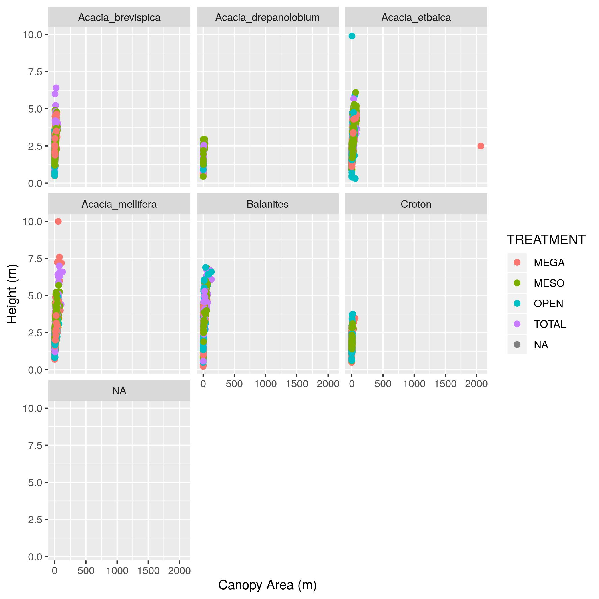
treesdata frame with a new column namedcanopy_areathat contains the estimated canopy area calculated as the value in theAXIS_1column times the value in theAXIS_2column. Show output of thetreesdata frame with just theSURVEY,YEAR,SITE, andcanopy_areacolumns. - Make a scatter plot with
canopy_areaon the x axis andHEIGHTon the y axis. Color the points byTREATMENTand plot the points for each value in theSPECIEScolumn in a separate subplot. Label the x axis “Canopy Area (m)” and the y axis “Height (m)”. Make the point size 2. - That’s a big outlier in the plot from (2). 50 by 50 meters is a little too
big for a real Acacia, so filter the data to remove any values for
AXIS_1andAXIS_2that are over 20 and update the data frame. Then remake the graph. - Using the data without the outlier (i.e., the data generated in (3)),
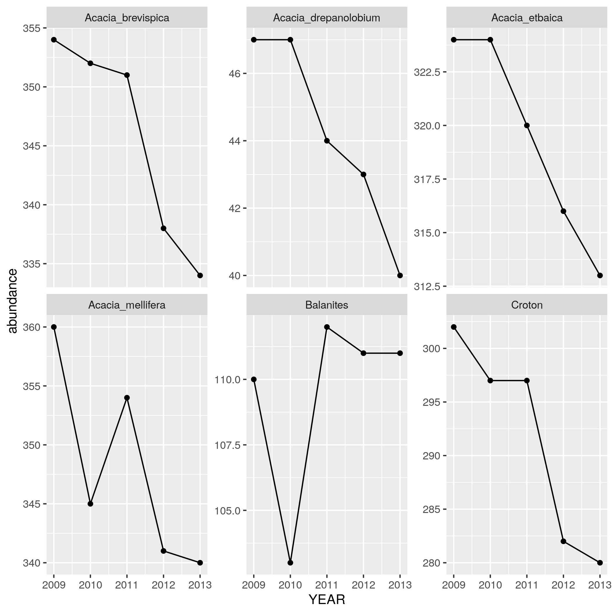
find out how the abundance of each species has been changing through time.
Use
group_by,summarize, andnto make a data frame withYEAR,SPECIES, and anabundancecolumn that has the number of individuals in each species in each year. Print out this data frame. - Using the data frame generated in (4),
make a line plot with points (by using
geom_linein addition togeom_point) withYEARon the x axis andabundanceon the y axis with one subplot per species. To let you seen each trend clearly let the scale for the y axis vary among plots by addingscales = "free_y"as an optional argument tofacet_wrap.